-
I want to thank all the members that have upgraded your accounts. I truly appreciate your support of the site monetarily. Supporting the site keeps this site up and running as a lot of work daily goes on behind the scenes. Click to Support Signs101 ...
You are using an out of date browser. It may not display this or other websites correctly.
You should upgrade or use an alternative browser.
You should upgrade or use an alternative browser.
Logo layout. Let me know what you think
- Thread starter Amazing Designs
- Start date

Amazing Designs
New Member
Isn't it more important to let people know what you do before you worry about the appearance of your name? If you are an established business that everyone knows then I understand emphasizing the name. Appreciate the critique, Just have heard different views on this.
GAC05
Quit buggin' me
From the thumbnail view I have to agree, the contrast is poor and the readability of the name is even worse.
You might try to thicken up the center strokes - reduce the white outlines & thin out brown strokes around the letters to give the name some weight.
wayne k
guam usa
You might try to thicken up the center strokes - reduce the white outlines & thin out brown strokes around the letters to give the name some weight.
wayne k
guam usa
Last edited:
artbot
New Member
no offense, this is a requested critique, but it is a mess. you are definitely a good at graphics. you just need to get away from the expanded borders. and the wallpaper print in the background is too small to make a difference. look up some art nouveau graphics. i think that is what you are going for. make it cleaner and more about the name, not the design.
Amazing Designs
New Member
ok! I see that everyone has opinions but, I dont even see any work that u have actually done? I am just trying to understand a little more who is critiquing me. Not saying that you guys dont know what your talking about. I would like to see your ideas if you have some. Also what is a contour tool? I am in Illustrator CS4 and 5
signmeup
New Member
A few points:ok! I see that everyone has opinions but, I dont even see any work that u have actually done? I am just trying to understand a little more who is critiquing me. Not saying that you guys dont know what your talking about. I would like to see your ideas if you have some. Also what is a contour tool? I am in Illustrator CS4 and 5
Do a little research on the people giving you their time for free. Some of them have been on this site for a while.
Your design has very low contrast and the strokes are way overdone.
Not everyone has a lot of spare time this time of year to do layouts for you.
Be more grateful of the free advice you get.
JasperST
New Member
It doesn't matter what anyone else has done or hasn't done, don't be so thin skinned. Do you think the public is going to care if you approve of their opinions?
The design is too hard to read, period. If you made the text heavier and thinned out the outlines it would be much improved.
The design is too hard to read, period. If you made the text heavier and thinned out the outlines it would be much improved.
weaselboogie
New Member
It doesn't matter what anyone else has done or hasn't done, don't be so thin skinned. Do you think the public is going to care if you approve of their opinions?
Exactly... My wife has never designed anything in her life, but she's the first one to tell me if I need to go back to the drawing board.
Everyone is telling you the same thing.... listen to them.
SignManiac
New Member
Phil,
I don't get any kind of feel that this is geared to a salon. If anything it makes me think landscaping business. Is your wifes name Joi De Vie or is that French for something else?
I think you need to try another direction with primary emphasis on legibility. Just out of curiosity, what exactly does your background circle design represent? The colors aren't working for me either. Can you tell me if this is going on a window or a sign on the wall?
Last edited:
Just Another Sign Guy
New Member
ah forget it...it just isn't worth it.
Great Job "Amazing Designs" Great Job...apparently that is what you want to hear...so there it is.
Great Job "Amazing Designs" Great Job...apparently that is what you want to hear...so there it is.
Don´t be so defensive! Try to listen to what people here say, belive me most of them are very good at giving pointers.
I get the feling that you accually didn't want any critics.
I think you made that logo and liked it very much and i also think you where proud of it and just wanted to show it to us, and when the critics started to come you felt hurt.
Its nothing wrong with feeling hurt and dissapointed and its good that you are proud over your work ( you should always be that )
But.. i think since you are so happy with it its easy to get stuck on a design. Take the advice you have gotten here and surf the web and look what others have, then take out a completley white paper and start to sketch again.
When it comes to your logo i agree with everyone else here, its to low contrast, the outlines are way to heavy and the colors doesn't make me happy.
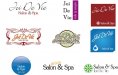
To help you to restart your thinking process i just hit together a number of
different ways to do your logo. Remeber this are not in anyway finished or tought thrue logos, just a bunch of very fast mockups as a help for you to start to think differently when it comes to how you do the logo.
Good Luck
I get the feling that you accually didn't want any critics.
I think you made that logo and liked it very much and i also think you where proud of it and just wanted to show it to us, and when the critics started to come you felt hurt.
Its nothing wrong with feeling hurt and dissapointed and its good that you are proud over your work ( you should always be that )
But.. i think since you are so happy with it its easy to get stuck on a design. Take the advice you have gotten here and surf the web and look what others have, then take out a completley white paper and start to sketch again.
When it comes to your logo i agree with everyone else here, its to low contrast, the outlines are way to heavy and the colors doesn't make me happy.
To help you to restart your thinking process i just hit together a number of
different ways to do your logo. Remeber this are not in anyway finished or tought thrue logos, just a bunch of very fast mockups as a help for you to start to think differently when it comes to how you do the logo.
Good Luck
Attachments
Last edited:

Gino
Premium Subscriber
The pastel background looks fine, but your overuse of effects is just that…. ‘overused effects’.
Whether you like it or not… a design is not comprised of a few letters and than add as many dazzling effects as you can to make it illegible. Light use of effects and more oomph to the actual make up of the logo is what really counts.
20 years ago, you would never have seen a design that looked like that because people don’t think or draw like that…. only computers and software create perfectly executed bad ideas and make them come to life. It’s your job as a designer to make sure the very idea you are trying to convey to the public… understand your participation. In other words… when someone says your wife’s salon name… they will speak it loudly, softly, quickly or with enthusiasm or any other tone they feel justifies repeating the name. Well, your silent written form of talking to the public when no one is around to be heard looks like someone just mumbled the words and got it stuck in their mouth and couldn’t utter the complete name. Now, is that doing your wife’s business any good ??
Remember this also Ama….no one here needs to show you their credentials. You’re the one asking for help and critiquing, so either take it like a pro and expand your horizons…. or forget trying to improve yourself.
If you want a pat on the back…. this one won’t do it. Come back with something else and shows us what you can do and how quickly you can learn. 