-
I want to thank all the members that have upgraded your accounts. I truly appreciate your support of the site monetarily. Supporting the site keeps this site up and running as a lot of work daily goes on behind the scenes. Click to Support Signs101 ...
You are using an out of date browser. It may not display this or other websites correctly.
You should upgrade or use an alternative browser.
You should upgrade or use an alternative browser.
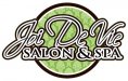
Logo layout. Let me know what you think
- Thread starter Amazing Designs
- Start date
GAC05
Quit buggin' me
Originally Posted by jiarby:
"That makes the whole thing look like Kirstie Ally in a Speedo."
Jiarby, in Queen Creek, if women wear the speedos does that mean men wear the thongs?!?
Out here in the islands we do it a little diffrent but are always behind the latest fashion trends....
wayne k
guam usa
"That makes the whole thing look like Kirstie Ally in a Speedo."
Jiarby, in Queen Creek, if women wear the speedos does that mean men wear the thongs?!?
Out here in the islands we do it a little diffrent but are always behind the latest fashion trends....
wayne k
guam usa
Dave Drane
New Member
I was going to do a smartass remark like, Put some diamond plate behind it and some flames off the copy along with some nice prizmatized helvetica medium with some edges and shades thrown off at different angles for different words....A) I am having a hard time to come up with something because you know that its always harder creating something for yourself.
B) I appreciate corrective criticism.... not just its junk or it looks horrible... How does that help me get better.
C)Thanks to Jill, Perks, signmaniac, and the ones back at the beginning... Sorry never expected all this crazyness..
D) to all the ones ragging me, I am self taught and don't claim to be a great artist.... never spent a dime of mom and dads money, and I am learning every day!!!
E) The name of the Salon was not my idea and if you are married you know what it's like trying to change a womens mind... I was against the name, but obviously that is what the women wanted... Joie De Vivre is the actual name that is French for "Joy of Living", "Joy of life", to live, living"...
by the way signmaniac I like what you came up with, you know what your doing I appreciate that, and I have seen some great work on here by others! I know everyone is busy never expected resumes I think everyone is really going a lil overboard with that. Since everyone is on the business name, It is my moms name she came up with when she started hand painting... The Amazing part is from Amazing Grace.... So please don't act like I am saying I am the best, because i know that I am by far far far from having an ounce of talent like others out there I would like to develop into a much better designer...
I am not the best at typing what I want to say and never really liked doing it because I have obviously stirred things up... wasn't looking to do that.. Sorry
BUT because you came back with this post
 I just want to say welcome from Down-Under.:Australia
daveb
General Know-it-all
You got to admit, your first response to the posts was a little antagonistic. PERHAPS I got the wrong impression. Sometimes you don't have to start from scratch on a design, just take a little advice and you might be surprised what you can accomplish. Although this probably could and will be done better by others on this forum.... I've taken your original idea and "Tweaked" it, definitely needs more attention but I think you get the idea. Much more contrast, non competing stroke widths, etc. See what ya think. Nuff said
Attachments

SignManiac
New Member
Definite improvement Dave on the initial design!
Marlene
New Member
You got to admit, your first response to the posts was a little antagonistic. PERHAPS I got the wrong impression.
me too. it's hard with new people as we have no history with you and there have been soooo many who only wanted praise and nothing more. the colors green, brown and white are nice. they give the logo a feeling a peace and nature which is good for a spa/salon as women go there for that. the biggest problem I had with the design was the outlines and the thin inline. it made the lettering way too complex and hard to read. you set a mood with a design. the colors are soothing but the lettering is jarring. do a search for a thread by Joe Diaz for a baseball logo he posted recently. everyone who saw it attached it to a feeling and loved it. it's a great logo as it not only tells people a name and a what it does, it sets a mood that you want to be a part of.
PS, sorry but I was going to link you to the above thread but it is in the premium logo design section but I think you can get the drift of what I am saying
Last edited:
Jillbeans
New Member
I tried making a grin to represent "joy" out of a parenthesis from the script font I used, Avalanche.
I put the green oval back there to keep the flavor of your layout but it could also be eliminated.
Don't try to overcomplicate a complicated (making people want to see the correct spelling) name.
My spacing on "vie" is off.
I put the green oval back there to keep the flavor of your layout but it could also be eliminated.
Don't try to overcomplicate a complicated (making people want to see the correct spelling) name.
My spacing on "vie" is off.
Attachments

Amazing Designs
New Member
Thanks, so much guys... I am going to try a few things. This is what kind of critique I was hoping for, because this definitely helps me.
stickermonkey
New Member
I much prefer a simpler, cleaner layout as well. There's more that can be done with it if you keep it simple as well. Such as, puting that lovely shade of green behind it. If you like the pattern, I'd sooner see it muted down as a background. That would make a lovely sign, vehicle wrap, business card...anyhow...I'm not sure my thoughts are clear...and if I had some time to dabble with it, I'd post something. And I agree with you about finding it tough to design for your own business...It's a challenge and very important to get it right, as it's what people are guage your capabilities with. The people who have posted here are all giving you fantastic ideas. And let me also say , that in writing, it's easy to be misunderstood and to in turn misunderstand a persons impression. (not to mention...it's hard to be critiqued) lol...good luck my friend! I'm sure it'll all work out wonderfully!
The people who have posted here are all giving you fantastic ideas. And let me also say , that in writing, it's easy to be misunderstood and to in turn misunderstand a persons impression. (not to mention...it's hard to be critiqued) lol...good luck my friend! I'm sure it'll all work out wonderfully!signgal
New Member
I tried making a grin to represent "joy" out of a parenthesis from the script font I used, Avalanche.
I totally just smiled when i opened it!!!

Amazing Designs
New Member
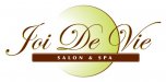
This is after taking some advice. I like what you guys have done and I don't have tons of great fonts. So this is what I came up with. Not saying that it is final or anything, but I am starting to like it more.
Jill I really like the Grin idea. I was also thinking of losing the circle and doing a vector chrysanthemum graphic, because it is a flower that represents joy.
One of my main problems is the building they are leasing already has a 6'x6' lighted sign and my stupid mind is stuck on, not having all negative space on the sign. That is the only reason I originally put the circle in the back.