• I want to thank all the members that have upgraded your accounts. I truly appreciate your support of the site monetarily. Supporting the site keeps this site up and running as a lot of work daily goes on behind the scenes. Click to Support Signs101 ...

My company logo designed by Neato. Thoughts?

SuncitySigns

New Member
Hi guys/girls

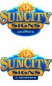
I have been working with (Neato:U Rock: ) over the past few days or so getting a logo done for myself.

This is how it is looking atm and I think Im pretty happy with it, just slighlty unsure about the bottom bit that reads

"AND or (&) GRAPHICS " and the shape of the bottm panel wether it should be rounded or squared off.


Any thoughts be appreciated on the above or the whole logo in general. :thankyou:
 

Attachments

  • SCS&G Logo.jpg
    SCS&G Logo.jpg
    68 KB · Views: 151

Tim Aucoin

New Member
I like the top one too... I'd like to see it with the outermost blue border the same shade to tie it together better... :rolleyes:
 

Moze

Precision Sign Services
I like the top one. Great work as usual.

I wonder if it would look more balanced with the paintbrush on the right and the pencil in the center. Might be my OCD side talking.

Looks great though!
 
C

ColoPrinthead

Guest
I like the top one best, it seems to have more dark/light contrast between the colors and I like how it works with and spelled out (king of reminds me of older painted signs). Both look nice.
 
Last edited by a moderator:

John Butto

New Member
Maybe it is late and I am having flashbacks, but I see a blue toaster with a hot english muffin popping up. (area for smiley face)
 

SuncitySigns

New Member
I like the top one best, it seems to have more dark/light contrast between the colors and I like how it works with and spelled out (king of reminds me of older painted signs). Both look nice.

As much as I like the clean cut modern day corporate looking logo this will stand out a lot more in my city :) And Im only young but I like the slightly old school look as well.
 

GAC05

Quit buggin' me
Both look good to me.
I think I like the bottom more than the top. Just take the "and Graphics" with the lines and put them in the bottom design.
The lower panel somehow makes the whole layout look more stable being straight vs curved option.

wayne k
guam usa
 

Jillbeans

New Member
To be honest (and I absolutely love Phillip) this is not his best work.
The Sun City looks squeezed or stretched or something.
I am wondering if you gave him a lot of input rather than just letting him do his own thing?
I like the sun but I don't think it needs the elements in it to clutter it.
Those tools have been done to death in our trade logos.
And what is the light blue ribbon thing?
I would have made the Sun City having a top concave arch to give the sun more room as an icon, and tucked the SIGNS part neatly underneath.
This is not to rip up Phillip's work, just to give an opinion.
Love....Jill
 

SignManiac

New Member
I'd like to see the black and white version myself. And I agree with Jill on nixing the paint brush stuff in the sun. It does add unnecessary clutter.
 

mikefine

New Member
"Sun" is dominant element with Sun City -- Sun image. Graphics and SIGNS appear secondary.
Shouldn't it be the other way around -- or more equal?
 

spudcity

New Member
I agree with getting rid of the tools in the sun. It took me a bit to figure out what they were without looking close; especially the pencil, it really is drowned out with the colors..

I like the top one otherwise.
 

neato

New Member
To be honest (and I absolutely love Phillip) this is not his best work.
The Sun City looks squeezed or stretched or something.
I am wondering if you gave him a lot of input rather than just letting him do his own thing?
I like the sun but I don't think it needs the elements in it to clutter it.
Those tools have been done to death in our trade logos.
And what is the light blue ribbon thing?
I would have made the Sun City having a top concave arch to give the sun more room as an icon, and tucked the SIGNS part neatly underneath.
This is not to rip up Phillip's work, just to give an opinion.
Love....Jill

Rip away Jill! Your opinion is appreciated. :)
 

neato

New Member
BTW, for some reason the colors are off on your images Shane...
 

Attachments

  • SCLogo5.jpg
    SCLogo5.jpg
    68.2 KB · Views: 116

ShoNuff

The Doer of Things
If I had to choose between the two, I would say I like the bottom one most. Give the proper balance and structure of a solid logo/brand. Would also look good on a custom cut metal sign blank.

Both are nice but I agree with some earlier comments on the tool elements in the sun adding unnecessary clutter to the icon. I feel that the sun should be more dominate to cap the top - wider so that the sides fall at the edges of the U and T. I would then add a subtle tone skyline inside the sun - almost as if a snow globe effect - so that it looks encompassed within the icon, and not just laid on stroke to stroke. You could even have the simple skyline of your city appear to be chizzled out or look like the city has been weeded out of the sun.

I also agree that the text looks skewed or stretched. I do love the depth and stroking of the SunCity wordmast though. The pallet is a nice choice. Im wondering what the blue in the back is?? Ribbon? Pin striping tape? Vinyl cores?

Maybe add a halftone burn to the sun and sign panel below to give some needed texture and further help the brand POP out from the icon and background of the logo. I like them, I just feel they need some more development. Take it as you wish.
 
Top