-
I want to thank all the members that have upgraded your accounts. I truly appreciate your support of the site monetarily. Supporting the site keeps this site up and running as a lot of work daily goes on behind the scenes. Click to Support Signs101 ...
You are using an out of date browser. It may not display this or other websites correctly.
You should upgrade or use an alternative browser.
You should upgrade or use an alternative browser.
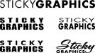
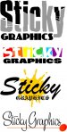
New Logo Design
- Thread starter stickygraphics12
- Start date
stickygraphics12
New Member
Marco
New Member
no no. where is that guy at? the graphic guy, wake him up, buy him coffee and put em to work, least til he come up with something we ALL like.:Big Laugh
J Hill Designs
New Member
I dont like how the S and the G are different sizes...

SignManiac
New Member
Jill I think you nailed it with the Brush Script, Olde English versions along with the jizz spot.


Gino
Premium Subscriber
Actually this was the first one that popped into my head.
Remember that old Rolling Stones album?
:ROFLMAO:
OK no more I promise.
I think you're hanging out in that girl's tip thread too much and you're heading for a one-way collusion with mr right...................

You need to come up for air............ :Oops:
stickygraphics12
New Member
I'm an easy going guy....you guys can have all the fun you want! Doesn't obther me one bit!
GypsyGraphics
New Member
roofer roofies?Sorry Gino I just need a vacation.
Well maybe I need more than that.
hahaha