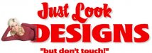
Hey everybody, I have been working on this logo for awhile and I was just curious on what people thought. The style is a bit different than my usual style so I figured I would ask for opinions from others. So bring your questions and comments, they are appreciated! Thanks everyone in advance.
-
I want to thank all the members that have upgraded your accounts. I truly appreciate your support of the site monetarily. Supporting the site keeps this site up and running as a lot of work daily goes on behind the scenes. Click to Support Signs101 ...
You are using an out of date browser. It may not display this or other websites correctly.
You should upgrade or use an alternative browser.
You should upgrade or use an alternative browser.
New Logo
- Thread starter kapelskic
- Start date

Pat Whatley
New Member
It looks really amateurish to me. You're really going to have to lose the idea of the eyes, it's been done (poorly) so many times that there's not a credible way to do it.
grafixemporium
New Member
I was gonna say it... but didn't want to come out flaming. Everything about it screams amateur. The name itself, the eyes, the distorted lettering. Back to the drawing board on this one!
Carl Crabtree
New Member

bob
It's better to have two hands than one glove.
Your proposed logo is as childish as the name itself. Before you commit to that awful name, you might take an informal poll seeing just how many cutesy named businesses are around after a year or so.
You can always be the exception but don't bet the rent on it.
You can always be the exception but don't bet the rent on it.
Okay so hate it was definitely the vote. That works for me. I find that through critique and suggestion one can truly grow and become better. So thanks for the input. Carl, I like the logo you sent, it makes me laugh. Anyways, I will say a few additional things about the logo. 1.Everyone called the squished text amature, and I agree to some extent, but the idea of making the text squished actually came from a seasoned design vet. Anyways, the logo itself is meant to be more of a portfolio piece to bring in clients.The name came about because in the past i have found that people always seem to like the logos i do with stupid businesses names like that. Obviously not in the real world though. I am sure the new info doesnt change anyones mind about the current logo,, but does any one else want to throw their 2 cents in??? Thanks again for all the input everyone!
SignManiac
New Member
First off, are "your" eyes really blue? If not, your potential clients might point that out. But...if you insist on using eyes in your logo I would go with red piercing devil eyes. That would really get attention. Besides, Satan is controversial and would get your clients talking. That's a good thing.
I like it so far with the few suggested changes.
I like it so far with the few suggested changes.
Marlene
New Member
but the idea of making the text squished actually came from a seasoned design vet.
even seasoned design vets have a bad day and I think they did when they thought that font looked good.
sounds like you are making mocks up to show customers
The name came about because in the past i have found that people always seem to like the logos i do with stupid businesses names like that.
I've got no problem with that and it most often works for you as you said and people seem to get a kick out of the stupid business names you make up for the samples. sounds fun to me and there sure isn't anything wrong with that. what's wrong is the layout, plain and simple. it is God awful. you might be able to come up with a sample logo using the same stupid name but make it work. do you want to give it a try now that we know what it is that you are really doing? once again, if only the details were given up front, things would have been easier on us.
Sorry for the lack of details in the beginning. It was late and since it was my first time posting images i was more worried about doing that correctly. Anyways, ya I dont known if the added details change anything design wise, but if people have more input I'll gladly take it. Thanks again everyone!

SignManiac
New Member
grafixemporium
New Member
Whoooaa. Are you serious SignManiac? Or is that a joke?
grafixemporium
New Member

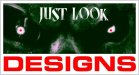
Usual Style
My usual style is a bit more 3d and modern looking with more effects usually and such. I linked a couple examples of work I have done that fall much closer to my design style.
The purpose of the "Just Look Designs" logo was to break away from all of the effects and such I usually incorporate and go for a more professional looking clean cut logo. As I noticed through research a lot of professional logos are flat and lack effects.
Just some more information for everyone. If you have additional feedback on the "Just Look Designs" logo please share! Also, if you want to critique my 2 examples I just posted feel free. Like I said before, I use critiquing to learn and grow, so all the comments / suggestions are greatly appreciated. Thanks again everyone for all the great feedback, I look forward to more in the future!!
Chris