• I want to thank all the members that have upgraded your accounts. I truly appreciate your support of the site monetarily. Supporting the site keeps this site up and running as a lot of work daily goes on behind the scenes. Click to Support Signs101 ...

Our new billboard.

Biker Scout

New Member
See, while your attempt at simplifying the billboard was a success... it's boring. It's what I call, "Safe Design" and I do that from time to time. Like when I can't think of something clever or new... I revert to "Safe Design" just to get the project done and out the door.

I like bold, brash attempts at getting a customer's attention. I want to see something I've not seen before. That's what makes my head turn. Heck, that's what drew me to Vegas in the first place. :cool:
 

Marlene

New Member
See, while your attempt at simplifying the billboard was a success... it's boring. It's what I call, "Safe Design" and I do that from time to time. Like when I can't think of something clever or new... I revert to "Safe Design" just to get the project done and out the door.

I like bold, brash attempts at getting a customer's attention. I want to see something I've not seen before.

when I drive thru my neighboring states that have billboards, I can not think of many that I actually took a look at. they all seem to blend in together after a while and not something bother to notice. I shop in upstate NY every weekend and when I tried to think of the billboards I drive by every week, I'm only able to remember one. it has a pack of angry snowmen on it and that got my attention as snowmen are usually cute, fun things and not an angry mob.

making it simple would have made for a nice sign but for something that is purely an ad to get attention, it needs to be soemthing that people will bother to look at.
 

Gino

Premium Subscriber
I don’t see anything wrong with his original layout. There are a few so-ever-small minor details that might work a little better if changed, but for the most part…. this layout works just right.

  • A picture is worth a thousand words and the OP has accomplished that.

  • In this country most people read left to right. So the natural flow of the eye is usually left to right. It’s odd for the eye to go backwards. You will find yourself looking into the next interesting image regardless if it’s another sign, a car or whatever….. your eye will not go backwards and do a good job. The OP has accomplished that… along with number #1 being included in it again.
  • The next thing is… we will read clock wise instead of counter-clockwise for the exact same reason. The OP has accomplished that, also.

  • The next part is strong colors vs. subdued colors to help indicate distance or what is to be read first, second, third and so on. That is the only area where I think he might’ve gone a little off. The strong color at the bottom, tends to make the sign a little bottom heavy with the dark green frame. Your eye tends to go down first which is counter-clockwise and defeating the other area I mentioned.

  • The last thing is… the phone number might be a little too close to the edge.
None of these things bother me as a viewer and they are certainly not impeding my ability to read this sign as fast or comprehend anything. I think the designer deserves a 9-1/2 paddle on this one for a job well done as a sign doing its job properly.
 

Billct2

Active Member
My first reaction is Awesome!, love the car breaking the border and the text is simple.
On second look my critique would be the flow of the message is disjointed and your name is kinda small, so here a quick rough idea of what I mean.
 

Attachments

  • 1.jpg
    1.jpg
    88.8 KB · Views: 116

Fanaticus

New Member
I think people do notice signs and billboards if they are in a visible location... even if they don't jump out at us, we see them.

If they are of any interest to us, we notice them.

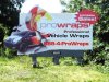
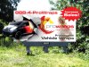
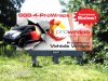
Somebody driving down the road who has no interest in a vehicle wrap will see this billboard once or twice, maybe more if they like to look around, but will take no real notice of it.

But, someone driving down the road who has been thinking about getting a vehicle wrap, or want to know more about them, will take more notice in this sign.

Just because a billboard can make me laugh or has something that "makes" me look at it doesn't mean I'm going to give 2 squats about the product being sold unless I have an interest in it to begin with.

I, personally, think that many billboards are out of control with attention grabbing gimmicks and are beginning to look spammy and are losing the feel of a quality product or service.

It's like when I'm walking through the mall, looking around at the different stores and some sales person from a kiosk jumps out in front of me with a sales pitch shoving his product in my face giving me every reason why I need it.

I understand the need for things to be of visual interest, or at least pleasing to the eye, but I don't think they need to scream at every person driving by day after day after day.....

Which is what the majority of traffic driving by your billboard will be, daily commuters who drive past that spot and past your billboard at least 5 times a week on their way to or from where ever they're going.

There's a billboard just outside of madison, wi that has a plane or something on it that is highlighted with a spot-light and makes it look like it's coming right at you. I actually swerved the first time I saw it because I thought I was about to be hit. To me, that's just not cool.
 

Craig Sjoquist

New Member
Let me clarify a bit.
I said your eye goes all over the place making everything important.
I'll explain how to correct, ...Billct2 has already done a great job, yes the car, Prowraps logo, increase sales panel are the 3 most needed and as Billct2 has done tied them well together.

Now this is where problems start the phone number (needed) professional vehicle wraps (not needed but wanted) in this case

A guild line for billboards is 7 things to look at within 3 areas, we have on original up to 13 in 5 areas.

Billct2 version we have up to 11 in still 5 areas just alot tighter and some bigger.

One problem with this layout is the colors red and black since we have a white background, they are both very strong on white, and red should be limited it's being used in 4 places.

Combining ..professional vehicle wraps with the phone number also the increase sales panel might be possible, that would reduced to 3 areas ...logo, car, phone.
Using more gray and limiting red & black will help pop out the car and logo arranging the phone with increased sales plus PVW copy so it all flows and balanced. look at it as 3 areas on white.

Hope that helps a bit.
 

GypsyGraphics

New Member
While it's a great idea, and I hope it will increase sales for you, I think it's backwards looking.
I would have put the copy on the left and the car on the right.

jill, like you, i'm of the mind that anything in motion looks better facing right.
becuase we read left to right it's what our brain and eyes like.

but...

i have to say... i think this is the one time my brain likes the car facing left.
i wasn't sure why at first, because it's not my inclination.

and then i figured it out...

if i was driving by that sign, and the car was facing right, it would be going the wrong way in traffic!
guess my brain thinks "safety before design" ...who'd have guess, not me!
 

CheapVehicleWrap

New Member
GG.. and if you were driving by mine, you would? Fess up... you'd be tempted to purchase a cheap vehicle wrap wouldn't ya? Wouldn't ya? Ya know you would, right?
 
Last edited:

ionsigns

New Member
If this were a college project the prof. might ask:

Why did you use the same typeface for all the text, headlines and subheads?

The left center graphic is all about action, 3-D and photorealism. Why are the rest of the text and logos as graphics FLAT and devoid of Photoshop effects?

Is flat white type on red starburst contrasty enough against the organic green background? [no. It is not].

[objective observations IMHO]
 

Malkin

New Member
If this were a college project the prof. might ask:

Why did you use the same typeface for all the text, headlines and subheads?
Same typeface is easier to read quickly, and there are at least 2 weights used.

The left center graphic is all about action, 3-D and photorealism. Why are the rest of the text and logos as graphics FLAT and devoid of Photoshop effects?
To help define a clear focal point and increase legibility for drivers.

Is flat white type on red starburst contrasty enough against the organic green background? [no. It is not].
I might have used the orange from the logo, with black text and a black outline on the starburst if it this had been suggested to me.

I agree with Gino, pretty good. You can always find something to tweak, hindsight being 20/20 and all...
 

GAC05

Quit buggin' me
I already said I like it the way it is but if there is too much focus with the car on the left - maybe add something on the right to pull the focus back to the center.
So..... what would pull guys eyes away from a car breaking out of a wall?
I dunno, but I am sure it will come to me in a bit...

wayne k
guam usa
 

Attachments

  • prowraps2.jpg
    prowraps2.jpg
    559.6 KB · Views: 84

ProWraps

New Member
you know what.. piss on both of you. i paid good money to my designer for that sh*t design i then paid more for to have made.

and where were you two? huh? HUH? you could have told me about girls on my board. but noooooooooooooo.

well. whatever.
 
Top