• I want to thank all the members that have upgraded your accounts. I truly appreciate your support of the site monetarily. Supporting the site keeps this site up and running as a lot of work daily goes on behind the scenes. Click to Support Signs101 ...

Post "YOUR" business logo

PMDesignz

New Member
Ok, I showed my logo and got my "arse" handed to me by others here on Signs 101.
I am a newb and not offended but pleased by the responses to help me out. :notworthy:
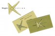
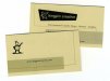
I'd like to see logos from "seasoned" veterans now.
So if you have been in the sign business for over 10 years I ask you to show your logo here.
I did a brief search and found nothing on this forum pertaining to showing off your own logo.
Keep it friendly and maybe with a brief description of your inspiration or reasoning behind your logo.
Let 'er rip! Should be fun. :thankyou:
 

Pat Whatley

New Member
Mine. I'm working on a grossly simplified variation right now but haven't nailed it down.

Yes, the name is SIGNS IN SECONDS. Why? Because 30 years ago we had the first (or one of the first) Gerber 4Bs in Alabama. The parent company, Ad-Arts, was started in 1949 and opened SIS for the purpose of handling all the quick sign work and to funnel all the bigger work to the other company. It was a great plan for a long, long time. Eventually SIS pretty much took over all the work. I worked in both shops for 15 years before buying the Signs in Seconds shop 7 years ago. The name is too established, and too recognizable locally to change at this point. Yes...I do hear "Can i really get a sign in a second?" at least once a day.

(I also just noticed that in the color version the chiseled "SIGNS" lettering had the colors reversed when I copied it over. I'm not fixing it for this...you get the idea.)
 

Attachments

  • SIS-GRAYSCALE.jpg
    SIS-GRAYSCALE.jpg
    21 KB · Views: 114
  • SIS-COLOR.jpg
    SIS-COLOR.jpg
    29.2 KB · Views: 112
  • SIS-B&W.jpg
    SIS-B&W.jpg
    17.7 KB · Views: 135

Fred Weiss

Merchant Member
Well Pat, we were the 3rd company in Palm Beach County, Florida to acquire a Gerber Signmaker 3 in 1983. Our name then was Allied Business Services because we not only sold signs but also sold to other businesses a new business license list we compiled weekly. We also had a few other services that never bore fruit. By the end of our first year we had found our best market was all the local sign companies that didn't want to spend $10K for a Signmaker 4B and we shifted gears to wholesale outsource. By 1986 we were totally wholesale, had 3 people working and had changed our name to Allied Compugraphics, Inc. In 2000 we changed our name to Allied Computer Graphics, Inc. These days we still sell signs, decals etc. as well as create and publish clip art, and, of course, run an online forum for professional sign makers.

These logos were designed right here in the Logo Design forum using the great input from a number of Signs 101ers. The newer logo uses the same blade, blade holder and roll of vinyl used in the original 1984 version.

Original Allied Logo.jpg

New Allied Logo New BW.jpg Allied-Logo-New-Color.jpg
 
Last edited:

Rick

Certified Enneadecagon Designer

Attachments

  • kingpin logo-site.jpg
    kingpin logo-site.jpg
    145 KB · Views: 118
  • site kingpoin design.jpg
    site kingpoin design.jpg
    59.6 KB · Views: 112
  • kingpin cards deluxe-2.jpg
    kingpin cards deluxe-2.jpg
    46.9 KB · Views: 107
  • kingpin concepts-2.jpg
    kingpin concepts-2.jpg
    350.4 KB · Views: 133
  • kingpin logo concepts-size.jpg
    kingpin logo concepts-size.jpg
    353.5 KB · Views: 113
  • kingpin design ideas.jpg
    kingpin design ideas.jpg
    479.8 KB · Views: 119
  • kingpin design ideas-2.jpg
    kingpin design ideas-2.jpg
    488.2 KB · Views: 116

Jillbeans

New Member
I still don't have a logo after 28 years.
This is what has been on my truck for about 4 years (well almost, I have CUSTOM SIGNS in one line)This is from my T-Shirt.
But I'm about to scrape that off. I'm going to handpaint something, I'm sick of vinyl.
My advice is to keep it concise yet punchy.
Love...Jill
 

Attachments

  • JillTRUCK.jpg
    JillTRUCK.jpg
    118.9 KB · Views: 107

Joe Diaz

New Member
Here is ours.
261.jpg
It can be oriented with the icon to the left of the copy for wider/shorter formats. The icon isn't always that large, depending on the application. Sometimes we might use only the icon, like on baseball hats for example. We have no specific company colors so this design will work with anything. I change the color of the paint slash to what ever color works with the given application. You can see what I mean if you check out our website diazsignart.com.

We have had probably 5 or 6 different logos over time. For years the imagery we used with our logo has been a paint brush. For several years we even used a design that had no imagery at all. I think the reason we did away with the paint brush was because we didn't just paint, and at that time we wanted people to not assume that is all we did. Now we want people to know we paint again. LOL The most recent logo we have been using for several years now, came about because we wanted some sort of mascot and we wanted to bring the brush back but have it much more subtle than before. This knight icon is recognizable here with the locals.
.
What does a knight have to do with sign making or design? Nothing. It's simply a mascot we chose to use. It is actually not just a knight. It is actually El Cid who was a fellow Diaz. The icon is based off of a famous statue of him in Burgos (Spain). http://en.wikipedia.org/wiki/File:Burgos-Estatua_del_Cid.jpg
 

John Butto

New Member
Here is ours.
View attachment 93902
It can be oriented with the icon to the left of the copy for wider/shorter formats. The icon isn't always that large, depending on the application. Sometimes we might use only the icon, like on baseball hats for example. We have no specific company colors so this design will work with anything. I change the color of the paint slash to what ever color works with the given application. You can see what I mean if you check out our website diazsignart.com.

We have had probably 5 or 6 different logos over time. For years the imagery we used with our logo has been a paint brush. For several years we even used a design that had no imagery at all. I think the reason we did away with the paint brush was because we didn't just paint, and at that time we wanted people to not assume that is all we did. Now we want people to know we paint again. LOL The most recent logo we have been using for several years now, came about because we wanted some sort of mascot and we wanted to bring the brush back but have it much more subtle than before. This knight icon is recognizable here with the locals.
.
What does a knight have to do with sign making or design? Nothing. It's simply a mascot we chose to use. It is actually not just a knight. It is actually El Cid who was a fellow Diaz. The icon is based off of a famous statue of him in Burgos (Spain). http://en.wikipedia.org/wiki/File:Burgos-Estatua_del_Cid.jpg

The statue ElCid in Spain has one leg on the ground meaning he was wounded in battle or died from wounds later on. Your ElCid relative in your logo shows he died in battle. Could be his cousin.
 

SignManiac

New Member
Mine may change in the near future. And here's the new version I'm considering.
 

Attachments

  • Skywatch Logo.jpg
    Skywatch Logo.jpg
    24.3 KB · Views: 119
  • New Skywatch Logo.jpg
    New Skywatch Logo.jpg
    37.1 KB · Views: 132

visual800

Active Member
Poor logo has been thru hell since I forst started and Im sure Ill change it again. Ive head onto this one for quite some times now, it has several variations
 

Attachments

  • van signs.jpg
    van signs.jpg
    47.5 KB · Views: 104

Billct2

Active Member
Here's ours as used on a set of mags I just made.
This was originally designed by former employee Mike Francher around 1991?
It has been modified but remains basicly the same.
 

Attachments

  • 1a.jpg
    1a.jpg
    67.3 KB · Views: 152

thinksigns

SnowFlake
Been using the first one for over 10 years. May be switching something along the lines of the 2nd group.
 

Attachments

  • Screen shot 2013-10-29 at 10.09.32 AM.png
    Screen shot 2013-10-29 at 10.09.32 AM.png
    18.6 KB · Views: 99
  • Screen shot 2013-10-29 at 10.11.35 AM.png
    Screen shot 2013-10-29 at 10.11.35 AM.png
    36.4 KB · Views: 89
Top