• I want to thank all the members that have upgraded your accounts. I truly appreciate your support of the site monetarily. Supporting the site keeps this site up and running as a lot of work daily goes on behind the scenes. Click to Support Signs101 ...

Real Estate Layouts

Locals Find!

New Member
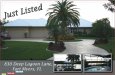
Doug, here is the newer modified version. I fixed the drop shadows. That took a bit to learn how those worked and what all the controls did.

Then I straightened out the main photo using the roof points. They are on the same level and distance so I figured it would be easier than trying to use the eaves as they are at different distances.

I added the accent line that was suggested separating the main photo from the background.

I didn't put the border around the Main photo as the Agent definitely wanted the photo full bleed for maximum exposure. This is a 2.1 million dollar listing and these are going to be handed out at the open house. So she wanted it to appear to be more like a photo as much as possible.

However, your other points did help the design. I am not fond of the fonts used on the copy myself. I ended up using Lucida Fax and I just was phoning it in when I grabbed that one. Some suggestions??

I would rather use fonts that I don't have to purchase as of right now this isn't a banner month around here. I usually get fonts from www.fontyukle.net
 

Locals Find!

New Member
Just realized I made a stupid mistake and never attached the files :doh:
 

Attachments

  • side1-postcard.jpg
    side1-postcard.jpg
    69.5 KB · Views: 104

Marco

New Member
wtheck is going on here. this is pathetic! just when i thought no one could beat my work. godleee?!@#
 

SignManiac

New Member
Addie, and I say this with nothing but the utmost of constructive criticism, you will need a lifetime of education in graphic design if you are to ever improve. Keep on, keeping on dude, you need a lot of help. Good luck!
 

Locals Find!

New Member
wtheck is going on here. this is pathetic! just when i thought no one could beat my work. godleee?!@#

Addie, and I say this with nothing but the utmost of constructive criticism, you will need a lifetime of education in graphic design if you are to ever improve. Keep on, keeping on dude, you need a lot of help. Good luck!

Ok, you two. Tell me what you would have done. Here are the points that the client asked for. #1. Photo large bleed to edge #2. Show 2 photos of the property on the front of postcard. I had 5 to choose from 3 of those interior shots.
#3. Must say just listed and Address somewhere.

So, with those factors in mind to make the client Happy what would you have done differently. I am honestly asking. I can't improve if I don't know what to improve upon. Doug was nice enough to point out a few items that after following his advice seemed glaringly obvious looking back on the original of this design.
 

SignManiac

New Member
Well for beginners, I don't let the client dictate to me what "they" want. I the "professional" tell them what they need. I do this with their best interest in mind. I can do this because I have many years of study and application in this field. I don't like typing out long descriptive explanations, tend to make my point with graphic examples as I find it easier and faster. I can't do that on an iPad, so when I'm back in my office on Monday ill show you by example.
 

Locals Find!

New Member
I asked your father, who art in heaven...

My Father isn't in Heaven. Thank Goodness. I know your joking but, your not far off the mark. I almost lost him last year about this time. Massive 2nd Heart Attack and a quad bypass.

The originals I was given had no clouds that I could tell. Would you mind sharing with me how you got them in there?
 

iSign

New Member
My Father isn't in Heaven. Thank Goodness.

not that father!!!

Our Father who art in heaven,
Hallowed be thy name.
Thy kingdom come.
Thy will be done in earth,
as it is in heaven.
Give us this day our daily bread.
And forgive us our trespasses,
as we forgive those
who trespass against us.
And lead us not into temptation,
but deliver us from evil:
For thine is the kingdom,
and the power, and the glory,
forever and ever.
Amen.
 

S'N'S

New Member
Do like doug presumably did and take your pictures into Photoshop (or similar) and lighten them up, those picture look all gloomy / dull and you need to the pictures to make the house and interior warm and inviting.
 

S'N'S

New Member
For you Doug..........JJ Jones of Jones & Co Realty
 

Attachments

  • jjjones.jpeg
    jjjones.jpeg
    9.7 KB · Views: 99

Locals Find!

New Member
Well, I am going to have to learn some new techniques. Will try some of them next time. Have a deadline on this and only one day left in the weekend before I have to submit this to print.

Have to just run it with the slight changes I was able to accomplish. Thanks for the Help Doug.
 

iSign

New Member
Jason,
I challenge you to send Fred $50 to join the premium members in supporting this site (Sorry Gino) you do that, & I'll bet that will be one of the best things you can do to increase skills in this business... you will have even more access to helpful information... and then you need to practice everything you see that you want to learn...

I'm not that good of a designer, never studied it, and only ever did sign design work so i have little skill in designing for print... but even though i don't ask anyone here for a lot of hand holding, i try things i want to learn and then I post them... that is what I think you should do.. and i will type out more suggestions if i see you join, practice & post your work!
 

TheSellOut

New Member
I tell you what Addio...you join premium, and for what it's worth...I'll let bygones be just that, and help you out anyway I can!
 
Top