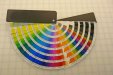
It is nice to have and use but for the life of me I cant understand why they don't just use Pantone colors like the rest of the graphics world.
The reason is simple: VersaWorks is a free, entry-level RIP, and as such, Roland didn't pay the licensing fee to include a PMS Library in it.
Simple as that.
It's certainly not that the printer would cost any more to include it. You can buy Onyx or Caldera or any number of other RIP's that do have a PMS Library, drive your printer with it, and then the issue of how close you can get to ideal becomes simply a matter of how good your profiles are.
In theory it should! This is what I don't understand about this whole subject. In my experience, it is all about how you convert the PMS colors to CMYK in its original software such as Illustrator or Photoshop you will get much better results.
Actually, no. Converting to CMYK in an application is the last thing you want to do. The proper CMYK mix for your printer on any particular media at any particular resolution is unique to that situation, and unless you're using that particular printer-media-resolution profile as your working CMYK space in your application when you make the conversion, you're going to make it wrong.
For any interested, here's a series of blog posts on pretty much this very subject:
Matching PMS Colors in Large And Grand Format Digital Printing