-
I want to thank all the members that have upgraded your accounts. I truly appreciate your support of the site monetarily. Supporting the site keeps this site up and running as a lot of work daily goes on behind the scenes. Click to Support Signs101 ...
You are using an out of date browser. It may not display this or other websites correctly.
You should upgrade or use an alternative browser.
You should upgrade or use an alternative browser.
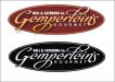
Rough logo ideas for catering company.
- Thread starter Jillbeans
- Start date
RJ California
New Member
Jillbeans -- I lost track of which one I liked the best but I did want to say that most all of your designs looked good. #2 in post 13 is great.
Gino -- The design your customer loves is definitely crapola but I am impressed with what you were able to get for it. Especially if $600 was just a deposit!
Gino -- The design your customer loves is definitely crapola but I am impressed with what you were able to get for it. Especially if $600 was just a deposit!
Gino
Premium Subscriber
Jillbeans -- I lost track of which one I liked the best but I did want to say that most all of your designs looked good. #2 in post 13 is great.
Gino -- The design your customer loves is definitely crapola but I am impressed with what you were able to get for it. Especially if $600 was just a deposit!
Don't even call it a design.... it's more like an abortion on glass.
As for the deposit, he only owes me about $90 yet. He only had $600 on him, so I felt.... ooh la-la.... sweet sweet green cash. So, I took it before he could change his mind and shushed him out da door.
SignManiac
New Member
Gotta love it, you can't get it....if you don't ask for it!
Good sell Gino!
Good sell Gino!
Happyprinter
New Member
Jill, I'm kinda partial to the original #2 if the name was a little easier to read.

Jillbeans
New Member
I like Tiki's take of rearranging the elements...I am gonna try something like that.
I think DELI & CATERING CO. should be more important than the odd name.
He wants to get rid of the Porky's name because it puts some brides off from using him as a caterer, because they think all he does is pulled pork.
Thanks.
I think DELI & CATERING CO. should be more important than the odd name.
He wants to get rid of the Porky's name because it puts some brides off from using him as a caterer, because they think all he does is pulled pork.
Thanks.
thinksigns
SnowFlake
I know I'm late to the game, but something has been bugging me about the name. I'm sure it's too late to change anything, but I would drop "Gourmet". Gourmet places I know of don't have it in their name. Also, if he wants to focus on the catering, I would suggest putting "Catering & Deli Co."
SignManiac
New Member
Tiki is on a roll lately
JKADesigns
New Member
Gemper Gourmet.... any of the ideas look good but I would def. incorporate a large G into the design in reverse somewhere like the 2nd one. That way he can just use the large G anywhere he wants to and it'll be reflected in the logo... think the pie lids, anything like that, and everybody that sees it will know that's GG's logo. Think Apple or Nike... this has the potential to go a long ways if it is designed right.
Service Sign Co
New Member

Marlene
New Member
#2 in post 13 was about the only one that I saw that worked OK with the GG as it was there but not in your face there. love what Tiki did. your original #1 was nice as it looks high end. you would expect a good meal from a company with a logo like that and not some hairy with a pig in an old 50 gallon barrow showing up at your wedding asking "who wants a piece of the head or would you rather have a foot"

")