-
I want to thank all the members that have upgraded your accounts. I truly appreciate your support of the site monetarily. Supporting the site keeps this site up and running as a lot of work daily goes on behind the scenes. Click to Support Signs101 ...
You are using an out of date browser. It may not display this or other websites correctly.
You should upgrade or use an alternative browser.
You should upgrade or use an alternative browser.
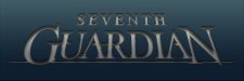
Sci Fi Logo
- Thread starter Joe Diaz
- Start date


Craig Sjoquist
New Member
Joe ..Seeing the thumbnail .. Thought nice & yes a sci-fi look sorta..Then I open it up BAM yes very sci-fi & really likes the font changes & shadows really makes it ...Well done.
Marlene
New Member
I'm not a fan of the big Cap at the start and end of a word. the big "G" is Ok but there's something off about the big "N" as my eyes go right to it and not sure that is your intent. I do love the raggedy shadow around the letters. what kind of sci-fi is this? space or something else? the colors just seem too "nice" for sci-fi unless it is space or future robots of some sort. to be honest, I would not have know sci-fi if you hadn't told us. I think this is the one and only time I didn't fall in love with something you've designed
nashvillesigns
Making America great, one sign at a time.
guardian
not bad. the frosting around the edges needs another element built into it..
it looks like you hurried that part up somewhat.
-mosher
not bad. the frosting around the edges needs another element built into it..
it looks like you hurried that part up somewhat.
-mosher
Joe Diaz
New Member
The larger letters at beginning and end... I've heard it called "Bookends". The thought is that it creates symmetrical balance. There will be imagery that accompanies this text. (still working on that part). It will be centered above this. If only the "G" were large the entire thing will feel off balance. That being said you aren't the only one that doesn't like "bookends". I've heard others complain about them too. I personally like them. SO it's definitely a subjective thing.
The style will make more sense when the rest of the theme for the game is revealed.
The style will make more sense when the rest of the theme for the game is revealed.
Marlene
New Member
The style will make more sense when the rest of the theme for the game is revealed.
I'm sure it will as you always pull it al together. agree some like the bookends, some don't. I just never have liked them, nothing personal against your design,just a personal dislike of mine. I'd rather see a bottom arc or some other reason why the end letters are larger. at least yours aren't crazy large. have you seen the ad for Van Ladder? they went totally nuts with the big letter bookends
Attachments

Gino
Premium Subscriber
Personally, I like 'Bookends'..... or the 'Aches' with things tucked up underneath there.
I believe the problem with the 'BookEnds' as you call it is..... so much of today's work is done by computer and the computer software, for the most part, doesn't give the proper stroke for letters if they are exaggerated too much, such as in your example, Marlene. When we used to do this stuff by eye to hand coordination, the stroke was automatically made to fit and it didn't upset the viewer. When using this style, we will go in and either thin the larger letters down a little and fatten the others up, so it's not so noticeable or just add to the smaller letters, cause the big one is already too big. A lot depends on the font chosen for this use, too.
I believe the problem with the 'BookEnds' as you call it is..... so much of today's work is done by computer and the computer software, for the most part, doesn't give the proper stroke for letters if they are exaggerated too much, such as in your example, Marlene. When we used to do this stuff by eye to hand coordination, the stroke was automatically made to fit and it didn't upset the viewer. When using this style, we will go in and either thin the larger letters down a little and fatten the others up, so it's not so noticeable or just add to the smaller letters, cause the big one is already too big. A lot depends on the font chosen for this use, too.
Marlene
New Member
Marlene. When we used to do this stuff by eye to hand coordination, the stroke was automatically made to fit and it didn't upset the viewer. When using this style, we will go in and either thin the larger letters down a little and fatten the others up, so it's not so noticeable or just add to the smaller letters, cause the big one is already too big. A lot depends on the font chosen for this use, too.
I do know how to do it correctly, I just personally have never liked it. that's just me and doesn't make it right or wrong. in this case, I see the letter "N" first before anything else as my eye is just drawn to it as it stands out more than the rest of the letters. I think it needs to be done sized some so it looks more like the size of the "G". it may be the exact same zie as the "G" but to me, it looks bigger and screams for attention. because I don't like the bookend style, I am being careful not to let that cloud how I am seeing this but it looks off to me
Joe Diaz
New Member
Believe it or not the G is actually larger than the N. I was always conscious of the fact that with most type styles round letters should be taller than a letter like N for example. In this case, not only is the G taller, but it's a wider letter too. To me, if it were smaller than it is now, it wouldn't look right. I actually did spend a good deal of time trying to get the balance right.
Marlene
New Member
Believe it or not the G is actually larger than the N. I was always conscious of the fact that with most type styles round letters should be taller than a letter like N for example. In this case, not only is the G taller, but it's a wider letter too. To me, if it were smaller than it is now, it wouldn't look right. I actually did spend a good deal of time trying to get the balance right.
I think it might be the raggedy shadow as it drops down on the "N" giving it more visual space than the "G". not really nit-picking, just seeing something and I may be the only one who does. it just looks like if you ground up the "G" and the "N" the pile of dust that makes up the "N" would be bigger than the "G"'s pile as the "N" has more going on so it looks bigger
Locals Find!
New Member
Liked the thumbnail till I opened it and it appears something threw up all over behind the letters. Absolutely hate it and would never watch, read, or have anything to do with something that had that as a logo. I am a huge sci-fi fan also and well that is just horrid.
I would have expected better. Maybe I am not as artsy as the folk on here complimenting it, but I am a consumer and well that just turns me off of whatever product it's supposed to sell.
I would have expected better. Maybe I am not as artsy as the folk on here complimenting it, but I am a consumer and well that just turns me off of whatever product it's supposed to sell.
Smacka
New Member
Wow. So much negativity! I have read the replies to your post and have found one thing to be true. None of it matters! Do you sell a lot of logos? I bet you do. Do you create things that most others can't? Big fat yes to that one too. So I doubt that negative input from anyone but your customer carries much weight. If everyone followed a "by the book" set of rules when creating logos we would all have logos that looked the same. So take the negative comments with a grain of salt and keep designing what works best for you.

Marlene
New Member
Liked the thumbnail till I opened it and it appears something threw up all over behind the letters. Absolutely hate it and would never watch, read, or have anything to do with something that had that as a logo. I am a huge sci-fi fan also and well that is just horrid.
I would have expected better. Maybe I am not as artsy as the folk on here complimenting it, but I am a consumer and well that just turns me off of whatever product it's supposed to sell.
really? and just what would you suggest to do? it is far from horrid. Joe's work is outstanding and always is amazing. what I brought up was something to do with wth balance. I also didn't see sci-fi but Joe has stated that this is just part of what the total look will be and I trust in his abilities and know that once he has all the parts together, it great as always. so you really wouldn't watch, read or have anything to do with something that had that as a logo, really?
Locals Find!
New Member
really? and just what would you suggest to do? it is far from horrid. Joe's work is outstanding and always is amazing. what I brought up was something to do with wth balance. I also didn't see sci-fi but Joe has stated that this is just part of what the total look will be and I trust in his abilities and know that once he has all the parts together, it great as always. so you really wouldn't watch, read or have anything to do with something that had that as a logo, really?
Yes, I usually am in awe of Joe's work. I sit mesmerized 99% of the time at his obvious skill. This one just causes a negative reaction with me. I don't know how to explain it. I can't offer advice on how to fix it. I am not skilled or talented enough to offer that up.
I am sorry if I hurt your feelings Joe. I just wanted to be honest with you about my feelings that came from seeing it. Not trying to just be dismissive.
Not everyone is going to please everyone. Hopefully, for you I will be a small minority in this case.
Joe Diaz
New Member
Not in the slightest. No worries. Dealing with the fact that you cannot please everyone in this businesses is kind of part of the job description. If I got depressed every time someone didn't like something I create, I would be a mess.I am sorry if I hurt your feelings Joe.