I want to thank all the members that have upgraded your accounts. I truly appreciate your support of the site monetarily. Supporting the site keeps this site up and running as a lot of work daily goes on behind the scenes.
Click to Support Signs101 ...
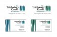
i like the top 2. I also like the font choices as I elike to see a little cursive thrown into logos instead of everything being so damn boring and monotanous. I dig it! I wouldnt change a thing
Oops. I didn't even notice your second image you posted. I'm on my iPod this morning. Those look even better than the first. Great font choices this time but I'm still diggin the round hair icon a little more.
Thanks for all the input guys. I've made some changes to the fonts, colors, and added their tag line... This seems to be what im leaning towards now, but idk... Some of you guys like the original too. I have an update of that version too i will upload.
I like the colors that are in the shades of green as it gives the feeling of growth/growing/fresh and new. it hints at new hair without going for the in your face kind of colors and graphics. I like it. not so much with the shades of blue.
I like the logomark a lot but not the fonts on any of your examples. I also like the blue greens in play, feels very medical which is a good thing. You want to calm and attract patients not trigger their tricho. Are you pretty new to typography? All of your examples just feel "default". I'd suggest you look through Hoefler & Frere-Jones, their fonts tend to read calm friendly American authority and work really well for branding and cross-channel marketing medias including signage. I don't like the lower case on the business name but I'm guessing that's out of your hands.
Yea, the type is somewhat default... I just thought that for this type of logo a basic font was needed to give it a professional medical feel... I definitely didn't wanna get too crazy with the fonts. Is there a particular font you have in mind that would work better? Can you post some examples??
This site uses cookies to help personalise content, tailor your experience and to keep you logged in if you register.
By continuing to use this site, you are consenting to our use of cookies.