-
I want to thank all the members that have upgraded your accounts. I truly appreciate your support of the site monetarily. Supporting the site keeps this site up and running as a lot of work daily goes on behind the scenes. Click to Support Signs101 ...
You are using an out of date browser. It may not display this or other websites correctly.
You should upgrade or use an alternative browser.
You should upgrade or use an alternative browser.
Ugly signs thread?
- Thread starter Colin
- Start date
Marlene
New Member
there should be an ugly sign thread as we all have to look at these things everyday. I'm not talking about the homemade things but the stuff that was made by sign shops that just are awful. one just went up on a new Chiropractor's office and when I saw it, I had to wonder just what the maker was thinking. it's a long narrow sign and the letters have no top or bottom margins at all so they could get a "big" as possible letter on the sign. they used a wimpy, thin stroked letter so their big letter attempt failed as it is hardly readable. what were they thinking?
Marlene
New Member
In some ways this is probably wrong, ridiculing some anonymous sign company.
But in other ways, maybe people will learn from their mistakes.
that's what I thought too but the value of learning what other's see when they look at a sign isn't a bad thing.
Colin
New Member


Marlene
New Member
hey, that looks like the same wimpy font used on the sign I mentioned!
well, here's a good example of an idea gone bad. the thougth to put the name and all the info on a wave because the name was wave might have seemed like a good idea but just didn't work in real life with the fonts choosen and the general layout.
well, here's a good example of an idea gone bad. the thougth to put the name and all the info on a wave because the name was wave might have seemed like a good idea but just didn't work in real life with the fonts choosen and the general layout.

Colin
New Member
I didn't have a camera with me, but I saw a tire store that made signs with a sharpie and neon posterboard. The funny part was, the TIRE store was having a BLOWOUT Sale.
Spare me.
J Hill Designs
New Member
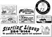
Does this count ??
omg gino thats awesome
JR's
New Member
Good one Gino,
I think I could dominate this thread. I have some ugly signs out there. And I think the uglyer the sign the longer it lasts. I've got a truck out there that I hand-lettered in 1989 the letters are way too thin and I think there's a misspelled word on it.
They don't drive the truck anymore it's just pocked in the lot. Every time I go by it, I say to myself please take that to the dump.
JR")
I think I could dominate this thread. I have some ugly signs out there. And I think the uglyer the sign the longer it lasts. I've got a truck out there that I hand-lettered in 1989 the letters are way too thin and I think there's a misspelled word on it.
They don't drive the truck anymore it's just pocked in the lot. Every time I go by it, I say to myself please take that to the dump.
JR
cptcorn
adad
I think rather than picking out random photos of bad signs you see...
How about we post up the crappy signs we've made. Everyone has those customers that want it their way. You take their money and they go on their way. I would assume 75% of the crummy signs you see are the result of this very behavior. I know I have a handful of work out there that I refuse to show people.
So lets spare the BS of mocking other people's work when we can show the community our own garbage, and mock ourselves.
J Hill Designs
New Member
JR's
New Member

cptcorn
adad
good idea cpt, but I would assume that we didn't take pictures...
Point taken, carry on!

JR's
New Member
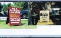
Here is some ugly signs. Combination of hand-painted and paint and frisket. I think it was made in 88 or 89. I just love stretching letters. That old saying just because you can doesn't mean you should.
Although I do like my split blended shaded shadow on the word sign. And I have a lot more where they came from.
JR
Although I do like my split blended shaded shadow on the word sign. And I have a lot more where they came from.
JR
Attachments
Jillbeans
New Member
Here are some of my layouts from when I first got a computer.
Most of these are from about 1998, but one is newer, about 2002.
Puke-a-riffic.
Some of these places are out of business (the ones with the phone numbers) and were heavily dictated by the client.
The others are 100% me thinking I was such hot sh!t.

I was more like an idiot with some clipart and a few fonts.
It's more fun to rip on myself than someone else, really.
I changed them to black and white but left the Algerian, Brush Script, and distortions alone.
Most of these are from about 1998, but one is newer, about 2002.
Puke-a-riffic.
Some of these places are out of business (the ones with the phone numbers) and were heavily dictated by the client.
The others are 100% me thinking I was such hot sh!t.
I was more like an idiot with some clipart and a few fonts.
It's more fun to rip on myself than someone else, really.
I changed them to black and white but left the Algerian, Brush Script, and distortions alone.