Edvin
New Member
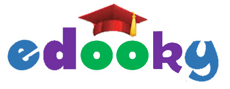
Hi, I'm about to embark upon an entrepreneurial venture in k-12 learning (tutoring) industry and would be grateful for your collective design feedback for my logo.
I would like to strive to make my Wordmark effective on all marketing assets, which includes storefront signage, website, letter heads, embroidered shirts, etc.
I'm not a designer; but, after looking at gender preferred color for my demographics and signage pallet, I came up with the following colors: blue, green, purple, red, black.
What are your thoughts regarding my attach design work?

(note: I copy/pasted graduation cap for this draft)
Thanks in advance.
Edvin
I would like to strive to make my Wordmark effective on all marketing assets, which includes storefront signage, website, letter heads, embroidered shirts, etc.
I'm not a designer; but, after looking at gender preferred color for my demographics and signage pallet, I came up with the following colors: blue, green, purple, red, black.
What are your thoughts regarding my attach design work?
(note: I copy/pasted graduation cap for this draft)
- Do you see any red flags?
- Do you think this will be effective & visible in the following areas:
- Storefront signage
- I'm thinking frontlite letter signage; do you dis/agree?
- Drive-by bill-boards
- Embroiled shirts
- Business card & letter heads
- Website
- etc
- What alternative design elements should I experiment or consider?
- Do you have any other thoughts/concerns newbie tips?
Thanks in advance.
Edvin

