-
I want to thank all the members that have upgraded your accounts. I truly appreciate your support of the site monetarily. Supporting the site keeps this site up and running as a lot of work daily goes on behind the scenes. Click to Support Signs101 ...
You are using an out of date browser. It may not display this or other websites correctly.
You should upgrade or use an alternative browser.
You should upgrade or use an alternative browser.
Would like some feedback - wrap for my shop van...
- Thread starter firesignz
- Start date
firesignz
Celebrating 10 Years in business
Not taling anybody's comments the wrong way. Everyone has their opinion and I like to hear them all to help me form my own decision. I guess I can safely letter my truck without fear of having made a mistake by NOT doing a wrap. Saves me a ton of $$$ and allows me to change it if I don't like the outcome. ")
Flame
New Member
First off, does not look professional at all, much less a representation of a DESIGN shop.
First off, the background is a CLOSEUP of fire? Lose it and do more like what was posted here... a more realistic shot of fire.
Then the tagline... um, you sure you want to be known as a cheapo shop? Just checking...
Lose ALLLLLL of those fonts. Every single one, and start over. And your logo looks like a 8th grader did it on GIMP. That was not... was not... done by a logo designer. Sorry.
Actually... to be honest, I'd work on branding your company before the wrap. Start with a logo, then make sure your cards, signs, clothes, vehicles etc. all tie in well together... then just keep it rolling.
So, in essence, start over and let's see what happens!
artsnletters
New Member
Not taling anybody's comments the wrong way. Everyone has their opinion and I like to hear them all to help me form my own decision. I guess I can safely letter my truck without fear of having made a mistake by NOT doing a wrap. Saves me a ton of $$$ and allows me to change it if I don't like the outcome.
Re-work your logo design BEFORE you put as much as a scrap of vinyl on your new van. You will thank us later. Don't hurry this process...
EVERYTHING posted from #13 down is right....that logo is just AWFUL...it isn't even really a "logo", just an ugly typeface with inlines & outlines added that just render it unusable to read from a distance. Start from square one as Flame suggested. Seriously...get the Mike Stevens' book Mastering Layout and study Dan Antonelli's work. Get a solid grip on designing your logo / image package. Luggnuts van to me looks pretty good as an example. Use high contrast elements and decent fonts to work on your wrap. Don't rush things, don't feel you gotta tackle it this weekend. Doing digitally printed components on your van will only work if worked into a cohesive unified design, and as far as that goes, i don't think you are there yet, so keep working on it. Oh yeah...FIRE YOUR "DESIGNER".
Tim
Joe Diaz
New Member
I didn't read the whole thread, but I looked at your name and a few ideas came to mind. Thought I would share:
I think a nice corporate look would go great with your name. Like others said work on a solid logo first.
I personally like simple and clean wrap designs over textured fills and Photoshop effects. I normally like the true-flame look, especially if you are going with some "digitalflames.net" . But that seems too obvious for your brand. I don't know maybe I'm too used to seeing everyone use flame graphics on everything they get their hands on.

I think a nice corporate look would go great with your name. Like others said work on a solid logo first.
I personally like simple and clean wrap designs over textured fills and Photoshop effects. I normally like the true-flame look, especially if you are going with some "digitalflames.net"
. But that seems too obvious for your brand. I don't know maybe I'm too used to seeing everyone use flame graphics on everything they get their hands on.artsnletters
New Member
Thats the ticket!!! Nice & clean! Pay Joe for the design and use it!!!
Tim
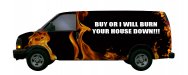
This marketing campaign may be a bit much...lol. Joke of course! Not making fun of your company or name. Just very tired and could not resist a quick flame design before I call it a night.
Did not have time to mess around with a logo. So I had some fun with the pitch...lol. I took out the flaming skull head, it was a bit too much...lol.
Good luck with your project. I would suggest to redesign your logo, just like any design the more you redesign it, the better it gets! I have about 8 versions of my logo and still working on improving it. By the way my logo still sucks...lol.
Also for you designers out there... The new CS5 Warp is going to be perfect for fixing assets like flames within your design. No more of the ol' man I wish that was just a little bit more to the left...lol.
Attachments
I think it's perfect.
"I really thought that my shop truck should reflect my design abilities"
Obviously you, your designer, and the "impressed" customers belong togaether.
You have a market that you want to be in and seem to be there.
If this is not the case, START AGAIN, and look at options. Joe would have to admit that his was quick and by far nowhere near his best. That's what GOOD designers do... they have an ability to whip something out as a concept and improve on that.
Adopt Joes design methods and approach - not his design.
Cheers
Jillbeans
New Member
Do hire Joe, and while he's doing the layout start learning how you can do this too (if you can) there is no shame in hiring a designer if design is not your forté.
I am glad you are realizing that your existing "logo" isn't really doing a darn thing to make your company visible or desirable to potential clients.
It needs a decent burial, preferably by fire.
I am glad you are realizing that your existing "logo" isn't really doing a darn thing to make your company visible or desirable to potential clients.
It needs a decent burial, preferably by fire.

Craig Sjoquist
New Member
ok after 35 years of changing my logo over and over again simple works the best, conservative image seems to sell better, bold and clean looking name, with a easy reading flow in layout, both Jillbeans & Joe Diaz & luggnut layouts do this except the to much flames part lol
Anyway your ideas are great, save for another job, go back to the drawing board and re-create a outstanding layout like we you know you can.
Anyway your ideas are great, save for another job, go back to the drawing board and re-create a outstanding layout like we you know you can.
Marlene
New Member
great job Joe! I didn't think there was much hope to make the concept look anything but cheap but you put it together so that it looks great and the message the customer will see is quality for less instead of cheap cheap cheap. great work as always!
back to the oringinal design. when you use the outline function, you need to tweek it so you don't get pointy things hanging down and weird inner pieces of stuff. also, having part look like they are in a box and other with some shapes doesn't work when using outlines and shadows. you have to move your letters apart, try different settings in outline such as points vs rounded etc. if nothing else works to make it look right, go in and re-work some of it in edit mode.
back to the oringinal design. when you use the outline function, you need to tweek it so you don't get pointy things hanging down and weird inner pieces of stuff. also, having part look like they are in a box and other with some shapes doesn't work when using outlines and shadows. you have to move your letters apart, try different settings in outline such as points vs rounded etc. if nothing else works to make it look right, go in and re-work some of it in edit mode.
Joe Diaz
New Member
Thanks guys. I'm just trying to help get the creative juices flowing.
:ROFLMAO:
To be honest, not that long. I wasn't watching the clock though. ( I always watch the clock )
)
Normally I don't just do layouts for people online unless an idea just hits me in the head. And it is quicker and easier to just draw something up than to try to explain it to someone. In which case you risk the idea not coming across. They say a picture is worth a thousand words you know. The only reason this particular layout went fast for me, was because I could visualize it before I even started drawing. That doesn't always happen.
You mean I can get paid to do this stuff???Thats the ticket!!! Nice & clean! Pay Joe for the design and use it!!!
Tim
:ROFLMAO:What a beauty, Joe! How long did it take you to come up with that?
To be honest, not that long. I wasn't watching the clock though. ( I always watch the clock
) Normally I don't just do layouts for people online unless an idea just hits me in the head. And it is quicker and easier to just draw something up than to try to explain it to someone. In which case you risk the idea not coming across. They say a picture is worth a thousand words you know. The only reason this particular layout went fast for me, was because I could visualize it before I even started drawing. That doesn't always happen.
Ballparks reminds me of this....
LOL....wow. I have seen a lot of funny pics like that one, but never seen that one..lol.
I will buy an extra box of cookies next time.
J Hill Designs
New Member
Joe DiazVital Designs
Vital Designs
I didn't read the whole thread, but I looked at your name and a few ideas came to mind. Thought I would share:
I think a nice corporate look would go great with your name. Like others said work on a solid logo first.
I personally like simple and clean wrap designs over textured fills and Photoshop effects. I normally like the true-flame look, especially if you are going with some "digitalflames.net"
View attachment 50519
I like that!
Dan Antonelli
New Member
Way to rock that one Joe!