natedawg9640
New Member
i like it! just please, tell me that second pic isn't the panel artwork (vertical panels)...
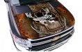
lol. no.. just crops i ripped of a larger version of the visual.
i think this car will get most of its exposure at expos and the grocery store.

")