-
I want to thank all the members that have upgraded your accounts. I truly appreciate your support of the site monetarily. Supporting the site keeps this site up and running as a lot of work daily goes on behind the scenes. Click to Support Signs101 ...
You are using an out of date browser. It may not display this or other websites correctly.
You should upgrade or use an alternative browser.
You should upgrade or use an alternative browser.
wrap design
- Thread starter Hog Wild graphics
- Start date
J Hill Designs
New Member
to me the front logo looks like a very screwy/hipster way of saying falcon...
Craig Sjoquist
New Member
3 things I see right off the bat.
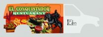
Agrees get the name off door ..1 ..give name more space shorten it up along with restaurant.
Smaller horse might help also showing more food that is the best part in this wrap ...2
3rd... the color of name is faded orange on orange ..? make it total white your looking for contrast the green outline does not help much but understands it is part.
When doing a full picture in full strong color on the background .. the lettering should be as plain as possible or at least readable and full contrast. why the picture is the main element so make it that way or reduce the strength of color on picture but not on this cause you want the food to show. ...hope I explained this right.
rjssigns
Active Member
If going on a white van take background colors and fade into doors, while eliminating door logo. Re-scale the horse and rider to fit at the end of the verbage. I would have the horses head slightly above the verbage.
The food is your hook, push it. Name and especially the logo become secondary. Other than a couple tweaks I really like the look.
The food is your hook, push it. Name and especially the logo become secondary. Other than a couple tweaks I really like the look.
Hog Wild graphics
New Member
Made a few changes. Customer was wanting to do partial wrap now they decided we are doing the whole thing. After I get this finalized I will design the rest to blind in.
Thanks for all your opinions. I really like the horse logo smaller since I think it is a boring logo.
HWG
Thanks for all your opinions. I really like the horse logo smaller since I think it is a boring logo.
HWG
Attachments
slipperyfrog
New Member
Papyrus? really?
Hog Wild graphics
New Member
The horse and the door logo is on all their tshirts. They have been using it for years.
slipperyfrog
New Member
Aw that sucks. I guess you can't play around with it then.
tsgstl
New Member
Papyrus? really?
Is there some underground anti Papyrus font movement that I was unaware of? I just don't want any giggles on future projects.
Is there any way to make the background image more like the horse? You have a lot of different styles going on. Maybe even blur it and have the edge of the food more visible.
I have no idea what I am talking about but it is fun thinking of what I would do.
JR's
New Member
Fade the graphics to white, so it looks like it blends into the front of the van.
The logo and the verbiage of the front door, I would change the color to a brownish color or orange to match the back of the van.
The wording on top of the photo can you make a blurred background just where the lettering is this way it's not that confusing.
Other than that looking pretty cool.
JR
The logo and the verbiage of the front door, I would change the color to a brownish color or orange to match the back of the van.
The wording on top of the photo can you make a blurred background just where the lettering is this way it's not that confusing.
Other than that looking pretty cool.
JR
JoshLoring
New Member
tsgstl said:Is there some underground anti Papyrus font movement that I was unaware of? I just don't want any giggles on future projects.
Ya. It's called every spa and salon in the US.
Or... You could just call it the Avatar font. Once used by a major movie.. Never use again..
signcrafters london
New Member
If I were you, I'd spend a few hours surfing the portfolio and vehicle wrap forums. Maybe you can get some inspiration from the wraps done by Dan Antonelli, Colorado, ProWraps, JoshLoring and other great designers I'm no doubt leaving out.
JoshLoring
New Member
My biggest recommendation is to start blank.
Then.. Spend an hour or 2 using the pen tool to meticulously cut the food from the background so that whatever you choose to place back there.. Looks seamless and not layer masked or eraser tooled in. This always looks tacky.
After that. Use the food to make people's mouth water. then focus on the rest.
*A van sized delicious cookie and crumbs with a 2 foot logo will be more effective then a van sized logo and a 2 foot cookie
kylebrk
New Member
signcrafters london said:If I were you, I'd spend a few hours surfing the portfolio and vehicle wrap forums. Maybe you can get some inspiration from the wraps done by Dan Antonelli, Colorado, ProWraps, JoshLoring and other great designers I'm no doubt leaving out.
+1
You don't have to be original!
Craig Sjoquist
New Member
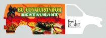
I like it... you positioned the horse and copy well, also like the fade on name now it helps restaurant pop and name harmonize, to me it would not hurt to kern them more and allow more space helping the food standout more.
Yes change door logo to a color closer to the wrap color, this to will help the food standout.
Yes change door logo to a color closer to the wrap color, this to will help the food standout.