-
I want to thank all the members that have upgraded your accounts. I truly appreciate your support of the site monetarily. Supporting the site keeps this site up and running as a lot of work daily goes on behind the scenes. Click to Support Signs101 ...
You are using an out of date browser. It may not display this or other websites correctly.
You should upgrade or use an alternative browser.
You should upgrade or use an alternative browser.
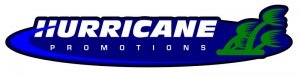
Logo we just finalized
- Thread starter qmr55
- Start date
")
Pat Whatley
New Member
Lose the broccoli. I'd go with the palm trees, just draw your own. Stylized trees, like the ones you originally used shouldn't take that long and will eliminate all the trouble.
Locals Find!
New Member
Drew my own trees...now it is fine right?
Hurricanes spin counter clockwise in this part of the world. So anyway you do it your spinning the wrong way.
Also, the lines don't look anything like a hurricane... Looks like someone flushing a toilet. I am a Floridian we know hurricanes and that sir is no hurricane.

btropical.com
New Member
What ever you do put a red plastic hat on it
qmr55
New Member
its not only the trees.....its the whole LOGO!!!!! its as close to copyright infringement as you can get......
you gota be from jersy.....you as hard headed as "the situation." all guys from jersy are like him huh??ahahahahahhaha
What are we in grade school? Hard headed from like "the situation" because I'm from Jersey...cmon grow up!
On a side note, I don't even watch "Jersey Shore".
Thanks
HulkSmash
New Member
What are we in grade school? Hard headed from like "the situation" because I'm from Jersey...cmon grow up!
On a side note, I don't even watch "Jersey Shore".
Thanks
lmao, he told OP to grow up. on snap
sar bossier
New Member
New approach, drew the trees myself for anyone questioning it.
If I may ... The trees resemble Venus Fly Traps to me ... just my .02
Pat Whatley
New Member
and a ladder.What ever you do put a red plastic hat on it

HulkSmash
New Member
New approach, drew the trees myself for anyone questioning it.
Are those sporks?


John Butto
New Member
I would draw something up for you but Jersey Shore just came on, gotta go.
qmr55
New Member
Looks like 'J'-'H' in the background. How does that now fit in ??
Try another script, that one is way too overused and abused.
Was going for it to just look like an H, didn't work as well as I wanted!
Whatya think about this one boss? Tried a different font, little different layout.
Attachments

GoodPeopleFlags
New Member
I really don't want to slam you but I have to say a couple of things. How could you *not* know that taking something from another logo is wrong? And then selling it to someone else, as your own creation, to use as their logo? You said you didn't know, that now you do, and you're working on a redesign. Good. You learned something and are trying to correct a big mistake. But that is something very basic that anyone who takes on the responsibility of getting paid to design a logo should know! It never ceases to amaze me how many people think that owning a plotter and software somehow qualifies them to be a designer. Not saying you're one of them. Maybe you are, maybe you aren't. The ones who do really make me wanna have a come-apart. I don't know why. Just does.
I'm not totally directing all of this at you, qmr55. At least you're trying and not storming off. That's great! But when I read your signature, "Truly elegant design incorporates top-notch funcuality into a simple, uncluttered form", I had to vent cuz I'm not seeing that you get that. Sorry. Keep trying and good luck!
I'm not totally directing all of this at you, qmr55. At least you're trying and not storming off. That's great! But when I read your signature, "Truly elegant design incorporates top-notch funcuality into a simple, uncluttered form", I had to vent cuz I'm not seeing that you get that. Sorry. Keep trying and good luck!