• I want to thank all the members that have upgraded your accounts. I truly appreciate your support of the site monetarily. Supporting the site keeps this site up and running as a lot of work daily goes on behind the scenes. Click to Support Signs101 ...

Mortgage Lending Logo

peavey123

New Member
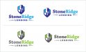
Hi All, I've been given the task of creating a logo for a mortgage lending company. Called Stoneridge Lending Inc. The Stoneridge name came from the area the company is located. It's located on the Niagara escarpment. Which if you don't know what that is, it's basically a large limestone ledge that spans across the GTA to Niaraga Falls. Carved out of the earth in the last ice age.

The company's target audience is very broad. From the wealthy to people with bad-credit. They also asked for "big & Bold". That's all the input I got. lol

I was just given this job last night. I haven't had much time to put into it yet. I just was wondering if you all could help me with some imagery ideas. Below is what I threw together this morning not sure if I should scrap it or not? I'm really trying to avoid pictures of banks and houses if possible. As the owner of this company is the president of another lending company that already has these design elements in their logo. Plus they are so over-used.

Any thoughts S101? Thank you!
 

Attachments

  • SRlogoconcept1.jpg
    SRlogoconcept1.jpg
    42.2 KB · Views: 178
I like the fact your not using the house bank theme. Maybe more of a ridge looking logo then a point. I have seen the ridge your talking about and it is a lot more of a flat long horizontal plane. Maybe something like that with the company name sitting about it. I like the green better. Green says money.
 

peavey123

New Member
Thx BigEasy, I will try again to get the escarpement ridge. I already have about 20 sketches trying to do an escarpment 'ridge' but it's darn hard to have it recognizable as a ridge. So I was just like "I'll make a rock instead" haha
 

CanuckSigns

Active Member
I've never heard of it being called "stone ridge" or anything similar lol! Stone ridge makes me think of Lime Ridge mall, not exactly "high finance" lol!

i can see how it would be difficult to make a recognizable drawing of the escarpment and not have it look like a blob. what about another direction, the niagara escarpment is also known for it's wildlife, could that be used instead?
 

TimToad

Active Member
I really like the font choices, very sturdy, chiseled and with dignity. I also prefer the green/grey color combos.

My first impression was the ridge looked too much like Devil's Tower in WY.
 

bob

It's better to have two hands than one glove.
While the two-tone 'StoneRidge' might be very stylish, it's functionally illegible. At first glance all I see is 'Ridge' and then, if I bother to look, which I probably wouldn't, the rest of the stuff.

The illustration is the best part if anyone gets around to looking at it. Who cares if it's geologically correct or not, it's a logo not a treasure map.

Typographically it's OK but there's probably better choices.

All in all it looks like a label one might see on a loaf of bread. It doesn't make me want to borrow a cup of sugar let alone money.
 

Billct2

Active Member
My first impression was the ridge looked too much like Devil's Tower in WY.
My first though too. I like the general concept though I would be careful not to look too much like this....
 

Attachments

  • 1a.jpg
    1a.jpg
    48.7 KB · Views: 150

Gino

Premium Subscriber
Based upon the area, had that said French Bread, it would've be more believable.


As for the approach to this logo thing, let the drawing/graphic out of the equation for now and concentrate on the overall words. Adding a picture can be done anytime and is the easiest part of any creation. Also, all of your samples look the same, other than just repositioning. If that's the only choice, stacked vs. horizontal...... nope, not yet.
 

Craig Sjoquist

New Member
Just glad it is a reasonable good looking logo ya produced & conservative image

Those 2 arrows are distracting but do fill the area so maybe longer word ?

Thinking the word lending could start under the S & end where it does...might help but as the icon goes on top it would look odd unless a line(s) or arrow goes to end of ridge.

Just my 2 cents
 

eahicks

Magna Cum Laude - School of Hard Knocks
I think StoneRidge should be one color, not two....depending on the viewer, one of the 2 colors stands out first. Other than that, decent design.
 

Moze

Precision Sign Services
Not trying to be a jerk, but this is the first thing that popped in my head:
 

Attachments

  • ScreenShot.jpg
    ScreenShot.jpg
    87.6 KB · Views: 146

shoresigns

New Member
I would spend more time on the typography. If there's one thing bank logos have in common, it's that they use typefaces that are resistant to aging. The font you've chosen looks a bit too modern I think, which means it's more difficult to predict whether it will age well. I would pick something more classic, but not a typeface that's too commonly used either.
 

nikdoobs

New Member
These look great. I definitely wouldn't scrap them. Maybe see what else you can come up with though. Nice work
 

Marlene

New Member
does the ridge really look like that? it's kind of phallic looking. I do like the gray/green colors
 

Jester1167

Premium Subscriber
While the two-tone 'StoneRidge' might be very stylish, it's functionally illegible. At first glance all I see is 'Ridge' and then, if I bother to look, which I probably wouldn't, the rest of the stuff.

The illustration is the best part if anyone gets around to looking at it. Who cares if it's geologically correct or not, it's a logo not a treasure map.

Typographically it's OK but there's probably better choices.

All in all it looks like a label one might see on a loaf of bread. It doesn't make me want to borrow a cup of sugar let alone money.

In the grey and green version I start to lose the word "Stone" because the green "Ridge" jumps out.

That got me thinking about the meaning of color and I found this. Interesting read
 
Top