hey folks
Decided to post here as my last resource, I know you guys are straight shooters (most of you) and some just like to bull newbies ( a few of you) but I'm ready to take it either way.
My situation at the moment is just overwhelming, I just moved overseas from Big Ole' Texas to my home country, and decided to open a small shop, doing t-shirts, decals, signs and whatever I can with the equipment I have and the knowledge I've been gathering from where ever I can, but just realized that creating my OWN logo is one of the toughest tasks.
I want something simple, but classy, professional but not corporate looking, and the lists goes on .... I've been following advice from this board on designing B&W and there are a few concepts that I like, but couple days later I found something on them that makes me toss 'em and start over.
I have my wife looking at my scratch pad and she likes a lot of them, but she doesn't know anything about design, readability, identity and all that stuff, but on the other hand I have the basic concepts but nothing seems to help me either.
What is haunting me is the fact that I know I will use this logo screen printed, so the amount of colors is important, I'm gonna use cut vinyl to reproduce it too, so it has to look good one one color, but also not a lot of small detail to save time weeding, digital printing is not an issue.
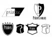
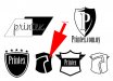
The name of the business would be Printex (yeah I know) because I want to honor the Lone Star State, and since I live in a spanish speaking country, the name has to be easy to pronounce,even being a foreign word, for all my potential customers here.
Not really asking for help, not really venting .... maybe someone has a few minutes to spare and can create something that can inspire me, I lack talent but I compensate that with effort and dedication, so I'm pretty sure something great is gonna result of all this. I've been reading a lot of the threads here on logo design, and cannot believe how many great logos you guys post "just to give an idea" to the person looking for ideas, and that was what inspired me to post here too.
Thanks for reading this, and if you think you can come up with something I'd appreciate it whatever it is.
take care
Carlos
Decided to post here as my last resource, I know you guys are straight shooters (most of you) and some just like to bull newbies ( a few of you) but I'm ready to take it either way.
My situation at the moment is just overwhelming, I just moved overseas from Big Ole' Texas to my home country, and decided to open a small shop, doing t-shirts, decals, signs and whatever I can with the equipment I have and the knowledge I've been gathering from where ever I can, but just realized that creating my OWN logo is one of the toughest tasks.
I want something simple, but classy, professional but not corporate looking, and the lists goes on .... I've been following advice from this board on designing B&W and there are a few concepts that I like, but couple days later I found something on them that makes me toss 'em and start over.
I have my wife looking at my scratch pad and she likes a lot of them, but she doesn't know anything about design, readability, identity and all that stuff, but on the other hand I have the basic concepts but nothing seems to help me either.
What is haunting me is the fact that I know I will use this logo screen printed, so the amount of colors is important, I'm gonna use cut vinyl to reproduce it too, so it has to look good one one color, but also not a lot of small detail to save time weeding, digital printing is not an issue.
The name of the business would be Printex (yeah I know) because I want to honor the Lone Star State, and since I live in a spanish speaking country, the name has to be easy to pronounce,even being a foreign word, for all my potential customers here.
Not really asking for help, not really venting .... maybe someone has a few minutes to spare and can create something that can inspire me, I lack talent but I compensate that with effort and dedication, so I'm pretty sure something great is gonna result of all this. I've been reading a lot of the threads here on logo design, and cannot believe how many great logos you guys post "just to give an idea" to the person looking for ideas, and that was what inspired me to post here too.
Thanks for reading this, and if you think you can come up with something I'd appreciate it whatever it is.
take care
Carlos
")