-
I want to thank all the members that have upgraded your accounts. I truly appreciate your support of the site monetarily. Supporting the site keeps this site up and running as a lot of work daily goes on behind the scenes. Click to Support Signs101 ...
Search results
-
-
Source for magnetic changeable letter sign?
Thanks. I was hoping for a reply from Signage since he keeps pestering me to post a pic. :) I am not a fabricator, and these things look pre-fabbed. Someone somewhere has to be selling them.- Jillbeans
- Post #12
- Forum: General Signmaking Topics
-

Painted Window
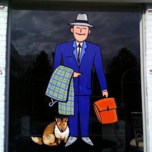
Freehanded based on period clip art, with an ad-lib dog.- Jillbeans
- Media item
- Comments: 0
- Album: Member Album by Jillbeans
-

Painted Window
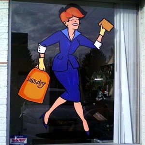
Freehand job based on period clip art, using 1 Shot and Ronan lettering enamels on a primered base.- Jillbeans
- Media item
- Comments: 1
- Album: Member Album by Jillbeans
-
Fun with paint!
Here's a before and after from this weekend. The new owner of this place has seen my window paintings in Mars PA and gave me total free rein. Luckily the weather was in my favor. This job took three hours start to finish and was a lot of fun. All it cost me was the gas to drive there. He...- Jillbeans
- Thread
- Replies: 29
- Forum: Portfolio Board
-
First time poster prepared for the worst.
^^ that's why I added a rule line in mine. :) You can overlap sometimes, but you have to be careful. Probably not for something which will be routered.- Jillbeans
- Post #39
- Forum: Logo Design
-
First time poster prepared for the worst.
#33 is a great start. I like doing the top line in lower case and the bottom in all-caps. I am glad you are studying that book.- Jillbeans
- Post #35
- Forum: Logo Design
-
Script Font ID PLS
Scriptina. http://new.myfonts.com/search/Scriptina/fonts/ Love....Jill- Jillbeans
- Post #2
- Forum: Fonts and Typography
-
First time poster prepared for the worst.
While the script font can be OK on some retro signs, it reads as f*cking to me. Try it for the name, kerned tighter, and use a simple font like Impact for the trucking part. Yours looks kind of MS Paint-y to me. Glad you got the Mike Stevens book. Here's a quick suggestion. Love....Jill- Jillbeans
- Post #27
- Forum: Logo Design
-
Source for magnetic changeable letter sign?
Finally got a chance to snap a pic.- Jillbeans
- Post #9
- Forum: General Signmaking Topics
-
OK....After much work....
Don't tilt the "and" an ampersand would look better. (not to you , but in general why is AND always highlighted?) Lose the wavy computery looking green stuff in front of the water tower and let it stand alone. Try all-caps on the tagline.- Jillbeans
- Post #49
- Forum: Logo Design
-
ok... rip us apart
The latest version is really weak still. Like SignBoy said, you could paak ya caa in the space between IN and DEMAND. I'd highlight what is done more than the name, In Demand tells me nothing.- Jillbeans
- Post #35
- Forum: Logo Design
-
Hershey's Chocolate Warning!
Recently I had a younger man tell me how much he liked my body. I replied that I got that way from eating chocolate. He said "Eat more chocolate." :) Love....Jill PS All you need is a bag of flour for those gals in the pic.- Jillbeans
- Post #6
- Forum: General Chit-Chat
-
First "real" banner
I really like what Tiki suggested, with the side rock-like panel. It had way more legibility. Your font looks stretched. And if using a drop shadow I would make it straight down, as if natural, not down and to the right. Love....Jill- Jillbeans
- Post #35
- Forum: General Chit-Chat
-
What did i do wrong? (customer meeting)
I wouldn't have broken it down into calling it a "layout fee" I would simply have said "Our policy is a 50% deposit before providing sketches." When he rushed for Friday I would have said "We can do this provided you approve the sketch as quickly as possible so we can get you into our production...- Jillbeans
- Post #21
- Forum: Sales, Marketing, Pricing Etc.
-
Corel X5 and Windows XP????
It works fine for me on XP but my only complaint is that X5 takes forever to load. Love....Jill -
OK....After much work....
I agree with Bruce.^^^ None are all that. The first one is OK, the others are not. The last one is just plain too hard to read. With a long name like Circleville, and there's nothing wrong with it, it kind of limits you as to what exactly you can do with your logo. I think maybe if you really...- Jillbeans
- Post #22
- Forum: Logo Design
-
making new logo
Wholly agree with the above post. I gave my two cents in your "welcome" thread, not having seen this thing close-up. Some of us have gone to art school, and most of us have attended the school of hard knocks. While we all do start somewhere, it never hurts to listen to good advice from seasoned...- Jillbeans
- Post #27
- Forum: Logo Design
-
hello everyone
Welcome from PA. Another tip is not to use two scripts in the same layout. Even if separately both are nice scripts. :) Bear with me, I can be bossy but I mean well. Love....Jill- Jillbeans
- Post #12
- Forum: New Member Introductions
-
Severe Bubbles on Layered Vinyl
It wasn't a flaming, just good advice. I never use 651 on a vehicle. I never pre-assemble layers. I do use wet app for layers after putting down the base layer dry using a center hinge (for the most part) I only use Rapid Tac not home brew. Lately if there are lots of colors in the vinyl I have...- Jillbeans
- Post #29
- Forum: Installation Equipment & Techniques


