-
I want to thank all the members that have upgraded your accounts. I truly appreciate your support of the site monetarily. Supporting the site keeps this site up and running as a lot of work daily goes on behind the scenes. Click to Support Signs101 ...
Search results
-

My new baby.
and here I thought I was going to see a mini Joe Diaz.... Congratulations on the new system- Sign_Boy
- Post #3
- Forum: Computer Hardware
-
-

New customers card design
The power wash guy looks better. Now what if you made it look like the washer gun was in front of part of the M? (where it sits behind it) As for the contact info... Still not crazy about it. Maybe it's me but I prefer to have it organized a bit more. Address on one side Contact info on the...- Sign_Boy
- Post #14
- Forum: Designs & Layouts
-
New customers card design
Nope have the power washing nozzle on the right side facing the copy.- Sign_Boy
- Post #12
- Forum: Designs & Layouts
-

It's so hot...
I've posted this before but it never gets old: http://www.youtube.com/watch?v=APAySMepRm8- Sign_Boy
- Post #3
- Forum: General Chit-Chat
-
-
New customers card design
Like Jill said flip the guy. I'm not crazy about the color scheme - yellow and green for a power washing company. I would try to use cleaner looking colors. I do like the top part just not the colors. I would also change the font used for the contact info. It's a too bold JMO. I would use the...- Sign_Boy
- Post #9
- Forum: Designs & Layouts
-
Why do I get all the dummies as customers..
If there was vinyl on the faces tell them it is 3D just not that much - only a couple of Mil. Fax or e-mail them the signed proof and let them know you can make it 3D but it's going to cost..- Sign_Boy
- Post #4
- Forum: General Chit-Chat
-
-
Corn Dogs, love em or hate em?
pigtails and corn dogs :loveya::loveya::clapping::ROFLMAO:- Sign_Boy
- Post #288
- Forum: General Chit-Chat
-
is it bad....????
Thank you once again :banghead::ROFLMAO:- Sign_Boy
- Post #11
- Forum: General Chit-Chat
-
Corn Dogs, love em or hate em?
:clapping::clapping: :supersmilie::loveya::corndog:- Sign_Boy
- Post #285
- Forum: General Chit-Chat
-
is it bad....????
No problem:thumb: I will tonight, Thanks Rex. Why do I get the feeling that's a dream you had???? Attack of Comic Sans and Papyrus oh nooooooooooo!!!- Sign_Boy
- Post #7
- Forum: General Chit-Chat
-
is it bad....????
I looked online and found that it's called Snellen Optotype and only consists of 10 letters - C,D,E,F,L,N,O,P,T,Z - or Sloan letters, designed by Louise Sloan in 1959. Mike it's kind of funny when the Dr asked what was better 1 or 2 I noticed that 2 compressed the letters a little.- Sign_Boy
- Post #4
- Forum: General Chit-Chat
-
is it bad....????
Went to the eye Dr the other day.... Is it a bad thing that I was more focused on trying to figure out the font on the eye chart than reading a line to the Dr.?- Sign_Boy
- Thread
- Replies: 15
- Forum: General Chit-Chat
-
-
Greek
oops... I don't know what I was thinking:doh: "Greek" was not mentioned in the name so "Greek Restaurant" Should be included :banghead::banghead::banghead:- Sign_Boy
- Post #35
- Forum: Designs & Layouts
-
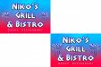
-
Greek
Could be but when I see Bistro & Grill I think food is served there. I'd ask them what they think. JMO..... Great now I'm hungry, I want a Gyro!!!!- Sign_Boy
- Post #33
- Forum: Designs & Layouts
-

Wednesday CoroPlane Check In
NICE!!!! You could fly it out to the sign meet!!!!- Sign_Boy
- Post #2
- Forum: General Chit-Chat
-

Logo I designed for a blogger...
Not bad - Did you try stacking them and using vs. instead of versus? The versus kind of gets lost IMO- Sign_Boy
- Post #2
- Forum: Logo Design