-
I want to thank all the members that have upgraded your accounts. I truly appreciate your support of the site monetarily. Supporting the site keeps this site up and running as a lot of work daily goes on behind the scenes. Click to Support Signs101 ...
Search results
-
-
-

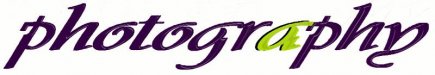
Font ID help
http://afreserve.com/downloads/pdf/airmans_creed.pdf vector version at bottom of page...- oldgoatroper
- Post #4
- Forum: Fonts and Typography
-

font help please!
It looks like Optima with some rounded corners...- oldgoatroper
- Post #2
- Forum: Fonts and Typography
-

Font id please
X-Acto Very Casual ? -- just kidding...- oldgoatroper
- Post #2
- Forum: Fonts and Typography
-
Sh#t, i just got scammed
I would say left one is fake... the logo looks like a mix of Gil Sans and Helvetica... just a guess...- oldgoatroper
- Post #3
- Forum: General Chit-Chat
-

I D font ?
At first glance I was almost certain that is a light version of DNA HotShot --- but after comparing, there are some significant differences... Sorry I couldn't help...- oldgoatroper
- Post #4
- Forum: Fonts and Typography
-

-

-

Help identifying font please
I'd say its Avant Garde bold, judging from the width of the narrow S and wide O and C ...- oldgoatroper
- Post #4
- Forum: Fonts and Typography
-

state farm logotype
I'm not sure if you're talking about a typeface spec for supplemental text in an ad or such, but if you're talking about the typeface used in the logo at the top of this topic, it most certainly is not Univers or Arial...- oldgoatroper
- Post #12
- Forum: Clipart, Vehicle Templates and Digital Files
-

USB long length connection
Powered hub is the way to go. Along with that get two 12' (or longer if you can) USB cables with Type A / Type B ends and connnect everything up.- oldgoatroper
- Post #10
- Forum: General Signmaking Topics
-
Photoshop file too LARGE
layers may also contribute to a large file size, especially if your dpi is high -- cuz then you don't just have one layer at high res...- oldgoatroper
- Post #7
- Forum: Adobe
-
Make a graphic Stick
Funny... from the thread title, I was thinking like a hockey stick -- but for graphics instead...- oldgoatroper
- Post #4
- Forum: Materials
-
-
Scared of heights? Step ladders make you nervous?
Anyone notice that at about 7:18 he is standing on the top plate and lets go with both hands to fiddle with his clip? Made my butt suck wind, that did....- oldgoatroper
- Post #16
- Forum: General Chit-Chat
-
Font Rant !!!!
Here, fixed that for ya... :Big Laugh- oldgoatroper
- Post #28
- Forum: Fonts and Typography
-
Font Rant !!!!
Since Arial is a drop-in replacement for Helvetica, its kerning is identical. Many of you have probably seen this little article on Arial, but for those that haven't -- The Scourge of Arial <-- clicky- oldgoatroper
- Post #11
- Forum: Fonts and Typography
-

Font Help Please
it may be a font -- the two Zs look identical, the I in Rizz and the I in Studios looks to be the same as well. The two Ss in Studios may be upper and lower case versions as they are different.- oldgoatroper
- Post #3
- Forum: Fonts and Typography
-

sharp logo
The font for CHIROPRACTIC somehow -- to me, anyway -- makes it look like "chiropractic" is spelled wrong... :-) ...but then, sometimes the word "the" looks like its spelled wrong to me...- oldgoatroper
- Post #9
- Forum: Logo Design
-
Are you superstitious at work?
Well, Tim... the only radio station in Calgary (or Alberta) that might be called "calming" is probably CKUA, no? As for me -- no superstitions... everything that goes wrong is just my fault -- according to my boss.....:-)- oldgoatroper
- Post #20
- Forum: General Chit-Chat