-
I want to thank all the members that have upgraded your accounts. I truly appreciate your support of the site monetarily. Supporting the site keeps this site up and running as a lot of work daily goes on behind the scenes. Click to Support Signs101 ...
Search results
-

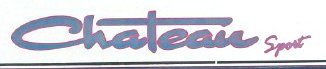
firetruck font
"R"s are closed in the heavier weights, but, yeah, the P shouldn't be. I would not doubt that the version of the font being used has been adapted to have closed Ps. Some knock-offs are like that, I think... Other than that, I'm not aware of any other font that is THAT close to FQ without...- oldgoatroper
- Post #5
- Forum: Fonts and Typography
-
-
-

Customer changed his mind. Now he wants this font
Not only do the Cs don't jive with the M, they also don't jive with each other. As well, the M is only "close" to a stretched Copperplate Heavy "M"- oldgoatroper
- Post #4
- Forum: Fonts and Typography
-

Forgetfullness Reoccurs
That's what I thought at first, too, but it isn't... though it is close.- oldgoatroper
- Post #3
- Forum: Fonts and Typography
-

Craftsman or Ryobi
Why not get one of those Gravity-Rise thingy stands that Bosch makes for your existing mitersaw. I have one on my Bosch table saw and its freakin' ingenious. It is SO easy to set that saw up or collapse it to move. I just giggle everytime I raise or lower it. Bosch makes one for a table saw and...- oldgoatroper
- Post #7
- Forum: General Signmaking Topics
-
Onyx Production house question
Jake, that certainly won't work with any printer that has any kind of a cache. For instance, depending on the size of the job, our Onyx rip will report a job is 100% complete when the panel on the Ion shows anywhere from 30% to 90% complete. Because of the cache on the printer, the %completed...- oldgoatroper
- Post #5
- Forum: Digital Printing
-
Another Font ID for you Fontophiles
I thought it might have been Dragonfly/Dragonwick, but it isn't, though its close...- oldgoatroper
- Post #2
- Forum: Fonts and Typography
-
That is not a logo, that is a sign layout
To me, a logo is any graphic composed of symbol(s) and/or type that would satisfy the requirements of a trademark. A layout would never qualify as a trademark so it could never be considered to be a logo.- oldgoatroper
- Post #8
- Forum: Logo Design
-

2 fonts... no clue
Eras Ultra or some bold weight of it Murray Hill "Lic #" is also some weight of Eras- oldgoatroper
- Post #2
- Forum: Fonts and Typography
-
Colorspan 72uvr profiler
Where did you get a 72UVR that still works? Ours lasted about 4.5 years -- about 2.5 years more than most, I understand. Its in the back in pieces. Need any parts?- oldgoatroper
- Post #4
- Forum: Digital Printing
-
Design taken to another sign shop, should I say anything?
+1 We never design for a new customer without a 50% deposit on a firm order and we never design anything even for an existing good customer without a firm order. And I make very clear, before even starting, how much of the total tab is design. Re: Dan's post... I once bid on design and...- oldgoatroper
- Post #23
- Forum: Business Management
-
Who would you recommend for automatic file backups?
I would never trust an online backup service to be there 100% of the time. Here's what I would do. Get a couple of 2-TB external drives at Costco. You can get smaller ones, sure, but why? Get FolderClone from folderclone.com Setup an automatic nightly backup to one of your...- oldgoatroper
- Post #9
- Forum: General Signmaking Topics
-
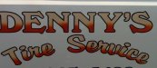
Font that is close?
Dennys --> Windsor might be close- oldgoatroper
- Post #2
- Forum: Fonts and Typography
-
-
Font id please?
Its very close to Benguiat Gothic Book but just not quite...- oldgoatroper
- Post #4
- Forum: Fonts and Typography
-

-

ID this font. Harley font from scratched tank.
Looks like X-Acto Very Casual :)- oldgoatroper
- Post #4
- Forum: Fonts and Typography
-

-

Another Font ID...
That's it! I always forget about that one... Thanks Kwik. That was quick.- oldgoatroper
- Post #3
- Forum: Fonts and Typography
-
Another Font ID...
Well, well... this one has me stumped. It's not: Helvetica Inserat, Helvetica Hanseatic, any Compacta, Helv XBD Cond WTF is no help. This is supposedly part of a magazine masthead so it has to be just right. Any ideas, anyone?- oldgoatroper
- Thread
- Replies: 2
- Forum: Fonts and Typography