• I want to thank all the members that have upgraded your accounts. I truly appreciate your support of the site monetarily. Supporting the site keeps this site up and running as a lot of work daily goes on behind the scenes. Click to Support Signs101 ...

Company truck wrap design - Tear it apart!

401Graphics

New Member
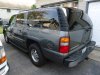
No fashion patterns. I would need 30" rims on the truck first lol.

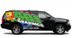
The logo i use is the one in the original pic. Some people on here dont like it. I like the speedway font you used in "graphics" though.
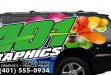
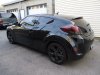
 

Pat Whatley

New Member
Just a thought.

401_GRAPHIC.jpg
 

Attachments

  • 401-GRAPHICS.jpg
    401-GRAPHICS.jpg
    43.3 KB · Views: 109
  • 401 GRAPHICS2.jpg
    401 GRAPHICS2.jpg
    152.4 KB · Views: 106
  • zoom.jpg
    zoom.jpg
    198.4 KB · Views: 93
  • 401 GRAPHIC.jpg
    401 GRAPHIC.jpg
    36.4 KB · Views: 126

John Butto

New Member
The catagory is Branding and the question is "who just put out the best design for 401 graphics truck"?
ding, ding, ding "who is Pat Whatley".
"Your correct and he will be our winner for today".
 

SlightlyChilled

New Member
Pat is there not a rule of thumb to not have names point down? I like your lay-out just thought I read that here or in a book. Not trying to sound like a jerk... Thanks
 

HulkSmash

New Member
I like it. The wife doesn't really like it much because she said this can all be done with just cut vinyl, and doesnt show our ability to print full color. Maybe add some kind of background pattern like Adam did on his wrap. (see pic)


hey! one of our trucks!
 

401Graphics

New Member
I agree the passenger side does look a bit odd. Great design, but not sure it would work on my color suburban either. I would like to do a full wrap.
Here is the suburban that will be wrapped. Also 2 other vehicles (Veloster, and Bucket Truck) that I would like to wrap some day and match the suburban to give a fleet look.
 

Attachments

  • DSC01546.jpg
    DSC01546.jpg
    77.8 KB · Views: 101
  • DSC01545.jpg
    DSC01545.jpg
    79.9 KB · Views: 85
  • DSC01547.jpg
    DSC01547.jpg
    71.5 KB · Views: 89

Pat Whatley

New Member
Pat is there not a rule of thumb to not have names point down? I like your lay-out just thought I read that here or in a book. Not trying to sound like a jerk... Thanks

Yes, it is a rule of thumb. Yes, I agree it looks wonky. No, you're not being a jerk at all. I stuck it up there because Bruce Bowers (Dr. CAS) pointed out to me one day how many wrap designs people post on here won't work on the other side of the vehicle. The problem with the one I posted is because the lettering is slanted and skewed it just wouldn't work...plus i don't like the "swoosh" from the 4 pointing to nowhere, kind of kills the flow. It is what it is....and worth every dime that was paid for it. :Big Laugh
 

TXFB.INS

New Member
the evolution of designs/layout is VERY intriguing, to see where this layout started and where it been edited and tweaked as well as seeing how concepts do not appease everyone.

As long as one has thick enough skin and can read through the BS then there is GREAT wealth of knowledge/advice to be learned
 

bikecomedy

New Member
Did you look at his work though? For ideas...about the color your wife wanted added into the design. Or other work for ideas? I wouldn't copy them but other artists inspire me. Also since you added the idea of doing all the vehicles you own, it makes this a different project all together. Is there any way you can let us know more about what you like?

Was thinking about Pat's design as your new logo and using a few strong lines on the vehcile that could be done in all your marketing pieces. Which is probably what Daniel was going to give you.... A brand new shiny brand.

I guess a moment to thank you and everyone here is due too. I am grateful to have participated in this thread. Feel like I have learned much. :toasting:
 

401Graphics

New Member
Personally out of his designs i like this one the best. http://www.graphicd-signs.com/portfolio-vehicle-advertising#38
My wife thinks we should incorporate cmyk stripes in it since its on our business cards and office walls. But I do think it might be time for a brand overhaul. The wall can easily be re-done, and im almost out of business cards anyways. So a whole new look would be fine.

Here is the business cards, and office. As you can see, it a bit blah.
 

Attachments

  • 306206_10150782346866364_1224019101_n.jpg
    306206_10150782346866364_1224019101_n.jpg
    58.9 KB · Views: 104
  • 560249_10150782331926364_24414504_n.jpg
    560249_10150782331926364_24414504_n.jpg
    43.3 KB · Views: 85

401Graphics

New Member
I also think the name "401 Graphics" has to stay the same. I was up all night checking different domain names, and everything good or decent with ".com" is taken.
 
Top