-
I want to thank all the members that have upgraded your accounts. I truly appreciate your support of the site monetarily. Supporting the site keeps this site up and running as a lot of work daily goes on behind the scenes. Click to Support Signs101 ...
You are using an out of date browser. It may not display this or other websites correctly.
You should upgrade or use an alternative browser.
You should upgrade or use an alternative browser.
designing new business cards
- Thread starter lil Details
- Start date
weaselboogie
New Member
That is exactly the point. The point of a having a good business card is not to please you, it's to please the people receiving it.
EXACTLY. Drop your preferences and design for the masses. Your tastes have a resounding negative feedback, so I don't understand why to continue to think that everyone willl change their tune.
I'm fairly adept at design, but I'm not so arrogant to think that I shit masterpieces. When a design matters, I may do a couple of different designs and show them to people who will tell you what they honestly think. I never ask someone who I think may blow smoke up my ass just to be polite... I'm not showing this off, I'm asking for critique... and here's the thing... I LISTEN TO IT!!
lil Details
New Member

lil Details
New Member

bob
It's better to have two hands than one glove.
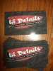
OK...so I had to "find" or shown, thanks iSign, a font that I would like....
how does this look...of course the texture and all is up for grabs, but layout and font choice??
Do not use a specimen typeface for secondary and body copy. This one is illegible.
Do not run secondary and body copy at weird angles unless you have a really good reason for doing so. You do not.
Do not run your main copy at some weird out of balance angle unless counterbalanced by some other element. You have none.
Do not use some overall effect on both background and copy unless there is something remotely pleasing about that effect. There is nothing pleasing about this one.
Do not opt for childish typefaces more suitable to vegetable stands and grocery store window banners. Like those you have chosen.
Other than those few things, shrug, it's OK I guess. More whelming than overwhelming.
Pat Whatley
New Member
...to steal Bob's favorite word - DELETIA...
Other than those few things, shrug, it's OK I guess. More whelming than overwhelming.
So what you're saying is you like the general business card shape but that's about it, right? :ROFLMAO:
Allied Digital
New Member
Not trying to be ugly, but this thread is wearing me out!
bob
It's better to have two hands than one glove.
So what you're saying is you like the general business card shape but that's about it, right? :ROFLMAO:
You have your finger on the pulse of the matter.
TheProfessor
New Member
I think the last two efforts were 4,000,000,000 times better than anything he has put up previously, so I am gonna give him some credit... I prefer the black card to the gray card, and if you are going to use the texture on the background, leave the texture off the text so it is more legible...
keep going, you are at least headed in the right direction-ish now")
keep going, you are at least headed in the right direction-ish now
weaselboogie
New Member
I think the last two efforts were 4,000,000,000 times better than anything he has put up previously, so I am gonna give him some credit...

Vinylman
New Member
Lil:
I haven't put ANY effort whatsoever into designing a business card for you because...
After watching this train wreck, and making several comments to attempt to encourage you to not give up. I have come to another conclusion.
You don't seem to be able to get beyond your "I'm a window tint guy who payes attention to the "lil details'".
Well Bunky, your failing to grasp even the fundamentals of decent design. Which have been CLEARLY pointed out to you numerous times in this thread.
Your last attempt is nothing more than borrowing Pat Whatleys' layout, adding iSigns font, and creating a lifeless blob that looks like it would be better suited for a door mat at the local laundromat than a business card.
{in a voice reminiscent of FogHorn LegHorn} BOY! I say BOY! do you have an ounce of glimmer left in that there tool kit you call a brain?
Either drop the card issue, or pay someone to design you a kick ass card. What you have done this far on a scale of 1-10 wouldn't even wake the needle up tomorrow morning if you was servin' cornbread and grits hot from the oven with fresh hot Maple syrup.
Attachments

Do you sell spray-on bedliners?
or with a different texture effect....
TheProfessor
New Member
Lil:
Your last attempt is nothing more than borrowing Pat Whatleys' layout, adding iSigns font, and creating a lifeless blob that looks like it would be better suited for a door mat at the local laundromat than a business card.
we can't really get mad at him for "borrowing" considering we told him to find stuff he likes and emulate it until he can learn more... and really, isnt copyright infringement the most sincere form of flattery? :Big Laugh
and for Lil, I know you have previously stated that you can't see a lot of the differences in the fonts you are using. I would honestly recommend, when you have some free time, typing out the same word in like 42 fonts that look the same to you and take a slow, long look at them. Try to find all the differences you can in each one. Look for serif styles, lack of serifs, ligatures, asender and descender heights, the shape of the negative space in the letters (like the hole in the e and o), the shape of the lowercase i dot, and little differences like that. Once you start to notice those things regularly, most fonts will look very different to you.
lil Details
New Member
thanks Professor....
lil Details
New Member
Lil:
I haven't put ANY effort whatsoever into designing a business card for you because...
After watching this train wreck, and making several comments to attempt to encourage you to not give up. I have come to another conclusion.
You don't seem to be able to get beyond your "I'm a window tint guy who payes attention to the "lil details'".
Well Bunky, your failing to grasp even the fundamentals of decent design. Which have been CLEARLY pointed out to you numerous times in this thread.
Your last attempt is nothing more than borrowing Pat Whatleys' layout, adding iSigns font, and creating a lifeless blob that looks like it would be better suited for a door mat at the local laundromat than a business card.
{in a voice reminiscent of FogHorn LegHorn} BOY! I say BOY! do you have an ounce of glimmer left in that there tool kit you call a brain?
Either drop the card issue, or pay someone to design you a kick ass card. What you have done this far on a scale of 1-10 wouldn't even wake the needle up tomorrow morning if you was servin' cornbread and grits hot from the oven with fresh hot Maple syrup.


stop beating your head on the wall then...go have a beer....
oh and "So long and thanks for all the fish!"
D2S
New Member
Wait for the cash for clunkers bailout to end.
Rumour has it the next segment to get a handout will be sign shops and designers. You might be able to get up to $3500.00 to have someone do the layout for you.
wayne k
guam usa
Wayne that was classi :U Rock: