Colin
New Member
Here's another example of what people wind up with when they shop for the lowest price. This is the back & forth email I had with this guy (me in blue):
We recently purchased a Grand Banks 32 trawler and are changing the name.
The vessel carries the typical GB teak signboards port & starboard on the bridge. The area where the lettering will be applied is approximately 29” X 4”. The new name is Shearwater.
As you may know, the traditional GB lettering is gold/yellowish-gold, often with a black shadow effect.
Would you be able to provide me with the fonts that you have available – in particular those you feel would be suitable for this application? As well as the more traditional fonts, I have also been thinking of a simple, easy-to-read script style in upper and lower case. I also thought of a small, subtle image of a Shearwater (a small soaring gull with very long wings) at the end of the name.
Your thoughts, suggestions, ideas...?
------------------------------------------------------
Sounds good, thanks for the thorough information.
I have over 100,000 fonts, so it’s not really possible to make them available. Based on your description, I can certainly design something you’d like and provide you with a proof, but in order to commence with design work (which is an inherent part of doing the job), I do require a deposit of some kind. I accept Visa or AmEx if that helps.
------------------------------------------------------
Thank you for your quick response Colin. One or two clarifications please...
Presumably there will be some back and forth discussion after you submit your initial proof, and perhaps one or two additional versions for any changes/modifications. Assuming this is the case, please give me an idea of the cost to design and make the lettering for the two boards.
-------------------------------------------------------
Yes, I’ll give you a few options.
Am I just providing you with the lettering, or would you be bringing the boards to me for applying the lettering to the boards as well?
-------------------------------------------------------
I would apply them myself.
-------------------------------------------------------
OK, to design & produce the 2-colour lettering would be $120.00. I could do the installation for you for $30.00
Unless you have applied vinyl graphics a lot, it’s not as easy as most people think.
-------------------------------------------------------
Thanks very much for your time Colin. I will get back to you.
-------------------------------------------------------
Hello again Colin,
Wanted to let you know that I have come up with another solution this time around.
Thank you for your time - I’ve heard very good things about your work and will keep your contact information close at hand.
-------------------------------------------------------
*At this point I was tempted to say something like: “I’m confused; you’ve heard very good things about my work, but you don’t want to use me?” But I didn’t. I just said:
I’d be interested to see the result with a photo.
-------------------------------------------------------
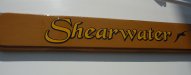
(I received a photo yesterday by email - the one I've named "Ugh")
".....here is a picture of the mounted name boards for Shearwater."
------------------------------------------------------
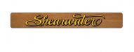
Yes, that’s the sort of thing one gets when shopping for the cheapest price. I probably would have done something like this (attached) with or without the bird graphic.
Have a good summer.
We recently purchased a Grand Banks 32 trawler and are changing the name.
The vessel carries the typical GB teak signboards port & starboard on the bridge. The area where the lettering will be applied is approximately 29” X 4”. The new name is Shearwater.
As you may know, the traditional GB lettering is gold/yellowish-gold, often with a black shadow effect.
Would you be able to provide me with the fonts that you have available – in particular those you feel would be suitable for this application? As well as the more traditional fonts, I have also been thinking of a simple, easy-to-read script style in upper and lower case. I also thought of a small, subtle image of a Shearwater (a small soaring gull with very long wings) at the end of the name.
Your thoughts, suggestions, ideas...?
------------------------------------------------------
Sounds good, thanks for the thorough information.
I have over 100,000 fonts, so it’s not really possible to make them available. Based on your description, I can certainly design something you’d like and provide you with a proof, but in order to commence with design work (which is an inherent part of doing the job), I do require a deposit of some kind. I accept Visa or AmEx if that helps.
------------------------------------------------------
Thank you for your quick response Colin. One or two clarifications please...
Presumably there will be some back and forth discussion after you submit your initial proof, and perhaps one or two additional versions for any changes/modifications. Assuming this is the case, please give me an idea of the cost to design and make the lettering for the two boards.
-------------------------------------------------------
Yes, I’ll give you a few options.
Am I just providing you with the lettering, or would you be bringing the boards to me for applying the lettering to the boards as well?
-------------------------------------------------------
I would apply them myself.
-------------------------------------------------------
OK, to design & produce the 2-colour lettering would be $120.00. I could do the installation for you for $30.00
Unless you have applied vinyl graphics a lot, it’s not as easy as most people think.
-------------------------------------------------------
Thanks very much for your time Colin. I will get back to you.
-------------------------------------------------------
Hello again Colin,
Wanted to let you know that I have come up with another solution this time around.
Thank you for your time - I’ve heard very good things about your work and will keep your contact information close at hand.
-------------------------------------------------------
*At this point I was tempted to say something like: “I’m confused; you’ve heard very good things about my work, but you don’t want to use me?” But I didn’t. I just said:
I’d be interested to see the result with a photo.
-------------------------------------------------------
(I received a photo yesterday by email - the one I've named "Ugh")
".....here is a picture of the mounted name boards for Shearwater."
------------------------------------------------------
Yes, that’s the sort of thing one gets when shopping for the cheapest price. I probably would have done something like this (attached) with or without the bird graphic.
Have a good summer.

 but he probably still would have wanted it for $50.