-
I want to thank all the members that have upgraded your accounts. I truly appreciate your support of the site monetarily. Supporting the site keeps this site up and running as a lot of work daily goes on behind the scenes. Click to Support Signs101 ...
You are using an out of date browser. It may not display this or other websites correctly.
You should upgrade or use an alternative browser.
You should upgrade or use an alternative browser.
Here is another
- Thread starter laserman70
- Start date
DrSteveBrule
New Member
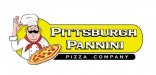
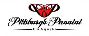
I think the font in the second one makes the word "pannini" an eye sore. I like the first one. What would it look like if the skyline was that green in stead of black? Just a thought...
Marlene
New Member
do you subscribe to "Sign Craft"? is so, read the article in the Jan/Feb issue on page 28. it is all about priortizing and tweaking copy. there are some good examples of tweaking fonts that I think will be a big help to you as the word "pannini" is one of those words where the font you use needs to be tweaked so it can be read and loks good.
laserman70
New Member
Craig Sjoquist
New Member
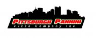
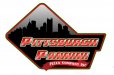
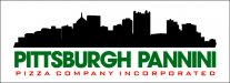
Well which ever one you choose ... I would use better contrast the 1st and 2nd ones should be white letters red outline the 3rd looks good as low contrast except the that square thing what is it is that the skyline then ok if ya bring it out more??
Well Duh! Dr. Steve....

Come on, show the guy something.

I think the font in the second one makes the word "pannini" an eye sore. I like the first one. What would it look like if the skyline was that green in stead of black? Just a thought...
Come on, show the guy something.
Jillbeans
New Member
The first one, if the letters were white, with thin black pinline stepped off bright orangey red outline.
Make sure the strapline and cityscape have the same angle as the name and try that in all caps.
Second one maybe white name with no bevels or very soft grey ones if you have to have them, and sharp not rounded outline in slime green.
Try replacing the red in border with Steelers gold but leaving red ribbon.
Boston Truckstyle needs to follow ribbon better.
There is just no contrast at all as it is in the first two examples.
The third one I would scrap totally, it has kerning issues and does not look iconic/food like.
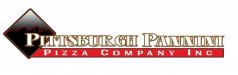
The one with the script is too valentiney for that type of business.
As much as I love any of Arthur's alphabets.
I am glad to see that you have purchased nice fonts but I think you need to buy a good layout book too.
Love.....Jill
Make sure the strapline and cityscape have the same angle as the name and try that in all caps.
Second one maybe white name with no bevels or very soft grey ones if you have to have them, and sharp not rounded outline in slime green.
Try replacing the red in border with Steelers gold but leaving red ribbon.
Boston Truckstyle needs to follow ribbon better.
There is just no contrast at all as it is in the first two examples.
The third one I would scrap totally, it has kerning issues and does not look iconic/food like.
The one with the script is too valentiney for that type of business.
As much as I love any of Arthur's alphabets.
I am glad to see that you have purchased nice fonts but I think you need to buy a good layout book too.
Love.....Jill
Dan Antonelli
New Member
Drop the INC from the layout. Makes them look small time, and is not needed in a logo.
Red and black really don't scream pizza. Try looking at the package design for frozen pizza boxes, like Fruschetta (somthing like that).
Red and black really don't scream pizza. Try looking at the package design for frozen pizza boxes, like Fruschetta (somthing like that).
JR's
New Member
Try looking at the package design for frozen pizza boxes, like Fruschetta (somthing like that).
 peanut butter jars and Candy bars. is a good book to get if its still in print.
JR
Dan Antonelli
New Member
The approach is also totally wrong. Why do you need a city scape when the name Pittsburg is already in the logo? Makes no sense.
I know THEY said they wanted it. That just makes them another client who knows nothing about building a proper brand.
YOUR job is not actually to give them what they want; its to give them what they need.
The world is filled with 'designers' who might make an OK living basing their livelihood on giving clients what they want instead of what they need. NOthing wrong with it I suppose, but the more work out on the street embodying poor fundamental design principles, the less likely you become known as a guy doing outstanding work. You blend, instead of standing out.
signcrafters london
New Member
The approach is also totally wrong. Why do you need a city scape when the name Pittsburg is already in the logo? Makes no sense.
I know THEY said they wanted it. That just makes them another client who knows nothing about building a proper brand.
YOUR job is not actually to give them what they want; its to give them what they need.
The world is filled with 'designers' who might make an OK living basing their livelihood on giving clients what they want instead of what they need. NOthing wrong with it I suppose, but the more work out on the street embodying poor fundamental design principles, the less likely you become known as a guy doing outstanding work. You blend, instead of standing out.
What do they need? What direction would you try to steer them?
Dan Antonelli
New Member
Steer them away from the whole Pittsburgh cityscape, and something more indicative of the nature of their business, and something that is easy to discern, and something that make them look larger and more sophisticated. And a color scheme that doesnt seem so common and amateur.
Clients need to understand their brand should stand out, not fit in.
Clients need to understand their brand should stand out, not fit in.
laserman70
New Member
Steer them away from the whole Pittsburgh cityscape, and something more indicative of the nature of their business, and something that is easy to discern, and something that make them look larger and more sophisticated. And a color scheme that doesnt seem so common and amateur.
Clients need to understand their brand should stand out, not fit in.
Thanks Dan and everyone else for the advice. I will head this in another direction and give them the options explaining the difference .
I thank you all for the help as usual.
Dan, by the way just got your books in Saturday. Cant wait to dig into them.
Dan Antonelli
New Member
Here's a few food ones we've done. Maybe some ideas in there.
http://www.graphicd-signs.com/portfolio-logo-food#1
Hope you enjoy the books. Making some big strides on the next one. Some much new stuff to get out there, just trying to organize it all!
http://www.graphicd-signs.com/portfolio-logo-food#1
Hope you enjoy the books. Making some big strides on the next one. Some much new stuff to get out there, just trying to organize it all!
JR's
New Member
Dan, by the way just got your books in Saturday. Cant wait to dig into them.
I should of had mine autographed before he got so famous. ;-}
JR
Dan Antonelli
New Member
I should of had mine autographed before he got so famous. ;-}
JR
Yeh, very famous. I just took out the trash, too. Legend in my own mind, as Clint Eastwood would say LOL....
The autograph ones only become more valuable when I'm dead, incidentally.