• I want to thank all the members that have upgraded your accounts. I truly appreciate your support of the site monetarily. Supporting the site keeps this site up and running as a lot of work daily goes on behind the scenes. Click to Support Signs101 ...

Discussion I know my answer already, what's yours...........................

Gino

Premium Subscriber
Have a customer that had me quote a job 13 months ago. They recently re-visited the quote and now want to move forward. I told them costs have gone up and put the quote up about $375. more. No problem, They excepted it all over again. Here's the dilemma...........

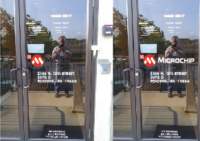
Their logo is red white and black which is fine for most of their signs, but they have two glass doors which are privacy doors and I automatically changed their black copy to white. Looked great, but the guy e-mails me back and says something about violating the branding guidelines. Ah, excuse me ?? You can't see black on glass, unless you're on the inside looking out and the nice blue sky is showing from behind. I told him there are times when corporate is wrong and they should take a closer look..... or why bother at all lettering the door ?? I said, why not a sign right above the door ?? I left them with decide and let me know, I'll letter anyway you desire.

So, how do you convince someone their idea is really really stupid ??
micro 101.jpg
 

Dan360

New Member
Just went through this with a customer, I gave up and we did about 20 doors with a black logo. Looks absurd. (This was for a college that teaches graphic design out of that building...)
 

Gino

Premium Subscriber
Right, I'm not gonna argue with them, but the white outline would be as much as a branding problem in my eyes as just reversing it out. I'll just wait to hear back from these creative wizards. I just wanted others input.
 

Texas_Signmaker

Very Active Signmaker
I'd suggest the white and tell them it will look bad doing it in black. If they insist, have them approve it in writing (or email) and produce the signs as requested. Charge them again when they call you back.

I don't fight anymore when people choose bad designs or don't take my suggestions. I'll bring up my concern or suggestion once, and if it's not received then I just roll with their more important plan. As long as there is a paper trail of your objection you're good.


I just designed a sign for a client and in my opinion, looked horrible. (Times new roman, poor placement of logo and using primary colors) I put my suggested design to the right that looked like a halfway decent professional did it.... Nope, they like their Microsoft word 97' drawing better. OK, no argument from me, I'll make it...but it won't go in my photobook.
 

Baz

New Member
Ask them how would they display their logo on either a white or black t-shirt.
I bet the guide has the logo on a white background. It should also have a provision for the logo going over a dark background.

It's either you change the color of the lettering from black to white or you put the whole logo over a white panel (like unclebun just said). Outlining a logo is usually not in logo guides.
 

Christian @ 2CT Media

Active Member
Have a customer that had me quote a job 13 months ago. They recently re-visited the quote and now want to move forward. I told them costs have gone up and put the quote up about $375. more. No problem, They excepted it all over again. Here's the dilemma...........

Their logo is red white and black which is fine for most of their signs, but they have two glass doors which are privacy doors and I automatically changed their black copy to white. Looked great, but the guy e-mails me back and says something about violating the branding guidelines. Ah, excuse me ?? You can't see black on glass, unless you're on the inside looking out and the nice blue sky is showing from behind. I told him there are times when corporate is wrong and they should take a closer look..... or why bother at all lettering the door ?? I said, why not a sign right above the door ?? I left them with decide and let me know, I'll letter anyway you desire.

So, how do you convince someone their idea is really really stupid ??

View attachment 141553
Microchips doors are White here in AZ... ask me how I know :)
 

equippaint

Active Member
I just designed a sign for a client and in my opinion, looked horrible. (Times new roman, poor placement of logo and using primary colors) I put my suggested design to the right that looked like a halfway decent professional did it.... Nope, they like their Microsoft word 97' drawing better. OK, no argument from me, I'll make it...but it won't go in my photobook.
But Its My Camera.jpg

it's actually straight I swear
 

Andy D

Active Member
What he said ^^^^ Life is too short to deal with others ignorance.
Edited to say, if they wanted to switch back to white, you should charge them
for three sets and installs.
 

Johnny Best

Active Member
Take some glass etch material and run it through your printer with their logo in red and black, approx 6"x30.5" etch panel.
Adhere to glass, collect money, go home.
 

shoresigns

New Member
Agreed, I would get a copy of their brand guidelines, and if it doesn't show a "reverse to white" version, open a dozen brand guidelines PDFs from previous jobs and send them screenshots of the 11 or 12 ones that show a reverse-to-white-when-background-is-dark option.
 

Christian @ 2CT Media

Active Member
Agreed, I would get a copy of their brand guidelines, and if it doesn't show a "reverse to white" version, open a dozen brand guidelines PDFs from previous jobs and send them screenshots of the 11 or 12 ones that show a reverse-to-white-when-background-is-dark option.
Why invest all that time for a small window job?
 

equippaint

Active Member
I think some are over-assuming that the guy who ordered this cares enough to do more than he was told to do and I don't mean this in a bad way at all. Many of these corporate guys are already over-extended and then get these little side projects crammed down their neck on top of it all. While the sign is important to the sign guy, it's nothing but an annoyance to the person that's tasked with getting it done.
 

shoresigns

New Member
Why invest all that time for a small window job?
This is one small part of a much larger job, as Gino mentioned in the original post. A larger job that includes several different signs is probably the type of job that you should request brand guidelines if the client doesn't include them initially.
 

Gino

Premium Subscriber
It's a small part of the overall project, so it is important. And also correct is, this was quoted 13 months ago and the guy who was in charge then, has moved into a new position. This guy inherited the old guys jobs and projects and he's trying to dot all his i's and cross his t's.

The problem with the guidelines is...... it had all the various conditions of when to use this color scheme or the reverse, but nothing indicates CLEAR glass, so they all assume black will be fine. They simply don't understand and won't listen to me, but I only said it wouldn't work. I didn't do any demonstrations. I doubt that will happen, but we'll wait and see.
 
Top