• I want to thank all the members that have upgraded your accounts. I truly appreciate your support of the site monetarily. Supporting the site keeps this site up and running as a lot of work daily goes on behind the scenes. Click to Support Signs101 ...

Logo design - before and after

threeputt

New Member
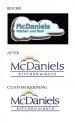
It's a huge improvement.

Quick question though. I hear posters on here calling the "kitchen and bath" a tag line.

Aren't those words a part of the name, proper?

Isn't a tag line more of a descriptive thing, like "remodeling with a flair".

(assuming this is a remodeler and not a retailer of kitchen and bath fixtures)

I like the logo as I said. Just looking for clarification, that's all.
 

Todd-sta

New Member
Hi all - and thank you for your many comments and suggestions.

Dan - their decades old radio 'jingle'... which is song put together by some musical marketing company, sings out: ♫♪ McDaniels, Kitchen and Bath... ♫♪ And it is spelled out as "a-n-d" as part of all their communication.

Client wanted to retain some semblance of a 'cloud'...... owner is a very good man (personally know him) and he takes great pride in touting his warm friendly staff. I thought the addition of 'sunrays' might help evoke that warm feeling..... but I can see where some might expect to get a donut and a cup of coffee when they walk in the door. hehe

I did originally plop in an 'ampersand' as I didn't realize before checking that the name read 'Kitchen and Bath' instead of 'Kitchen & Bath' ....... but I may talk to him and see if he'd be up for switching that out.

Gino - thanks for the suggestions and comments - you always have a lot to share and I appreciate it. I personally was looking to get away from a big bold logo. They sell some very high-end services, and I equate 'high-end' with restrained, classic styling. Trying to use more of a Lexus style look than Dodge Ram bold. That is also why I replaced the 'Stay-Puff-Michelin Man_Marshmellow' cloud with a more diminutive, tastefully executed one that fit around the lettering. At least, that's how I approached this. :)

Others - I am up for exploring a different, sans-serif font for the tagline - which yes, is actually part of his business name to be literally correct.
 

the graphics co

New Member
and = &

I like the middle right version as well, it has nice balance and hierarchy. The small "and" just doesn't look right though. Especially with the rest of KITCHEN and BATH being in all caps. A "&" might solve that problem.

Just a thought, vast improvement from the previous logo though, nice work.
 

Todd-sta

New Member
Thanks! There seem to be a lot of requests to dump the lower case/small 'and'...... so I will have to address that! Thanks again.
 

Billct2

Active Member
I think it's looking good and within the parameters of the project- a redesign keeping certain historical elements of a well know brand. They didn't ask for a rebranding, just an update.
 

Todd-sta

New Member
Jon - 'niels' was not modified at all in relation to the rest of the 'McDan' letters.... so I am assuming that they are all pretty much the same - as they were typed out.
 

John Butto

New Member
"clean, classy, and contemporary" As far as the new logo you changed, I am trying to understand and it just does own up to your "three c's". You took a little cloud with sunrays like My Little Pony fron the 80's and there goes the classy. You took an old Signpainter font and just type out the name so there goes the contemporary. Then the kitchen and bath at the bottom is not clean as others have pointed out. Don't get me wrong, it would make a nice sign on the front glass of a hardware store but to bring him up to date as he wants, the old logo has more of that than your new one.
 

Todd-sta

New Member
John - no need to be a rude jackass. If you like the marshmellow cloud better, well.... that speaks volumes.
 

John Butto

New Member
Well, I see you are person of thick skin. I am sorry you took it that way but was giving giving my honest opinion on your new logo. You put it out there for people to see and I from your reaction, you were not looking for a critique but a pat on the back. Their "marshmallow cloud" was done by somebody and you seem to have a pretty harsh, rude opinion on that, but I cannot have one on yours? And by the way, Jackasses are not rude, they are stubborn.
 

Todd-sta

New Member
I think you meant to say 'thin' skin.

I am always happy to take advice from people I respect and/or those that put forth suggestions that have merit - which many kind folks supplied me with in this thread.

I obviously hurt your feelings. My apologies. Thanks for your input.
 

John Butto

New Member
The Jackass replies: that was not my design, that was the original just with font and color change, "you did not reply because you did not know what to say". It does not seem to stop you now, and I meant to say thick, but I see that went over your head. Will note to myself to not reply to your designs from now on and just leave that to your merited friends who won't tell you you are not wearing any clothes.
 

Todd-sta

New Member
LOL.... c'mon John. I'm sure you're a very nice guy. I apologize for taking issue with your insults... I should have let them slide. Let's start over with a clean slate.

Shall we cyber-shake to make it official?
 

phototec

New Member
I like your new design, and as others have said the second on the right looks pretty good, however I was going to add a little observation I noticed about the lack of custom kerning, but I'm not sure how you will take it. I know you are looking for positive feedback, however, when I see designs that lack customized kerning, it sticks out like a sore thumb to me.

So please understand, I'm just trying to help, when I suggest you use custom kerning in your new design (below), similar to the old design, look at the old design and you will see how well the tight kerning looks and reads.

:smile:
 

Attachments

  • McDaniels-Logo-Modified Kerning.jpg
    McDaniels-Logo-Modified Kerning.jpg
    93.3 KB · Views: 92

grafixemporium

New Member
My 2 cents. Less is more.

and Phototec is totally right on about the kerning (which I did not address is my 2 minute mockup).
 

Attachments

  • MCDANIELS.jpg
    MCDANIELS.jpg
    32.3 KB · Views: 83

GAC05

Quit buggin' me
I think the direction it is going is good.
My concern is that while there is a connection between streams(rays) of golden yellow and the bathroom it may not be a positive one as far as corporate imaging goes.....


wayne k
guam usa
 

Wiggum PI

New Member
I think the direction it is going is good.
My concern is that while there is a connection between streams(rays) of golden yellow and the bathroom it may not be a positive one as far as corporate imaging goes.....


wayne k
guam usa

lmao
 

Border

New Member
I like your new design, and as others have said the second on the right looks pretty good, however I was going to add a little observation I noticed about the lack of custom kerning, but I'm not sure how you will take it. I know you are looking for positive feedback, however, when I see designs that lack customized kerning, it sticks out like a sore thumb to me.

So please understand, I'm just trying to help, when I suggest you use custom kerning in your new design (below), similar to the old design, look at the old design and you will see how well the tight kerning looks and reads.

:smile:

That tighter kerning really makes a difference.:thumb:
 
Top