-
I want to thank all the members that have upgraded your accounts. I truly appreciate your support of the site monetarily. Supporting the site keeps this site up and running as a lot of work daily goes on behind the scenes. Click to Support Signs101 ...
You are using an out of date browser. It may not display this or other websites correctly.
You should upgrade or use an alternative browser.
You should upgrade or use an alternative browser.
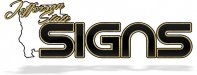
My new Logo/Company name
- Thread starter Warlick Designs
- Start date
shoresigns
New Member
That's two threads I've seen today where the geographical shape of the state is used in the company logo. Why not base the logo on something more meaningful? I'm sure there's something more interesting about your regional identity than the shape that your border makes on a map.
Biker Scout
New Member
Is that an upside down "U"?
Warlick Designs
New Member
lol thanks for the welcome..
no its not an upside down "U"
Im sure there are there are more interesting things aside from the shape of a state but "Jefferson state" is obviously not a real state with real borders.. the point im trying to make with the logo is that these are the counties I serve "Northern CA" I could go main stream and call it "Nor-Cal" signs.........
J Hill Designs
New Member
Jefferson state is 'trying' to become reality...I'm sure you know this.
edit: quite a controversial topic to be naming your company after...
edit: quite a controversial topic to be naming your company after...
Biker Scout
New Member
There are already plenty of Nor-Cal Signs around. I used to own a business there.
I know it's not really a "U"... just never been a fan of that font. Or any font that mixes upper case with lower case. There are some quirky, hipster, eco type exceptions. But for a sign shop, typography and display lettering should be everything.
Anyway, your cute little insurrection upstate aside... no one outside of that specific region even knows that a few neighboring Oregon counties in conjunction with some northern Californian counties want to form their own 51st state. There are so many other things you can use as part of your logo that exemplify the area in which you serve. Redwoods to Mt. Shasta, there is so much in between.
(When the gob't comes in and institutes martial law, they will take note of anyone displaying an outright affront to the NWO. Jefferson State will stick out like a confederate flag and mark you as "Red Label" for the FEMA camps! :ROFLMAO:
Warlick Designs
New Member
True there are plenty of things around here I could use instead but... the sun dial has been WAY over used, Mt. Shasta even more over used, the redwoods aren't a bad idea but personally I prefer not to look like another logging company.
It may be a bit controversial but im not a news reporter or trying to change any political views.. im merely a sign shop that operates in what could/would be "Jefferson State" lol
I wasn't serious about the "nor-cal" thing frankly im sick of seeing nor-cal all over everything around here..
It may be a bit controversial but im not a news reporter or trying to change any political views.. im merely a sign shop that operates in what could/would be "Jefferson State" lol
I wasn't serious about the "nor-cal" thing frankly im sick of seeing nor-cal all over everything around here..
Biker Scout
New Member
How about the double XX thing and call yourself XXTreme Signz!
Warlick Designs
New Member
lol ill pass
DesireeM
New Member
For the name I'd say it's fine...sometimes the name makes the business but sometimes the business makes the name BUT I would caution you not to accidentally alienate any potential customers... It's best to keep your political views to yourself.
Why not just "Jefferson Signs"?
As for the logo itself I think it could use some refining. Here are some notes (take em' or leave em')
-The state outline is barely visible - either make it more of a prominent part of the logo or remove it altogether. It's just junking things up.
-The word "SIGNS" is way too big in relation to "Jefferson State"
-The font used for "Jefferson State" is hard to read.
-I'd get rid of the texture in the yellow(gold?) areas - makes it look dirty.
-The "n" really takes the focus and it shouldn't. My eye is drawn to it like it should represent something but it doesn't. A more traditional "n" would be better.
Also , the word "Jefferson" looks like it's going to fall...like tilt off the left-side of the logo. I think it needs to be balanced. So that the 2nd "e" sits on top of the "S" in "State".
shoresigns
New Member
I had to look up what "Jefferson State" was. I'm not American though. If it's that controversial, maybe just go with "Jefferson Signs" as someone else suggested?
Back to the logo though. Do some brainstorming, sketch out any ideas you can come up with and bring them back here to show us. If the logo is for your own company, I really think you should put more work, more ideas and more creativity into it. Either that, or hire someone to design it, who will.
Back to the logo though. Do some brainstorming, sketch out any ideas you can come up with and bring them back here to show us. If the logo is for your own company, I really think you should put more work, more ideas and more creativity into it. Either that, or hire someone to design it, who will.
Warlick Designs
New Member
I do appreciate the input. However, as far as the name itself goes "jefferson signs" isn't in any way appealing to me. Im honestly not to worried about it being a controversial issue due to the fact that I live in Northern CA and "most" people up here would prefer to be separated from the rest of CA and its insane taxes/regulations.
The "gold" when I do the company vehicle wraps will be a gold foil same w/ business cards and so on.. it might not look as good on screen tho...
I really want the word SIGNS to stand out so thank you for noticing that it does just that") I might consider changing the style of the N tho..
I might consider changing the style of the N tho..
I do agree that its best to keep my political views to myself but I'm not going out screaming "CHANGE THE STATE" Im just using it in reference to Northern CA.. a lot of companies are beginning to do the same and have not had any issues with existing or new customers. (I did a little homework on the name)
The state outline your correct on but I won't be using a white background for the wraps, cards etc.. (I should have mentioned that before)
also.. this is my "sign" logo not a logo I'm using for the design side of my company. I want it to be looked at as easy to notice that I do signs. Ill be making a new logo for design work soon but I don't plan on paying anyone to do what I get paid to do lol
The "gold" when I do the company vehicle wraps will be a gold foil same w/ business cards and so on.. it might not look as good on screen tho...
I really want the word SIGNS to stand out so thank you for noticing that it does just that
I might consider changing the style of the N tho.. I do agree that its best to keep my political views to myself but I'm not going out screaming "CHANGE THE STATE" Im just using it in reference to Northern CA.. a lot of companies are beginning to do the same and have not had any issues with existing or new customers. (I did a little homework on the name)
The state outline your correct on but I won't be using a white background for the wraps, cards etc.. (I should have mentioned that before)
also.. this is my "sign" logo not a logo I'm using for the design side of my company. I want it to be looked at as easy to notice that I do signs. Ill be making a new logo for design work soon but I don't plan on paying anyone to do what I get paid to do lol
Stanton
New Member
Jefferson state is 'trying' to become reality...I'm sure you know this.
That's what I was thinking.....
Warlick Designs
New Member
That's what I was thinking.....
we shall see
Warlick Designs
New Member
Biker Scout
New Member
No, there are at least a dozen other fonts that have the same look and feel, but aren't trying to mimic the NASA font. Just keep searching the fonts. (DaFont under SciFi is a good start to hunt for a match)
And if it's your "Sign" for your business, then you should make it your Logo. If you intend for the logo to be on a dark background and reverse letters, then have your sign look like that too. Especially if it's backlit. Even if it's not backlit, reverse letters can be read from further away.
And if it's your "Sign" for your business, then you should make it your Logo. If you intend for the logo to be on a dark background and reverse letters, then have your sign look like that too. Especially if it's backlit. Even if it's not backlit, reverse letters can be read from further away.
Biker Scout
New Member
Logos are hard, especially one's own logo. Takes real thought and planning. Many stages of development. Hashing and re-hashing. Getting other's opinions is sometimes very helpful.
shoresigns
New Member
mind = blown
Beat me to it.
 I get so tired of helping people sometimes.
SignManiac
New Member
I wish I could comment with a clear conscious, but I can't. 
Warlick Designs
New Member
No, there are at least a dozen other fonts that have the same look and feel, but aren't trying to mimic the NASA font. Just keep searching the fonts. (DaFont under SciFi is a good start to hunt for a match)
And if it's your "Sign" for your business, then you should make it your Logo. If you intend for the logo to be on a dark background and reverse letters, then have your sign look like that too. Especially if it's backlit. Even if it's not backlit, reverse letters can be read from further away.
thats where I gathered this font up
ill take a look lol but I still like this font even if it seems to resemble NASA. It will indeed be my signs and logo & your right about the revers letter.. the colors will be reversed based on what I'm printing/making but the overall logo/sign I intend on keeping the same for a long time. Unless this whole political thing kills my business Im pretty sure there are numerous sign companies that call themselves "USA sign co." etc... what I have is really no different
Joe Diaz
New Member
I was always told to avoid talking politics and religion with customers. You plan on naming your business after a political topic. You have to ask yourself, is getting your political opinion out there as important as attracting as many clients as you can? Like most topics similar to the one that influenced your new name, you are going to run into folks that appose your point of view. They may not do business with you because of it. They may make assumptions about the rest of you beliefs based on this one thing. I'm not saying that's right, but it is a reality. The question then shouldn't be: "Am I going to attract more customers than I scare off with this name?" It should be: "Could I attract more customers with a completely different name that has nothing to do with politics, and avoid scaring off people all together?" Also keep in mind politics change over time. Is this name going to stand the test of time?
Biker Scout
New Member
If you've ever been to Northern California, then you'd understand that "those people up there" are in no way of running off any business by being all tea party/patriot/succeed from the union/start our own state types. They pretty much stick together and will shop at each other's establishments well before going "into town" to that fancy WalMart and avoiding dem der "City Slickers"
Plus they are part of the "Green Triangle" and once the stuff is legalized, and it will be, they just want to be one step ahead and not have to send their taxes down to Sacramento, where they'd literally do no good for the locals up there. Which is really destitute. Especially since the fishing industries have dried up, and all the leftist tree hugging wackos have basically killed the logging industry. They really are a state unto themselves up there. That area is literally a void, hundreds of miles between two large metropolitan centers, and state capitols.
Plus they are part of the "Green Triangle" and once the stuff is legalized, and it will be, they just want to be one step ahead and not have to send their taxes down to Sacramento, where they'd literally do no good for the locals up there. Which is really destitute. Especially since the fishing industries have dried up, and all the leftist tree hugging wackos have basically killed the logging industry. They really are a state unto themselves up there. That area is literally a void, hundreds of miles between two large metropolitan centers, and state capitols.