-
I want to thank all the members that have upgraded your accounts. I truly appreciate your support of the site monetarily. Supporting the site keeps this site up and running as a lot of work daily goes on behind the scenes. Click to Support Signs101 ...
You are using an out of date browser. It may not display this or other websites correctly.
You should upgrade or use an alternative browser.
You should upgrade or use an alternative browser.
New logo
- Thread starter stoneandtle
- Start date
J Hill Designs
New Member
<shudder>
stoneandtle
New Member
<shudder>
Looks that bad?
Jet Fast Printing
New Member
I don't mean to sound rude AT ALL (my logo ain't the best either)
Start over.
Start over.
stoneandtle
New Member
I don't mean to sound rude AT ALL (my logo ain't the best either)
Start over.
What parts of it don't you like? Is it the colors? The layout? Or just everything in general?
Locals Find!
New Member
I can barely see the car and the blue is too light. Just my two cents.
I'm kind of dumbfounded....how did you get into wraps? Wraps is not entry level work, that logo looks worse than most high school art I see.
I'm just...dumbfounded bro.

WildWestDesigns
Active Member
I would also say bring out the car as well.
SignManiac
New Member
I think you would do better to hire a professional than try to glintch your own together. Just because you can wrap, does not mean you can design a logo that would serve you better.
John Butto
New Member
get some attention
ouch...
ouch...
Gino
Premium Subscriber
I get the idea of the fades and maybe even the color combinations, but they don’t work with all of your ideas scrunched into one design. You have too many things going on. Effects, bad colors, wrong contrast for lettering to color background, wrong elements emphasized, poor choice of fonts and doesn’t pass the squint test for any part. Take it into grey scale and you’ll get an idea of color usage. As far as shape combinations… you’ll have to experiment some more.
Jet Fast Printing
New Member
What parts of it don't you like? Is it the colors? The layout? Or just everything in general?
The colors seem 1990's to me. Diamond plate is way overused, and the car gets lost.
again, I am NO master designer, just my thoughts.
michsanford
New Member
I think it is just too much...and not very fond of the colors.
J
john1
Guest
IMO start over and i would focus more on the Paint Protection Film wording. Make that your main copy and the business name your sub copy since it really doesn't mean anything of paint protection film to me anyway
petesign
New Member
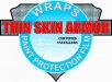
I like the shield. Ditch the blue on top, and make thin skin armor take up the shield. Ditch the diamond plate, and make it metallic.
I see what you are trying to go for, but it's like you took two logo ideas and put them together into one. One thing I have learned on here is to keep it SIMPLE.
Just a quick simple thing.. not sure how you would incorporate wraps in it.. But it's cleaner if you want to go the shield route. I am by no means designing along the lines of the many great artists you see here, but maybe this could help steer you in another direction.


