stoneandtle
New Member
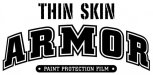
This explains it all for your ultimate protection.
That'll be our next product line...
This explains it all for your ultimate protection.
Try something more along this line.
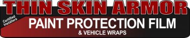
I was thinking of using a picture at the bottom that outlines where the paint protection film would cover...maybe when I update the picture below it may help it come together more than the silhouette that's there currently.
My thought was you would read 'paint protection film'...then follow down to 'thin skin armor' to reinforce protection in your mind...then finally down to the picture that shows the areas of the car outlined that would be protected. So it is leading you top to bottom...but I see I may need to work on how to close the logo toward the bottom like you suggested.
I actually hadn't thought of it being a downward pointing arrow until you mentioned it...I only saw a 'triangle'.")
Some advice I would throw out there is to stay away from photos in your logo. Think simple. Also, you should print out your designs both small and large when designing. Look at it say...an inch big. Can you read everything? If not, your viewers won't either if at a distance.
Check out Wiliams Signs' example. Something like that is on the money. SIMPLE! The "ARMOUR" is big and bold, perfect. "thin skin" is a thinner, slightly smaller typeface. Then a simple line drawing illustrating the concept of your product. Plus, it can be read both big and small.
Try and use that as inspiration...it really is a solid direction.
Try and use that as inspiration...it really is a solid direction.
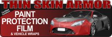
Here's a version using a different format that I think helps with the heirarchy problem that was mentioned. It also pulls the car in to the logo a little better I think and makes it easier to identify what the paint protection covers using the bold "PAINT PROTECTION FILM" as well as the identifying marks on the vehicle. I think it also helps pull the black outline around the name into the logo.
Thoughts?
I liked the way that logo looked, but the first thing that came to mind when I saw it was CAR COVER. Isn't that what you would think at first glance?
As much as I don't want to use a photo, I don't think there's another way to convey what this product is other than using an actual photo to help convey the idea that it's film on select areas of the vehicle. The only problem I have with the picture right now is trying to find a way to let people know it's not colored - it's completely clear, practically invisible. I want to change the semi-transparent color from 'red' to a color closer to the vehicle, but I'm not sure anyone will see it very easily if I do that.
I will most likely make a version without the vehicle in it for very small versions of the logo - like letterheard, basically shrink it from the bottom to the top and flatten the text so it reads from left to right. Something like this...see photo.
I know it's cheesy but it's somewhat iconic.
One more in the ring.