iSign
New Member
Nice designs Heath.
+1
Nice designs Heath.
Thanks guys...had to play a little more.
ARMORdillo....or rat armor?
Mine fails at most of the advice already given, but I think more than one winning layout has already been posted so this was just for the practice.
wayne k
guam usa

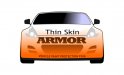
Ok, I took a lot of the advice offered. I removed the vehicle and the "extra" stuff that didn't seem necessary like the "certified installers" tag.
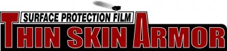
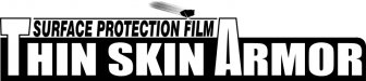
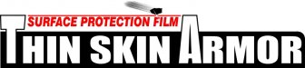
I think this is pretty basic, but gets the point across without being too specific. I went with a flying rock that hits a surface above the logo to show protection from 'what' and changed the keyphrase to "SURFACE PROTECTION FILM" so as to be not specific to vehicles (mentioned in one of the posts as being too specific to a particular product which I have to agree with).
The armadillo one looks really good though...that one has a lot of potential. And the one with the orange center with the peelback looks pretty cool too!
How do either of these look?
Ok, I took a lot of the advice offered. I removed the vehicle and the "extra" stuff that didn't seem necessary like the "certified installers" tag.
I think this is pretty basic, but gets the point across without being too specific. I went with a flying rock that hits a surface above the logo to show protection from 'what' and changed the keyphrase to "SURFACE PROTECTION FILM" so as to be not specific to vehicles (mentioned in one of the posts as being too specific to a particular product which I have to agree with).
The armadillo one looks really good though...that one has a lot of potential. And the one with the orange center with the peelback looks pretty cool too!
How do either of these look?
Heath, I like what you did.
Tiki, outstanding as ever.
Stone, have you read anything that anyone has suggested?
It looks like the same typed text.
No contrast on the first one and no appeal on any of them.
Not trying to be mean, just being honest.
Avery Nano-fusion uses a VERY similar rock-bounce graphic in their marketing material - I dont know if that might present a conflict...are you using their film?
") However, I kind of like the larger "A".
However, I kind of like the larger "A".much better in my opinion...
show us with a real "O" in that same font & size, then convert to outlines, and node edit to remove the circular knock out of the O center, and replace with the shield shape.. add "protection" text... this one could stand alone in black & white too
I can barely see the car and the blue is too light. Just my two cents.