-
I want to thank all the members that have upgraded your accounts. I truly appreciate your support of the site monetarily. Supporting the site keeps this site up and running as a lot of work daily goes on behind the scenes. Click to Support Signs101 ...
You are using an out of date browser. It may not display this or other websites correctly.
You should upgrade or use an alternative browser.
You should upgrade or use an alternative browser.
New logo
- Thread starter stoneandtle
- Start date
SignManiac
New Member
Not sure what you mean Adrian?
stoneandtle
New Member
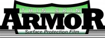
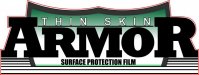
An orange/yellow combo looks good to me. Straight yellow washes out the 'thin skin' text. Green doesn't look bad either; I think I actually like green the best now.
Regarding the line weight of the end characters, I'm not sure if thinning the character lines will make it look correct. I tried a little of that last night, but the characters didn't look correct afterward - looked disproportionate. I could stretch the letters upward, but then they look different, and everyone here has drilled me over a dozen times on stretching any text so I've tried to completely avoid doing that.
Regarding the line weight of the end characters, I'm not sure if thinning the character lines will make it look correct. I tried a little of that last night, but the characters didn't look correct afterward - looked disproportionate. I could stretch the letters upward, but then they look different, and everyone here has drilled me over a dozen times on stretching any text so I've tried to completely avoid doing that.
Attachments


iSign
New Member
looking good David!!
the THIN SKIN text could be outlined too... still very thin, but a black outline defining that thin weight font... even leaving yellow showing through, instead of the white, to keep it subtle... or not...
I'm workingon something, but here's the tweaked main copy i got so far
the THIN SKIN text could be outlined too... still very thin, but a black outline defining that thin weight font... even leaving yellow showing through, instead of the white, to keep it subtle... or not...
I'm workingon something, but here's the tweaked main copy i got so far
Attachments

signmeup
New Member
Not sure what you mean Adrian?
The font for "armor".
stoneandtle
New Member

stoneandtle
New Member

iSign
New Member
I gotta go open my shop now, but like i said I think your idea is your best yet & it's looking pretty good... and the most appreciated help i ever got around here was helping ME tweak MY ideas... and you got one worth finishing in my opinion.. so I'm just throwing ideas at that layout because i think it could help you keep taking what you got & trying new things to it...
so, what was bugging me is the half shield... but i like the lines at the bottom... sorta makes me think of a overlaminate protective film already... I tried to get the rest of the shield in there & further the thought of an overlaminate... I was going to try to get the secondary copy under the flipped up shield, but i'm out of time..
so, what was bugging me is the half shield... but i like the lines at the bottom... sorta makes me think of a overlaminate protective film already... I tried to get the rest of the shield in there & further the thought of an overlaminate... I was going to try to get the secondary copy under the flipped up shield, but i'm out of time..
Attachments

ForgeInc
New Member
In my humble opinion, the cut off shield isn't working, nor does it add anything to the concept of the logo. I think you could lose the shield entirely, lose the lines at the bottom, then convert the "surface protection film" to all caps. You'd be close, and it would be SIMPLE! I think the thin type @ top and bold "armor" type could be enough to get the concept of your business across. I would try the above ideas, then maybe also try adding "vehicle" or "automotive" before the type at the bottom as another option. It's getting there, way to keep with it.
EDIT: Isign's idea definitely helps with the cutoff thing...but you might still look at my suggestions above. Keep at it!
EDIT: Isign's idea definitely helps with the cutoff thing...but you might still look at my suggestions above. Keep at it!
SignManiac
New Member
The font for "armor".
Ahh, Batman Forever alternate
stoneandtle
New Member
I gotta go open my shop now, but like i said I think your idea is your best yet & it's looking pretty good... and the most appreciated help i ever got around here was helping ME tweak MY ideas... and you got one worth finishing in my opinion.. so I'm just throwing ideas at that layout because i think it could help you keep taking what you got & trying new things to it...
so, what was bugging me is the half shield... but i like the lines at the bottom... sorta makes me think of a overlaminate protective film already... I tried to get the rest of the shield in there & further the thought of an overlaminate... I was going to try to get the secondary copy under the flipped up shield, but i'm out of time..
Ohhhh I see what you're saying now. Hmmm...I'll play with that and see where that goes. Nice one!
stoneandtle
New Member
It really sucks that there's no end to the possibilities, which makes it even harder to decide on one only? I boils down to personal taste I guess. Here's one more that popped into my head. If I were spending more time on it, I would modify the bottoms of the ribbon panel to something more linear.
There sure are a lot of great ideas being shown.
Kind of reminds me of a college fraternity...a very socially active fraternity...
John Butto
New Member
my take
like my first post, "like the drink but spelled different"
like my first post, "like the drink but spelled different"
stoneandtle
New Member
Well I made adjusts to the sizing of the lettering to make them look more equal in dimension; however, I didn't have much success in finding something to do with the "bottom" of the shield. Everything I tried either didn't fit the perspective (needed more angle) or left me unsatisfied. My initial thoughts of the bottom peel back, like the shield is a sticker, looked like it might work, but the more I'm looking at it...I'm just not sure anymore.
I think the letter sizing looks better as suggested by iSign.
I added a few more bars below the bottom of the shield, and now it kind of looks "flat" like it's coming up between the bars. Not sure if I'm fond of it or not though...
I was just looking at this logo again, and realized that the phrase "Surface Protection Film" and the image of the shield essentially on a surface (with those two extra lines) go hand in hand. Unless someone sees something really wrong with those two extra lines, then I think this might be it...I just have to stop looking at it and making changes LOL
Attachments
Last edited:
Service Sign Co
New Member

stoneandtle
New Member
Great work, The ideas have evolved well. Here's another take on it
Which software package are you using to simulate the silver effects?
stoneandtle
New Member
CG I am going to do a Boston Truckstyle intervention on you.
(I bet you also like Bleeding Cowboys...huh! Huh?)
Stone I think you have made a 100% improvement from where you started.
No more typed text look.
Halleluia!
Try the bottom line in all-caps Impact, no slant.
I'm going to try all-caps Impact later today, and I was thinking maybe adding some 'bullets' or stars within the shield outline to differentiate it from the letters a little and see how that looks.
...got caught up with a bachelor party since Friday...you know how that goes LOL
stoneandtle
New Member
Jill - here's what it looks like with the Impact font and all caps. I have to agree with you on this, after looking at it like this, I like it better than the italic font I was using. Thanks for the tip!
I also lightened the shield border a little to separate it from the black letters; I wanted it to look subtle, not a stark contrast to the letters sitting on it, but enough that it's noticeable.
The red outline is the cut path I'll be using when creating stickers of the logo. I'll add the web address and/or phone number beneath the entire logo before creating the sticker.
edit - I think a blue gradient shade with the words at the bottom a little larger with a white outline looks better to me.
...the one positive to paying someone else to make stuff for you is that you know it's finished after you pay for it, because it's pretty rare that you would take it back in a few days to get re-worked again because it's going to cost you. BUT, if you end up doing it yourself, you get this compulsive drive to keep wanting to make it better, and it seems it's never "done" (if there is such a thing). HOWEVER, I think THIS is the final one
Attachments
Last edited: