phototec
New Member
I think if you use a shield, then it must be complete
The final ONE, wow, I hate to tell you this but it doesn't look very good to me. I don't think the half-shield works at all and I don't like the horizontal lines at the bottom. The half shield, looks like a piece of toast coming up out of a toaster (the horizontal lines). Or like the bottom of the shield is missing.
Many folks on here have given you guidance and suggestions, however, I think you are dead set on using this design, I not going to blow smoke up your arse, I'm going to shoot straight and tell you like it is, and the fact is the last version is not very good.
I'm just trying to help you, and as mentioned in many, many posts as of late, some folks just can't see the difference between a good or bad design, meaning, they look at this latest version and say it's great.
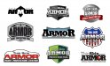
What I would like to suggest is, look at the attachment, which includes many different designs and compare them to your latest version, the one design element that stands out on yours compared to all the others, it just doesn't look complete, looks like something is cut-off at the bottom.
I think if you use a shield, then it must be complete, not just the top half!!!!
Many of the other examples look better then yours (IMO), and the example above, below and to the right also read better, I can't read "Thin Skin" on your version.
Don't forget, colors can be changed if you don't like the colors.
Just my 2 cents worth.
HOWEVER, I think THIS is the final one
The final ONE, wow, I hate to tell you this but it doesn't look very good to me. I don't think the half-shield works at all and I don't like the horizontal lines at the bottom. The half shield, looks like a piece of toast coming up out of a toaster (the horizontal lines). Or like the bottom of the shield is missing.
Many folks on here have given you guidance and suggestions, however, I think you are dead set on using this design, I not going to blow smoke up your arse, I'm going to shoot straight and tell you like it is, and the fact is the last version is not very good.
I'm just trying to help you, and as mentioned in many, many posts as of late, some folks just can't see the difference between a good or bad design, meaning, they look at this latest version and say it's great.
What I would like to suggest is, look at the attachment, which includes many different designs and compare them to your latest version, the one design element that stands out on yours compared to all the others, it just doesn't look complete, looks like something is cut-off at the bottom.
I think if you use a shield, then it must be complete, not just the top half!!!!
Many of the other examples look better then yours (IMO), and the example above, below and to the right also read better, I can't read "Thin Skin" on your version.
Don't forget, colors can be changed if you don't like the colors.
Just my 2 cents worth.

 I'm REALLY liking this thread!! It's interesting to see the exchange of information and the evolution of the design!