• I want to thank all the members that have upgraded your accounts. I truly appreciate your support of the site monetarily. Supporting the site keeps this site up and running as a lot of work daily goes on behind the scenes. Click to Support Signs101 ...

Question Should I Dare Ask?

Status
Not open for further replies.

chester215

Just call me Chester.
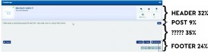
I have a +- 20" monitor, and 1 maybe 2 posts show up on a page meaning a lot to scroll thru.
Ad block warning is pretty annoying, I don't think I would become a paid member just to get rid of them.
I just visit the site less.
 

Johnny Best

Active Member
"It looks great
dress.jpg
."
 

bob

It's better to have two hands than one glove.
No your 100% incorrect, I will not tolerate person attacks or disparaging of people I put in place to do the work. When there was constructive comments we promptly complied. But every conversion turned into nitpicking and arguing over how I run my business.

So then if you hired Vlad the Impaler you'd not tolerate anyone pointing out that your employee is somewhat less than a nice guy? Or, if you hire an overly defensive inept dofus to rebop a web site you'd be somewhat less than forbearing of anyone taking note of this?

Which is more important to you? Revenue or fretting over what someone might say about someone else? Only via tortured reasoning can one be related to the other.

The phrase 'constructive criticism' general is a warning that effusive praise is sought, not honest opinions. And the latter will be dealt with harshly.

Some visit these waters seeking information, others seeking entertainment. Often a little of both. What does it matter why anyone should attend as long as they do attend. A lively discussion is vastly more interesting that someone complaining that their cyan head isn't working. Perhaps not for everyone but for most other than those terminally serious specimens that are only dimly aware of their own existence.
 

Pauly

Printrade.com.au
It's "ok"
I also don't understand why everything is so big. It's like it accommodates for a touch screen. Fair enough if i was on my ipad, but i'm on my 13" macbook pro. I'm sure there's a tabled mode somehow.
If i had a choice between this layout and the original one. I would go back to the original one. Ok, it was a little outdated but it's a forum. browsing the forum should be all about finding threads and reading post. Not eye candy.
Right now i can only see 1 post at a time which i find annoying.
Also it took me about a week to realise that icon to the left of "Home" is to navigate sub forums. It would be nice if the sub forms had their own page by 1 click from the top bar, not a popup... Cannot see if there's any new post in specific sub forums ect. It's a forum right?

That's my 2c.
 

Silvertip

Silvertip Graphics Signs & Designs, Inc.
I too don't like that I can't seem to readily find posts that I have posted or commented on...those are what I want to check first and while I have eventually found them and adjusted my preferences it does seem clunky. Also, the replies do seem to take up a whole lot more space so scrolling thru is less likely to keep me here. I had to chuckle over the "nitpicking of how I run my business comment"......welcome to Signs101. That more than any other single issue has what has kept me from this forum more often than not. I will still keep coming though as overall when I do post or read thru for helpful input on others posts I do find that I usually find at least something that is genuinely helpful from one member to another member looking to help or better each others business.
 

Marlene

New Member
when I click "home" I get one page of threads. I have to click "new unread" to get an option to go thru the pages. I don't want to have to read the "how to" instructions for the simple functions, I just want to be able to log on and read. is there a better to get the most recent and be able to go thru the pages for the lessor? also the other day I tried to upload a file for a font ID when I posted a thread. I had to answer my own thread with a file as it was the only place where upload a file was clear.
 

Marlene

New Member
well, I answered one of my own questions as I clicked home and the drop down menu has the recent posts with the pages option. seems like that should be the default
 

Signs101Admin

Owner
Staff member
I too don't like that I can't seem to readily find posts that I have posted or commented on...those are what I want to check first and while I have eventually found them and adjusted my preferences it does seem clunky. Also, the replies do seem to take up a whole lot more space so scrolling thru is less likely to keep me here. I had to chuckle over the "nitpicking of how I run my business comment"......welcome to Signs101. That more than any other single issue has what has kept me from this forum more often than not. I will still keep coming though as overall when I do post or read thru for helpful input on others posts I do find that I usually find at least something that is genuinely helpful from one member to another member looking to help or better each others business.

If you hold you mouse icon over your username in the upper right than click on "your content" there you will find all your posts.

I'm sorry that my comment bothered you, may I stop by your business and tell you how to run it one day? Of course you have taken out of context....
 

Signs101Admin

Owner
Staff member
when I click "home" I get one page of threads. I have to click "new unread" to get an option to go thru the pages. I don't want to have to read the "how to" instructions for the simple functions, I just want to be able to log on and read. is there a better to get the most recent and be able to go thru the pages for the lessor? also the other day I tried to upload a file for a font ID when I posted a thread. I had to answer my own thread with a file as it was the only place where upload a file was clear.

At the top of EVERY page is a "new unread posts" button.
 

Signs101Admin

Owner
Staff member
It's "ok"
I also don't understand why everything is so big. It's like it accommodates for a touch screen. Fair enough if i was on my ipad, but i'm on my 13" macbook pro. I'm sure there's a tabled mode somehow.
If i had a choice between this layout and the original one. I would go back to the original one. Ok, it was a little outdated but it's a forum. browsing the forum should be all about finding threads and reading post. Not eye candy.
Right now i can only see 1 post at a time which i find annoying.
Also it took me about a week to realise that icon to the left of "Home" is to navigate sub forums. It would be nice if the sub forms had their own page by 1 click from the top bar, not a popup... Cannot see if there's any new post in specific sub forums ect. It's a forum right?

That's my 2c.

I'm working on the site being to big I do not like that as well. Not sure were you see eye candy...
 

shoresigns

New Member
I think because of all the blocks on the left, it makes everything huge. a 1 line reply takes up as much space as a 30 line reply. I can get 2 posts per screen, in 1920x1080 resolution.

It's never really "bugged" me, but it does seem pretty low.

This is the biggest design issue with the new forum, IMO. Overall I like the new design and it didn't take long to get used to the new interface.
 

FatCat

New Member
It has been quite the change. Anyone used to visiting here for more than a few years is going to need time to digest the look and feel. I'm still fumbling around and I consider myself fairly tech savvy. That said, overall the new site is OK, I do like looking at posts in the horizontal vs vertical option - seems to take up a little less space. But still seems like a lot of space is wasted with the way this template works. Even on my 27" iMac I can usually only see 2-3 posts in a thread at a time, seems like an awful lot of wasted space....but just my opinion.

Also, I have noticed many have left - will stick around and hopefully continue to see improvements as we go forward.
 

Jburns

New Member
I am happy with the layout - speed etc. However I receive this warning upon every visit. I am not sure why. Internet Explorer 11.0.9 -

upload_2017-2-27_12-1-5.png
 

Attachments

  • upload_2017-2-27_11-58-59.png
    upload_2017-2-27_11-58-59.png
    280.8 KB · Views: 203
  • upload_2017-2-27_11-59-45.png
    upload_2017-2-27_11-59-45.png
    280.8 KB · Views: 157

legacyborn

New Member
The horizontal layout is better! I still feel there is a lot of wasted space. On most posts which are 1-2 lines, the actual post is less than 10% of the content taking up page space. not sure if anything can be done about it, but this is one of my issues.
 

Attachments

  • Spacing.jpg
    Spacing.jpg
    615.4 KB · Views: 133
Status
Not open for further replies.
Top