-
I want to thank all the members that have upgraded your accounts. I truly appreciate your support of the site monetarily. Supporting the site keeps this site up and running as a lot of work daily goes on behind the scenes. Click to Support Signs101 ...
Search results
-

-
-

Is there a font ceiling in Win 7?
We have finally went to Win 7 with one of our design stations and we keep running into what seems to be a limit on the number of fonts installed -- about 570.... Anyone else seen this? Also, even with no. of fonts under this "limit", fonts still get dropped from the list at random times...- oldgoatroper
- Thread
- Replies: 4
- Forum: General Software
-
Post your scam emails...
Heh, heh... Let's see... there's Tomato Red, Cardinal Red, and now folks, there's Somehow Red...- oldgoatroper
- Post #49
- Forum: General Chit-Chat
-
Customer wants mags all over van, How can i handle this?
Heh, heh.... I've actually said to a customer (one I knew well)... "I'll do [whatever] for you, as long as you promise never to tell anyone where you got this... "- oldgoatroper
- Post #23
- Forum: General Signmaking Topics
-
Domain Name Registration Only - On the Cheap?
domainsatcost.com (I use the Canadian counterpart domainsatcost.ca) Great hosting is available at siteground.com- oldgoatroper
- Post #9
- Forum: General Chit-Chat
-

-
Stumped by this font...
Tim... I'm not 100% certain on this but I think Triple E has had this logo since I was a kid... which might mean it isn't really a font... ...but you never know...- oldgoatroper
- Post #2
- Forum: Fonts and Typography
-

-

Font ID
Futura Md BT stretched -- the G is a bolder weight of the same font, obviously stretched as well..- oldgoatroper
- Post #2
- Forum: Fonts and Typography
-

Winnipeg Jets
Not meaning to rub it in, but... It's starting to look like Atlanta is a place for growing NHL teams for Canadian cities... :) As far as the logos go, they look great, except the roundel just might be tooooo close to the actual Canadian military roundel for my tastes... but that's just me...- oldgoatroper
- Post #5
- Forum: Logo Design
-

-
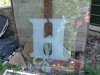
"H" for a glass etcher friend
looks to be like Raleigh XBd BT but upside down and from behind -- possibly even outlined a bit...- oldgoatroper
- Post #2
- Forum: Fonts and Typography
-

embroidered font help
Lowercase letters look like Uncial that has been modified a bit and squished... the cap G's look very familiar but can't remember..- oldgoatroper
- Post #2
- Forum: Fonts and Typography
-

Font ID help
The capital letters (H & G) are Vivaldi -- the lower case letters.. its hard to tell... <edit> the lowercase letters are very squished Palatino Italic- oldgoatroper
- Post #2
- Forum: Fonts and Typography
-

-
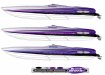
From Fast Boats to Slow logos :)
I like the GWD. I don't like the stretched Avant Garde type below it... (or is that Century Gothic?) Whatever. No distorted type. Ever. Especially in a logo. ... my two cents <edit> ...and by the way, welcome to S101... :)- oldgoatroper
- Post #2
- Forum: Logo Design
-
Best vector for the $$
So, are you saying that Irritator actually has an import filter for CDR files? And that the resultant graphic is crap? So, who's fault would that be? Adobe's or Corel's? Come to think of it, that would be smart on Adobe's part. Sour the users away from the competition...- oldgoatroper
- Post #60
- Forum: General Software
-

Nice Tools for Cutting Coroplast
We have had a KeenCut Javelin (104") for about seven years, now. It came with a box of maybe two dozen awesome blades... I just counted them and I have about 18 left. Should be good for a while...- oldgoatroper
- Post #34
- Forum: Tips & Tricks
-
Yo......... Canadians..................
A french military friend of mine who feels the same way you do once told me that the cost of translating all the the manuals of all of the systems on Canada's frigate program (supplied by the manufacturers in English) to French was the same as the purchase price of of a single complete frigate...- oldgoatroper
- Post #11
- Forum: General Chit-Chat
-
Yo......... Canadians..................
Tim, We do have prime ministers on our 50s and 100s -- at least that's what I'm told....- oldgoatroper
- Post #9
- Forum: General Chit-Chat