-
I want to thank all the members that have upgraded your accounts. I truly appreciate your support of the site monetarily. Supporting the site keeps this site up and running as a lot of work daily goes on behind the scenes. Click to Support Signs101 ...
Search results
-

Font ID request
Verdana <edit> Oh, now you put up a pic... definitely not Verdana- oldgoatroper
- Post #2
- Forum: Fonts and Typography
-
-

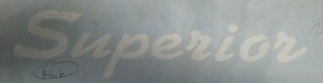
Please Help with this font.
Upon a closer look, I agree...- oldgoatroper
- Post #5
- Forum: Fonts and Typography
-
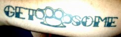
Please Help with this font.
Mesquite that has been stretched out a bit...- oldgoatroper
- Post #3
- Forum: Fonts and Typography
-

Fonts not to use?
Yes, I can see what you mean, but I've never used it that way... for me, always on signage, when I want to "upgrade" from TNR... the slightly thinner strokes look fine at 2 or 3 inches printed on coro. Most people just assume its "that Times font", but it just has a classier feel to it.- oldgoatroper
- Post #12
- Forum: Fonts and Typography
-
Font ID Help
NJ, you seem to hit the real obscure ones quite often... Great job...- oldgoatroper
- Post #5
- Forum: Fonts and Typography
-
Font ID Help
It looks to be inspired by the font Broadway -- but that M is probably the product of the tat artists imagination...- oldgoatroper
- Post #2
- Forum: Fonts and Typography
-

Font or Custom Lettering?
Its mechanically centered, but it sure isn't optically centered... and even though it still looks nice, the off-center thing still bugs me...- oldgoatroper
- Post #4
- Forum: Fonts and Typography
-
Fonts not to use?
Fonts I never use.... Souvenir (long story) Arial (The Scourge of Arial) Comic Sans (Ban Comic Sans) Papyrus Bleeding Cowboy <edit> Brush Script Fonts I hardly ever use: Avant Garde Times New Roman Helvetica Fonts I use a lot: Galliard Arno Myriad Frutiger Also, anytime...- oldgoatroper
- Post #3
- Forum: Fonts and Typography
-
Powerpoint files
actually, the best you can hope for is to have them lay it out to scale and any images are not to be downsampled or compressed when creating the PDF for you...- oldgoatroper
- Post #3
- Forum: General Signmaking Topics
-
Powerpoint files
hahahahahahahahahaha PowerPoint hahahahahahahahahaha- oldgoatroper
- Post #2
- Forum: General Signmaking Topics
-
Tough One...
The two r's are different -- likely hand done or badly traced. This really looks like it started out as Kaufmann BD BT (the S is from something else) and was simplified...- oldgoatroper
- Post #2
- Forum: Fonts and Typography
-
-
Wireless Network Bridge
But the wireless part of it is not being used? If so, then see my other reply... Otherwise you should be able to pick up an 8-port switch for about $30-40...- oldgoatroper
- Post #4
- Forum: Computer Hardware
-
Wireless Network Bridge
best way to do this is to replace your non-wireless router with a straight switch, then plug it into one of the ethernet ports (usually 4 of them) on the wireless router. Job done. Also, you may be able to configure your current non-wireless router to act as a switch. Then just do as...- oldgoatroper
- Post #2
- Forum: Computer Hardware
-

Font ID, please... My memory is gone...
Impress BT -- squished a bit horizontally...- oldgoatroper
- Post #2
- Forum: Fonts and Typography
-
Best Flatbed?
When you guys have this all sorted out, would you guys mind moving on to 'what is the best food?' ...'cuz I'd like to know...- oldgoatroper
- Post #19
- Forum: Flatbed Printers
-

-

Font Help Needed ASAP
Times New Roman (not bold) fits perfectly when an outline is added.- oldgoatroper
- Post #2
- Forum: Fonts and Typography
-

-
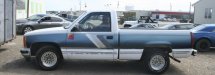
Can anybody find these graphics?
That kind of design looks like its from the 80's... Back then, we produced about 200 packages very similar to that type of design for a Chevy dealership -- they stuck them on plain Cavaliers with upgraded wheels and the decal package which also included a couple "Z22" decals. Apparently, they...- oldgoatroper
- Post #5
- Forum: Clipart, Vehicle Templates and Digital Files