-
I want to thank all the members that have upgraded your accounts. I truly appreciate your support of the site monetarily. Supporting the site keeps this site up and running as a lot of work daily goes on behind the scenes. Click to Support Signs101 ...
Search results
-
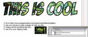
Found a cool design tool and wanted to share.
There are links at the site to many other online time wasters. Lots of programming there- 2972renfro
- Post #11
- Forum: General Chit-Chat
-
-

Font ID pretty please
do you need the letters or something new? You've probably spent more time hunting then redrawing it yourself- 2972renfro
- Post #2
- Forum: Fonts and Typography
-
Is this site for real?
And you have all these files how? You seen to know quite a bit plus the screencapture- 2972renfro
- Post #13
- Forum: General Chit-Chat
-

Looking for an artist that can create this backdrop
A competition? I would hope your artist gets all the credit then- 2972renfro
- Post #12
- Forum: General Signmaking Topics
-

Real Estate Layouts
Ad, there is nothing here that remotely resembles good layout and use of space, fonts etc. All of these are nothing more than customer provided photos with your type laid over it. No originality, boring fonts, crowded layouts. It reminds me of layouts in the yellow pages or local newspaper done...- 2972renfro
- Post #21
- Forum: Designs & Layouts
-
-

-

-
Give Up Hire a Professional
I have looked at your portfolio before and have hesitated to comment before, but wow. Not really of nice way of saying it, but this looks like a kid drew some of these things. Pick one and let's debate how it can be improved http://www.wildwestdesigns.biz/GraphicGallery.html- 2972renfro
- Post #34
- Forum: Logo Design
-
iPhone coming to Verizon, No seriously
So are you having sex with men now? http://signs101.com/forums/showthread.php?t=71436 post #7 BTW you did offend me in that thread, I am happily married, own a Mac and have no interest in men- 2972renfro
- Post #39
- Forum: General Chit-Chat
-

Our New Logo
Which ones are the better pieces? The photos of the knights and castle?!?!- 2972renfro
- Post #29
- Forum: Logo Design
-
Our New Logo
I think you are lying here. Since this was first called out you said you did not know that you were using this illegally. How is it then that you "just happened" to use a USPS eagle for your mailing division? If you just wanted an eagle in your logo and picked another one I would not suspect...- 2972renfro
- Post #27
- Forum: Logo Design
-
copyright
OMG, the most awesome reply to Bob ever. I agree. There needs to be a [bob to common english language converter.] Us lower slobs don't know half the time what he is saying- 2972renfro
- Post #56
- Forum: General Signmaking Topics
-
copyright
I recall that there is a member on here that uses the old post office logo as part of their own logo. Big no-no- 2972renfro
- Post #51
- Forum: General Signmaking Topics
-
copyright
Read that sites user agreement link. Seems like he is contradicting himself- 2972renfro
- Post #49
- Forum: General Signmaking Topics
-
Our new website is up and running!
The tumbling blocks detracts from the professionalism exhibited throughout the site. Not everyone wants to wait for them to stop tumbling to see them all and many landed upside down. Don't like it at all- 2972renfro
- Post #9
- Forum: Website Design
-
A&S Tuscano Script
Are you doing this as an opentype font? I recall your asking about open type in another thread. This does allow for many alternate characters- 2972renfro
- Post #15
- Forum: Designs & Layouts
-
Chevy billboard, drawn with markers
What about the cost of paying a professional photographer to take pictures of the cars and then an ad agency to have them design the layout, crop the photos, color correct the photos and whatever else is involved in producing a design for a billboard My guess is for 1 billboard, hand drawn is...- 2972renfro
- Post #15
- Forum: General Chit-Chat
-
wait a minute thats my sign....
No you have the old USPS logo. Even though it is not used anymore, you still cannot use it- 2972renfro
- Post #103
- Forum: General Signmaking Topics
-
wait a minute thats my sign....
BTW Adtechia. You might want to change your logo. You have the USPS eagle symbol in there. Big no-no- 2972renfro
- Post #100
- Forum: General Signmaking Topics