-
I want to thank all the members that have upgraded your accounts. I truly appreciate your support of the site monetarily. Supporting the site keeps this site up and running as a lot of work daily goes on behind the scenes. Click to Support Signs101 ...
You are using an out of date browser. It may not display this or other websites correctly.
You should upgrade or use an alternative browser.
You should upgrade or use an alternative browser.
designing new business cards
- Thread starter lil Details
- Start date

Biker Scout
New Member
Don't mix slanty, cursive and/or display fonts with one another. The outline around the words is a retina burner. I believe Flame was directing you to keep what you had, but put a black outline AROUND the existing white lettering. I know you won't see the outline but where it overlaps your lil' tail on the D and S, it will make a difference.
Your first one there was pretty darn good for a re-vamp... basic, but good. Needs only minor tweaks. The second one with the added names and such, kinda got cluttered pretty fast. Use both sides of the card, it doesn't cost anymore to do so.
Design 101 Rule: 2 Fonts Maximum (Header/Display/Logo doesn't count as long as it's not really used again)
Design 101 Rule: Legibility wins out over creative font usage. (Can you read it at a glance? Will little old ladies have to put on their Tri-Focals to read your contact info?)
lil Details
New Member

:ROFLMAO:
goodness...guess I am going to get off of this thing tonight....can't wait for the comments tomorrow....
oh....looked at graphic design classes local and the only one is taught by a lady that I really didn't think had much design skills several years ago....she showed me some logo she was working on and I thought it was not that great and she was very proud of it....but that is neither here nor there now...
lil Details
New Member
Don't mix slanty, cursive and/or display fonts with one another. The outline around the words is a retina burner. I believe Flame was directing you to keep what you had, but put a black outline AROUND the existing white lettering. I know you won't see the outline but where it overlaps your lil' tail on the D and S, it will make a difference.
Your first one there was pretty darn good for a re-vamp... basic, but good. Needs only minor tweaks. The second one with the added names and such, kinda got cluttered pretty fast. Use both sides of the card, it doesn't cost anymore to do so.
Design 101 Rule: 2 Fonts Maximum (Header/Display/Logo doesn't count as long as it's not really used again)
Design 101 Rule: Legibility wins out over creative font usage. (Can you read it at a glance? Will little old ladies have to put on their Tri-Focals to read your contact info?)
ok...so I am not gone yet...
That is only one font on any of the last cards. Other than my own hand drawn business name it is one font....
lil Details
New Member

Biker Scout
New Member
Well, here...
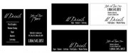
Some simple layouts that use your info. Sorry about not using your "Logo" I just picked a font that looked hand drawn, and I wanted it to be really hard to use. In fact, I don't even know why I have it, I've never used it.
Anyway, I found a font that complimented it, and stuck with it. But you can substitute your "lil" drawing, or use whatever. But since I started with a font, I used it for the names as well. No, they aren't terribly legible as far as a font goes, but it does have a pen and ink, hand written quality to it. So for a pair of names it's just fine. Because I didn't over do it.
They are nothing fancy, and I didn't spend more than 5 minutes total for all of them. I'd be proud to hand out any one of them... Try not to over think it. Emulate styles that catch your eye until you develop your own. Or just get real good at emulating any style, and that will suit your customer's needs in the future.
Keep at it... you'll eventually get it.
Attachments
Biker Scout
New Member
I keep seeing different layouts for this, and I keep messing with them. I shouldn't as this is your homework assignment. But trying different combos and allowing other people to critique them is a valuable way to hone your skills.
Anyway, as a side note, here's one of my favorite cartoons I've got printed out at the shop.
Anyway, as a side note, here's one of my favorite cartoons I've got printed out at the shop.
Attachments

Last edited:
iSign
New Member
I didn't mean to be rude with that and if it was then I am very sorry. I was simply looking at what she had wrote and all but the point one about the slant and then the "buddy drew it" part was all about the first card with blue and shadows and all that..... I think I had changed all of that on the last card that I had posted. If I didn't then would you kindly show me what I am missing on my own picture?
no, I didn't think you said anything wrong.. not rude at all... I meant "ouch" because it's like watching someone fall off their bike, to watch you trying to design cards without training wheels... & then getting up, dusting yourself off & saying "I meant to do that"

...so, now I guess I can apologize for being rude, but you seem like a good sport, so what the heck...
Let's try something else fun... & fun for the rest of us too... because this WILL wear thin soon... this card has dominated the discussion long enough. people here enjoy helping people, and because you're a good sport, we enjoy helping you... but this should be an hour project, not a week...
So, pick a new name! ...I think it's a great idea for real life... but I don't recall you responding to that suggestion at all, even though I think others agreed with me...
..so, lets pick one for a design lesson, 'cause I personally think lil details sucks & I refuse to write it again... & I certainly won't do a layout with it... But if you like cool retro automotive emblematic & iconic stability, and you like black, & maybe some casual faded black jean simplicity...
...well you can't have it!! ...not with a sesame street, candyass smurfname!
gimmee something cool, and original & showing a dramatic departure from everything you are stuck on... do it for fun, and to keep us engaged (or believe me, you will lose us on this one soon...)
astro8
New Member
hopefully this is back those 2 steps and forward one or two....
Your business name, your logo, your email address and your card stinks!
Honestly, the whole thing is really poor...that must be one of the most pissweak logo's I've ever clashed eyes on.
I'm not trying to be an arse, I just think you need to be told.
I cringe everytime I look at your card and your business name, my eye then drops to your email address....
Take the advice you're getting on here...there's people taking time out to help you, so help them to help you.
Don't try and learn everything the hard way...change that name, logo, everything...just do it and get on with it...you'll be glad you did sooner rather than later when you're stuck with THAT.
Good luck to you anyways....
Pat Whatley
New Member
...well you can't have it!! ...not with a sesame street, candyass smurfname!
:ROFLMAO:
Jillbeans
New Member
Your best attempt was in post #101 but it looks like you broke wind in the pants party and killed all the guests, and this is their funeral announcement.
Please, please listen.
Your font choices may be to your taste, but are they to a customer's?
Would some blue-haired moneybag broad hire you, based on the look of that card, to do a huge expensive job for her?
Will the local Baptist church consider you when they need a VBS banner?
Would a contactor get job site signs from you?
That card will bring in business, but it will more than likely be all from teenage girls wanting windshield stickers that say "Princess" and boy-racers wanting wanting Calvin peeing decals.
Please go back and re-read everything that everyone said directly to you, not the bickering stuff. Even biker scout's little cartoon. Perhaps consider hiring Neato for your logo, or any of the other designers-for-hire here.
You are not doing yourself any favors by being married to an odd biz name which has nothing to do with signs and an even odder nasty-looking letterstyle.
Here is a suggestion, and then I am going to shut my mouth. Because I feel like I am married to you and have been telling you to take out the garbage for the past two weeks. But you enjoy the scent.

I am still learning textures and backgrounds too but this was supposed to look like Doug's faded black jeans comment. I hear they are coming back in style.
Please, please listen.
Your font choices may be to your taste, but are they to a customer's?
Would some blue-haired moneybag broad hire you, based on the look of that card, to do a huge expensive job for her?
Will the local Baptist church consider you when they need a VBS banner?
Would a contactor get job site signs from you?
That card will bring in business, but it will more than likely be all from teenage girls wanting windshield stickers that say "Princess" and boy-racers wanting wanting Calvin peeing decals.
Please go back and re-read everything that everyone said directly to you, not the bickering stuff. Even biker scout's little cartoon. Perhaps consider hiring Neato for your logo, or any of the other designers-for-hire here.
You are not doing yourself any favors by being married to an odd biz name which has nothing to do with signs and an even odder nasty-looking letterstyle.
Here is a suggestion, and then I am going to shut my mouth. Because I feel like I am married to you and have been telling you to take out the garbage for the past two weeks. But you enjoy the scent.
I am still learning textures and backgrounds too but this was supposed to look like Doug's faded black jeans comment. I hear they are coming back in style.
Attachments

Vinylman
New Member
:ROFLMAO:
goodness...guess I am going to get off of this thing tonight....can't wait for the comments tomorrow....
oh....looked at graphic design classes local and the only one is taught by a lady that I really didn't think had much design skills several years ago....she showed me some logo she was working on and I thought it was not that great and she was very proud of it....but that is neither here nor there now...
I have read this thread for a number of days now, and painfully watched {lil Details} failure to grasp the fact that he is in the VERY SAME PLACE as the lady who is offering the graphic design classes.
lil Details, do you see the irony in your own comment about the lady who is offering classes in graphic design?
Perhaps she has gotten better over the years[?] than your first impression of her would allow you to see. But the important thing YOU need to see is how very IMPORTANT FIRST IMPRESSIONS are.
They many times leave lasting impressions that will be difficult if not impossible to correct in the years that follow.
lil: Dude take a step away from your own work. Try to grasp the totality and depth of help that you have been offered here. Some of the FINEST creative people you may ever come in contact with have stepped in here and given you an ALL EXPENSE PAID 1 year college course in design. At no charge to you.
ALL of us are at different levels in our continuing quest to be better at what we do.
All of us have skill sets that are at different levels based on time and practice and commitment to excellence.
Many of the best business people on this sight would admit that drawing, or creative abilities, or business management, or hand painting or {you get the idea} are NOT their strong suit in the total picture of running a successful business in todays competitive market place.
That being said, the person who understands their own weaknesses can always hire those that can compliment their strengths to make the entire operation more professional and PROFITABLE.
Most of us who are one or two person sign companies have to wear most or ALL the hats in trying to run a business on a day to day basis.
In so doing SOMETHING will suffer. But that is the nature of being in business as a one/two person business.
If you take the time to create good alliances with other crafts persons while building your business you can very profitably create many win win situations along the way and also make money doing it.
Your customer does not need to know [ and many don't care} that you are not the one who came up with the creative idea, drawing, or painting of their finished sign.
They only care that it is done in a professional manner.
How YOU accomplish that is your business. If it is done as a collaboration of 6-7 OTHER craftspersons, or by Me, Myself, & I. DOES NOT MATTER.
And just a side note: Sometimes if the customer perceives that you have {collaborated} they might look at your company as a larger entity than it really is [not necessarily a bad thing}.
When I refer to my company in conversations I almost always use terms that are plural in structure.
WHY?
Perceived Image !
I hope you will scrap your business card ideas and listen to some if not all of the professional ideas presented here. It will set you on a path to success that you can not even imagine from your current vantage point.
Signs101 is probably one of the premier sign forums on the Internet today.
It has gotten to this point BECAUSE we share a common love for our profession, and realize that non of us would be where we are without the support and encouragement of at least one other person pushing us or leading us to a higher commitment of excellence.
Welcome to SIGNS101.

Biker Scout
New Member
I forgot to add a couple more items that just popped in my head. Mainly, because I forgot that I actually have a "Pre-Employment Test" for potential designer roles among my company. Yes, it's a Business Card Test. I never look at their portfolios right off the bat either. Why? Because they aren't usually real world, working conditions examples. Many of them are semester long class projects. In the real world, you need to be able to do a double sided business card from scratch (or clever design skills) in about 15 minutes.
In my test, I've already typed out all the copy, included artwork that a "client" might have already picked out or brought in, mentioned client's favorite or company colors. etc... I have 4 different cards in the test, with hopefully 4 different looks/industries. The candidates must use InDesign, and complete all 4 cards in about an hour or less.
What's funny is the range of excuses I hear when they turn in their test for me to critique. From, "I'm a little rusty" to, "I don't have a lot of font choices on my machine, I had to re-load the system software, so not all my fonts are loaded yet." or, "I usually use PhotoShop, so it took me a little longer to 'remember' how to use InDesign."
But none of that matters to me... because you either have an eye for it or you don't. I can tell right off the bat who has talent, and can be taught new tricks to fit within my company. And it's not the lack of fonts either. Or their typing ability. It's their ability to follow minimal guidelines, and use their creativity.
I often get asked if I went to school for Graphic Design. I usually laugh outloud, and scoff "No". When I went to college, there wasn't a degree for Graphic Design, you got one in Art. Graphic Design might have been a minor. But there were plenty of night schools that could offer you a faux degree in Computer Graphic Design.
No, in college I didn't want anything to do with the graphics industry. Even though that's what I did for a job, because that's really the only employable skill I had at the time. I got a degree in History. Thought I was going to teach.
Anyway, I tell people who are interested in learning that say that they want to take a course, blah, blah... and I tell them to should save their money. I always recommend a few books that took my crap to a whole new level, and I could teach them in a week what a whole 4 years in Graphic Design would teach them. We'd skip the theory, portfolio and history classes that relate to the field. Those are just fluff and don't serve you out in the real world. I cut my teeth in the trenches, from Newspaper Page Monkey, Print Shops, Speciality Design Houses, Free Lance etc. All the while learning new tips and tricks to anyone who would teach me.
The only difference was that I already had an eye for color and design, and I just needed to hone my skills. And believe me, it's humiliating when you think you are Awesome Sauce, but when the supervising manager or art director hands you back your proof because it sucks. You can't even see what's wrong with what you did... because you did it, it must be fine.
Now that I'm on my own, there isn't an Art Director above me to check my work. If I fail, I don't get paid. So a lot is riding on doing it right the first time. Which is why I suggest to you, to outsource your design work. Trust me, designing your own stuff is waaaay more challenging than for a client. I paid two people to come up with my logo... and I still was satisfied with it. Took about 2 years before the light came on and I came up with what I use today. Sure it's not special or fancy, but suits my personality. But it was a long road to get there.
lil Details
New Member
no, I didn't think you said anything wrong.. not rude at all... I meant "ouch" because it's like watching someone fall off their bike, to watch you trying to design cards without training wheels... & then getting up, dusting yourself off & saying "I meant to do that"
Yep, that sounds like me....and my 2 year old son....
lil Details
New Member
guess that this should be a closed thread. "lil Details" is the business name. What does it have to do with signs? What do most business names have to do with that business? If I took my own name and put SIGNS on the end would that be better? Why?? My business at this time is Window Tinting and it is branching in to signage. "lil Details" is about the fact that it is the little details that set something apart. Small things that most would miss, but SOME will see right off.
Little things like the kerning of text, the direction of shadows, the color of shadows, everything that was pointed out to me here and on my "first signs" thread.....
I hope that you would all forget the first cards I have put up on here. I am done with business card design for now.
Thank you all for what you have given.
You're in the sign business... essentially, you're telling the world you can design THEIR identity for them for a living. Your design skills must be up to the task or you must hire someone to take on that task or you end up looking like every other flea market sign guy in the country. Perhaps you're fine with that, but your design is your image and your image is your business.
It's more likely here that there's no budget to pay for anything, be it fonts, software, or design help for that matter so he's just trying to make it work with what he has.
I suggest you go on a little trip in your area and gather as many business cards from as many different businesses you can and see which ones grab your eye. Which ones are memorable regardless of the actual business and learn from those.. there's a reason you remember them or were attracted to them.
bob
It's better to have two hands than one glove.
guess that this should be a closed thread. "lil Details" is the business name. What does it have to do with signs? What do most business names have to do with that business? If I took my own name and put SIGNS on the end would that be better? Why?? My business at this time is Window Tinting and it is branching in to signage. "lil Details" is about the fact that it is the little details that set something apart. Small things that most would miss, but SOME will see right off...
It's unclear which is worse, the name you affect or the designs you present.
The name is terrible. It reeks of teeny-bopper cuteness and presents no aura of business acumen. It the name of something that appeared in the night and will be gone in a few weeks or months. Worse that you rationalize some obscure meaning into it where no one else on the planet will do so. Moreover the uber-childish "Lil" is beyond all bounds of taste.
Change your name. Try for something with authority and longevity instead of your notion of clever. You can do clever but first do authority before you indulge yourself.
Your designs presented thus far are a series of typographical train wrecks. They all look as it they were something scrawled on the cover of an underachieving high school student's binder.
Lose that god-awful typeface, if that's what it is, you affect for the name of your endeavor. Try for something with just a little more gravitas instead of graffiti casual. Then pick something legible and simpatico with that specimen typeface for your body text.
Add some color, at first glance your efforts look like something seen at a convention of funeral directors.
iSign
New Member
yeah, fine... I suggested you make up something else, even just for a training opportunity. Don't then, whatever...guess that this should be a closed thread. "lil Details" is the business name.
next?
I hope that you would all forget the first cards I have put up on here. I am done with business card design for now.
Thank you all for what you have given.
you're welcome...... QUITTER!
we'll all think about how much time we wasted offering free advice to a quitter, so we don't make the same mistake twice!