• I want to thank all the members that have upgraded your accounts. I truly appreciate your support of the site monetarily. Supporting the site keeps this site up and running as a lot of work daily goes on behind the scenes. Click to Support Signs101 ...

Here is menu... what do you think ??

Zazzess

New Member
Hi !

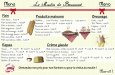
This is a menu I made that must be installed on a wall...
It will be about 70''/40''.

I've been looking at it for a few hours now...
I'm wondering what is going wrong about it...
I think about scaling up the title (Le Moulin de Beaumont)...
What else ???
So what do you think ?
Can you help me please ?

&
Thanks for your help :signs101: !

:U Rock::loveya:
 

Attachments

  • MB_Menu22.jpg
    MB_Menu22.jpg
    87.7 KB · Views: 150

Pat Whatley

New Member
Main thing I noticed is that all the words are misspelled except BACON.

Maybe make the background a little darker so the panels stand out a bit more. I'd get rid of the font for the headers (marking pen?) and use something closer to what you used in the body copy, just bolder. Other than that I kind of like the loose, casual style.
 

Zazzess

New Member
Main thing I noticed is that all the words are misspelled except BACON.

Maybe make the background a little darker so the panels stand out a bit more. I'd get rid of the font for the headers (marking pen?) and use something closer to what you used in the body copy, just bolder. Other than that I kind of like the loose, casual style.


Oh thanks ! I appreciate your advices :thankyou:
 

Gino

Premium Subscriber
So far, it’s very nice and clean. :thumb:


Some things I think you could do would be to give your sign some breathing room, get rid of the ribbon and check out your usage of ellipsis. I don’t understand French, but that is one heck of a pricing system. The numbers and dollar signs and stuff are not my cup of tea, but they also seem to have some varying factors going on there.

I like to see the actual items justified left and the prices justified left in their own column. Your method seems somewhat random and makes the viewer confused since nothing has a pattern to it. Again, it could be a French thing, I’m not aware of.
 

joeshaul

New Member
I like the color scheme, the background is also nice and not detracting, the design itself seems too chaotic though. The graphic item placements seem to collide with another and the design elements seem out of alignment (IE: the white box for Pain, Breuvage, and Produits Maisons all seem to start different on the y axis).

If the menu's inside the restaurant, I don't really see the need to advertise the name too much, so I think the size that you have for the name is fine. I don't really care for the the "Menu" on the sides as it detracts the eye and just seems to be there to fill in space, but you want that space so people can focus on the other details. Font for the menu items/prices is a bit too fancy, and most of the menus I've set, I've manually spaced the prices out to all be in some form of alignment.

I'm not too familiar with French style menu designs though, most of the ones I do are hispanic or american, so they usually aren't as elegant, but I think part of elegance is ease on the eyes. My suggestion would be hide the graphic elements of the food, and see about getting the text back on track, then see about working the foods back in later.
 

Zazzess

New Member
So far, it’s very nice and clean. :thumb:


Some things I think you could do would be to give your sign some breathing room, get rid of the ribbon and check out your usage of ellipsis. I don’t understand French, but that is one heck of a pricing system. The numbers and dollar signs and stuff are not my cup of tea, but they also seem to have some varying factors going on there.

I like to see the actual items justified left and the prices justified left in their own column. Your method seems somewhat random and makes the viewer confused since nothing has a pattern to it. Again, it could be a French thing, I’m not aware of.

Hi Gino ! Thanks for your comments !

The breathing space thing bugged me too... I'll take care of that :)
I like my ribbon :p I don't know what I'm going to do about it...
Anyways I have to do a reorganization here :)
About the ellipsis use... I'm not sure I understand well...
Are you suggesting to add an ellipsis to put emphasize on the big title ?

Thanks again for your help :)

I'm looking forward to improve my approach :)
 

Zazzess

New Member
I like the color scheme, the background is also nice and not detracting, the design itself seems too chaotic though. The graphic item placements seem to collide with another and the design elements seem out of alignment (IE: the white box for Pain, Breuvage, and Produits Maisons all seem to start different on the y axis).

If the menu's inside the restaurant, I don't really see the need to advertise the name too much, so I think the size that you have for the name is fine. I don't really care for the the "Menu" on the sides as it detracts the eye and just seems to be there to fill in space, but you want that space so people can focus on the other details. Font for the menu items/prices is a bit too fancy, and most of the menus I've set, I've manually spaced the prices out to all be in some form of alignment.

I'm not too familiar with French style menu designs though, most of the ones I do are hispanic or american, so they usually aren't as elegant, but I think part of elegance is ease on the eyes. My suggestion would be hide the graphic elements of the food, and see about getting the text back on track, then see about working the foods back in later.

I think it is the right thing to do joe :)
I'm glad you came to help :)

:thankyou:
 

Mike F

New Member
Colors are nice, and yea you should get rid of "Menu" on the sides up top, and definitely try to make it a little more organized. The suggestion about taking out all the food graphics, getting the text organized, and then working them in is probably your best bet. I also agree that you could probably just do without the entire header since it'll be inside the restaurant or whatever. If you decide to keep the name and the ribbon at the top, I'd just make it a single ribbon and center it. I don't know why but I feel like that might look better.

edit: oh, and you should really make a decision between colons or ellipsis, if only for the sake of consistency.
 

Zazzess

New Member
Colors are nice, and yea you should get rid of "Menu" on the sides up top, and definitely try to make it a little more organized. The suggestion about taking out all the food graphics, getting the text organized, and then working them in is probably your best bet. I also agree that you could probably just do without the entire header since it'll be inside the restaurant or whatever. If you decide to keep the name and the ribbon at the top, I'd just make it a single ribbon and center it. I don't know why but I feel like that might look better.

edit: oh, and you should really make a decision between colons or ellipsis, if only for the sake of consistency.


Hi hi !! you are so right !

I will remember this lesson for all my life :D

And I will try the single ribbon !

:goodpost: Thanks a bunch !
 

SebastienL

New Member
I like the background, i like the font used for the items but not the Comic sans style font used for the categories, I'd go for something more "handwritten" like the items listed.

I really dont like the cliparts... They're distracting and don't add anything to the layout. I find they're just confusing the whole layout. This looks like a classy place, but the cliparts scream truck cantine by the side of the road. (I'm sorry, please don't take offense!)

Maintenant, j'sais pas pourquoi, mais J'ai faim...
:toasting:
 

signmeup

New Member
I like the background, i like the font used for the items but not the Comic sans style font used for the categories, I'd go for something more "handwritten" like the items listed.

I really dont like the cliparts... They're distracting and don't add anything to the layout. I find they're just confusing the whole layout. This looks like a classy place, but the cliparts scream truck cantine by the side of the road. (I'm sorry, please don't take offense!)

Maintenant, j'sais pas pourquoi, mais J'ai faim...
:toasting:
"Now... I don't know why, but I'm hungry" (how did I do?)
 

Zazzess

New Member
I like the background, i like the font used for the items but not the Comic sans style font used for the categories, I'd go for something more "handwritten" like the items listed.

I really dont like the cliparts... They're distracting and don't add anything to the layout. I find they're just confusing the whole layout. This looks like a classy place, but the cliparts scream truck cantine by the side of the road. (I'm sorry, please don't take offense!)

Maintenant, j'sais pas pourquoi, mais J'ai faim...
:toasting:


:thumb: :peace!: I like my cliparts :D Did them myself :ROFLMAO:

I wanted to give it the cantine style :Big Laugh

But no sure no offense !! I know I can improve my art a lot !
I need you guys :)

Thanks Seb :)

Bonne appétit :D :goodpost:
 
Top