-
I want to thank all the members that have upgraded your accounts. I truly appreciate your support of the site monetarily. Supporting the site keeps this site up and running as a lot of work daily goes on behind the scenes. Click to Support Signs101 ...
You are using an out of date browser. It may not display this or other websites correctly.
You should upgrade or use an alternative browser.
You should upgrade or use an alternative browser.
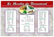
Here is menu... what do you think ??
- Thread starter Zazzess
- Start date

xtremesignshop/brad
New Member
i would put all the prices in line to the right and as noted before the same type of symbols between the item and price other than the menu's up top it looks great!
SignManiac
New Member
I would start fresh. Have a look at some of these examples to get inspiration. Notice that with most of them, the graphics are tightly integrated. The problem with your layout is that everything is all over the place. Try breaking thing down into copy blocks, the fewer the better.
http://www.google.com/search?q=crystal+river+wildlife+refuge&hl=en&client=firefox-a&hs=wTH&rls=org.mozilla:en-US fficial&prmd=ivnscm&source=lnms&tbm=isch&ei=BVAoTovHDYaltwfonti7Cg&sa=X&oi=mode_link&ct=mode&cd=2&ved=0CBMQ_AUoAQ&biw=1680&bih=904#hl=en&client=firefox-a&hs=J9b&rls=org.mozilla:en-US%3Aofficial&tbm=isch&sa=1&q=menu+board+design&oq=menu+board+design&aq=f&aqi=g2g-m2&aql=&gs_sm=e&gs_upl=14313050l14320312l0l14320528l45l23l0l0l0l2l205l2829l11.11.1l23&bav=on.2,or.r_gc.r_pw.&fp=4ba991f50cc387bb&biw=1680&bih=904
http://www.google.com/search?q=crystal+river+wildlife+refuge&hl=en&client=firefox-a&hs=wTH&rls=org.mozilla:en-US
fficial&prmd=ivnscm&source=lnms&tbm=isch&ei=BVAoTovHDYaltwfonti7Cg&sa=X&oi=mode_link&ct=mode&cd=2&ved=0CBMQ_AUoAQ&biw=1680&bih=904#hl=en&client=firefox-a&hs=J9b&rls=org.mozilla:en-US%3Aofficial&tbm=isch&sa=1&q=menu+board+design&oq=menu+board+design&aq=f&aqi=g2g-m2&aql=&gs_sm=e&gs_upl=14313050l14320312l0l14320528l45l23l0l0l0l2l205l2829l11.11.1l23&bav=on.2,or.r_gc.r_pw.&fp=4ba991f50cc387bb&biw=1680&bih=904Zazzess
New Member
I would start fresh. Have a look at some of these examples to get inspiration. Notice that with most of them, the graphics are tightly integrated. The problem with your layout is that everything is all over the place. Try breaking thing down into copy blocks, the fewer the better.
http://www.google.com/search?q=crys...gc.r_pw.&fp=4ba991f50cc387bb&biw=1680&bih=904
Yes I agree with you and I did start over
I'm about to show you were I'm at right now
Thanks for your help !
I will take a look for some inspiration !


SignManiac
New Member
Here's something I just threw together real fast to give you an idea. Everything is pulled together and relates. Try using only one graphic, preferably not clip art. Use some stock photo art and find something appropriate. Reversing the top panel makes for a nice header and the added contrast helps a lot.
Attachments
Pat Whatley
New Member
Not a bad idea. Here's a link to chalk board deli clipart http://www.chalkartstudio.com/home.aspxMaybe start over and do a ''fake'' chalk board menu ???
btropical.com
New Member
print it on clear sheet , use over head projecter see what it looks like on wall , at 40 by 70 should be a nice menu . i am sure customers know what they are coming in for . So no reason to Mcdonaldlize every menu
iegrafixs
New Member
you can get some food clip art from here if you need. http://sharegfx.net/?s=menu&cat=0
iSign
New Member
I get it ! Thanks for this lesson
We're ALL lucky Bob is helping around here!
Zazzess
New Member
print it on clear sheet , use over head projecter see what it looks like on wall , at 40 by 70 should be a nice menu . i am sure customers know what they are coming in for . So no reason to Mcdonaldlize every menu
Thanks I really appreciate
