-
I want to thank all the members that have upgraded your accounts. I truly appreciate your support of the site monetarily. Supporting the site keeps this site up and running as a lot of work daily goes on behind the scenes. Click to Support Signs101 ...
You are using an out of date browser. It may not display this or other websites correctly.
You should upgrade or use an alternative browser.
You should upgrade or use an alternative browser.
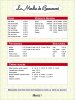
Here is menu... what do you think ??
- Thread starter Zazzess
- Start date
sfr table hockey
New Member
accent is good!
Do you speak Italian too?
Nevermind... Here is a menu I did:
http://islandsign.com/OldSite/damenu.jpg
Note the prices are all in reverse panels. I do this so I can provide a large sheet of various prices in these same size panels. this allows client to maintain price changes for quite some time, without coming to see me.
I like your idea of the prices this way...
By the way..... I think that Zazzess is really a big fat bald guy just using that avitar to get help..........
Hope you know I'm kidding....... I enjoy reading the posts too......
JR's
New Member
By the way..... I think that Zazzess is really a big fat bald guy just using that avitar to get help..........
Hope you know I'm kidding....... I enjoy reading the posts too......
man that is funny. lol but she is a looker.

JR
Rick
Certified Enneadecagon Designer
i have done quite a few menu boards, mostly at theme parks so the style changed up quite a bit and had to stick to a certain format while being guided by marketing and restaurant specific designers (interior, environmental and graphic) I see a lot of help, but not enough questions.. like:
--- What is "cantine style"? Do you mean "bistro"? then what style, yeah I'm thinking French but it if not, it would help to know...
--- In order to pick a "correct" legible typeface, (and there are plenty of them in many styles) I think you should look at the interior, branding/logo, architecture... anything that will compliment the area and identity.
--- I think adding a field color to the copy adds nothing and giving the layout less balance, complicating the layout.
--- I think a menu should add to the branding, and be an extension of the interior architecure.
---Always... I mean always look at the layout with a scale person in place or better yet, placed in a photo rendering to the correct scale to see how the size works, to me the original size sounded large, but not knowing where it was placed, how high, the surrounding environment, a lot of the suggestions may not be of any help without knowing that additional information.
I was bored so i played with it after thinking about it... then the format changed... and the client went with something.
Attachments


HulkSmash
New Member
i have done quite a few menu boards, mostly at theme parks so the style changed up quite a bit and had to stick to a certain format while being guided by marketing and restaurant specific designers (interior, environmental and graphic) I see a lot of help, but not enough questions.. like:
--- What is "cantine style"? Do you mean "bistro"? then what style, yeah I'm thinking French but it if not, it would help to know...
--- In order to pick a "correct" legible typeface, (and there are plenty of them in many styles) I think you should look at the interior, branding/logo, architecture... anything that will compliment the area and identity.
--- I think adding a field color to the copy adds nothing and giving the layout less balance, complicating the layout.
--- I think a menu should add to the branding, and be an extension of the interior architecure.
---Always... I mean always look at the layout with a scale person in place or better yet, placed in a photo rendering to the correct scale to see how the size works, to me the original size sounded large, but not knowing where it was placed, how high, the surrounding environment, a lot of the suggestions may not be of any help without knowing that additional information.
I was bored so i played with it after thinking about it... then the format changed... and the client went with something.
screw mine, this is 100 times better.
Zazzess
New Member
Printing... I'm almost gone !!
That is what they ordered... :Big Laugh
WoW Thats Pretty !!
That is what they ordered... :Big Laugh
Attachments
Zazzess
New Member
Thanks everyone for your help !! Everything happened so fast !! Here is the results of all of us working together ") I'm blessed to have you by my side ! And be sure your notes will always be a guide for me I need you so I can learn the ''magic of graphic'' ! (Didn't know how to name it otherwise)
I'm blessed to have you by my side ! And be sure your notes will always be a guide for me I need you so I can learn the ''magic of graphic'' ! (Didn't know how to name it otherwise)
Merci !!
I'm blessed to have you by my side ! And be sure your notes will always be a guide for me I need you so I can learn the ''magic of graphic'' ! (Didn't know how to name it otherwise)Merci !!