-
I want to thank all the members that have upgraded your accounts. I truly appreciate your support of the site monetarily. Supporting the site keeps this site up and running as a lot of work daily goes on behind the scenes. Click to Support Signs101 ...
You are using an out of date browser. It may not display this or other websites correctly.
You should upgrade or use an alternative browser.
You should upgrade or use an alternative browser.
logo idea
- Thread starter jkdbjj
- Start date

TyrantDesigner
Art! Hot and fresh.
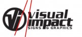
dude, the VI in ALL of your logos no where mimic the lettering you put with them. With the exception that they are all bold in one place or the other ... all different. I feel like your trying to tell me you're schizophrenic or something.
Also in the last one ... the I is too close to the V.
Also in the last one ... the I is too close to the V.
jkdbjj
New Member
Only because your screen name implies you are a designer and your profile says you are, would you mind linking your website or portfolio, so I can see what some of your projects or logos look like?dude, the VI in ALL of your logos no where mimic the lettering you put with them. With the exception that they are all bold in one place or the other ... all different. I feel like your trying to tell me you're schizophrenic or something.
Also in the last one ... the I is too close to the V.
I agree with your advice, minus the insult to me personally, and I think it might help to check out some solid logo designs to help set me straight.
What is your website?
Thanks for the feedback!
J Hill Designs
New Member
i agree with tyrant...too much fluctuation in stroke thicknesses
jkdbjj
New Member
Also, on the latest critique, if those issues are addressed would it be decent? I mean am I chasing my tail here only to end up with a logo that is correctly adjusted from the feedback, but still have a bad logo.
In other words are you offering advice cause it has potential? If you don't think it has potential, just say so, so we are clear.
Thank you.
In other words are you offering advice cause it has potential? If you don't think it has potential, just say so, so we are clear.
Thank you.
tsgstl
New Member
I wanted to see what the & looked like in the "P" then I got carried away
I can't stand when kerning is dif on 2 words in a line like your last proof
I'm no expert designer and I usually hate the feedback when I play with a logo but it was fun with my Jack 2 tacos for a buck.
I can't stand when kerning is dif on 2 words in a line like your last proof
I'm no expert designer and I usually hate the feedback when I play with a logo but it was fun with my Jack 2 tacos for a buck.
Attachments

jkdbjj
New Member
I wanted to see what the & looked like in the "P" then I got carried away
I can't stand when kerning is dif on 2 words in a line like your last proof
I'm no expert designer and I usually hate the feedback when I play with a logo but it was fun with my Jack 2 tacos for a buck.
I really agree about the keening. I need to watch that before submitting another for critique. Thanks for the mock up.
What do you think about the earlier suggestions of making the word impact more bold but use the same font and same kerning?
J Hill Designs
New Member
I still like the ones in post 14
tsgstl
New Member
I don't know man, you have got a ton of great advice from a lot that know a heck of a lot more than me. I see you put up a lot of threads on here asking for advice. I actually got put off a little by it but I have learned a lot and am trying to soak in some of the stuff that has been said in your numerous threads. There is no way you are going to come up with something everyone is going to agree on. Thank god your customers are not going to be all of the members from signs101
I do better with seeing something and telling you what I don't like or what I notice could be better. Telling you what or how a font feels is out of my league.
BTW keep posting and the rest of us can keep learning from the advice you are getting.
I do better with seeing something and telling you what I don't like or what I notice could be better. Telling you what or how a font feels is out of my league.
BTW keep posting and the rest of us can keep learning from the advice you are getting.
TyrantDesigner
Art! Hot and fresh.
Only because your screen name implies you are a designer and your profile says you are, would you mind linking your website or portfolio, so I can see what some of your projects or logos look like?
I agree with your advice, minus the insult to me personally, and I think it might help to check out some solid logo designs to help set me straight.
What is your website?
Thanks for the feedback!
Sorry, that wasn't ment to be an insult to you personally (or at all.) as when I refer to 'you' I really ment that logo as the voice and representation of what you present to the viewer as 'you' ... You have three different styles of lettering in the name, you have 2 different styles of lettering in the logo, none match, and attached is a little thing to show the angle of your lettering ... from logo to letter if you have them together ... angle should match. This is what is referred to as schizophrenic lettering ... many voices in one idea.
Just to make note in order to fully express this ides ... I don't think you are schizo, just the logo. find your one voice and express it clearly.
Attachments
Last edited:
TyrantDesigner
Art! Hot and fresh.
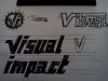
Alrighty so I've said this about a dozen times, but drawing is the easy way to weed out bad ideas as they start. It's quick and dirty.
So the version 3 logo is interesting, it's simple, but had issues. for example, you took the time to custom design out a V and i but just used a font for the rest. if you take the time to design out one part, spend 5 minutes, sketch out an idea of the rest and make more that are in the similar theme. Total time on this sketch was 2 minutes, 37 seconds so you can get forth the time it takes to start to get lettering that is both custom and completely one voice with your logo. When I saw the lettering, first thing that came to mine was Serpentine Typeface merged with an almost block lettering like Agit Prop (without the Russian struggle against the proletariate feel) ... your "i" should have a feel of that angle jutting out from the same base line as the v, with a dot on the top that mimics that size and shape. Now as for the text, the 's' 'a' and 'c' in Visual impact would be the most easy to add a small accent point to the inner tips (thus the Serpentine feel) and the t I think should have a feel of the lower case 'L' with the allusion to the full cross bar by knocking it off on the left side and keeping the kerning clean and solid.
all in all, that is what I see when I see that logo and the style of text that should go with it. will you find that as a font? ... nope. start with a sketch, weed out the weak, design the strong parts, revise as you go.
And jillbeans does some good work, follow her sharpy advice and go with something that is striking in the marker phase. Kudos Jill, kudos.
Attachments


ucmj22
New Member
Alrighty so I've said this about a dozen times, but drawing is the easy way to weed out bad ideas as they start. It's quick and dirty.
So the version 3 logo is interesting, it's simple, but had issues. for example, you took the time to custom design out a V and i but just used a font for the rest. if you take the time to design out one part, spend 5 minutes, sketch out an idea of the rest and make more that are in the similar theme. Total time on this sketch was 2 minutes, 37 seconds so you can get forth the time it takes to start to get lettering that is both custom and completely one voice with your logo. When I saw the lettering, first thing that came to mine was Serpentine Typeface merged with an almost block lettering like Agit Prop (without the Russian struggle against the proletariate feel) ... your "i" should have a feel of that angle jutting out from the same base line as the v, with a dot on the top that mimics that size and shape. Now as for the text, the 's' 'a' and 'c' in Visual impact would be the most easy to add a small accent point to the inner tips (thus the Serpentine feel) and the t I think should have a feel of the lower case 'L' with the allusion to the full cross bar by knocking it off on the left side and keeping the kerning clean and solid.
all in all, that is what I see when I see that logo and the style of text that should go with it. will you find that as a font? ... nope. start with a sketch, weed out the weak, design the strong parts, revise as you go.
And jillbeans does some good work, follow her sharpy advice and go with something that is striking in the marker phase. Kudos Jill, kudos.
+1
jkdbjj
New Member
You feel the word visual needs a dot on the I? Just wondering if it bothers you.I dig the first one I like how the dot for the 'i' serves double duty. Cool.