• I want to thank all the members that have upgraded your accounts. I truly appreciate your support of the site monetarily. Supporting the site keeps this site up and running as a lot of work daily goes on behind the scenes. Click to Support Signs101 ...

Need Billboard design feed back ASAP!!

HulkSmash

New Member
I guess what I said and Dan said had no notice.
I guess no one read the advice from that link I posted. It reinforces what Dan and I posted.

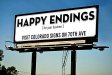
There is way too much going on with those panels to be used in a billboard. Do a squint test. Squint the eyes. Cover them so you cannot see out. Uncover them for 4 seconds. Re cover the eyes and tell us what you saw.

They must be...Simple. easy to read with no effects.
7 words or less. No effects. And a contact point.

Billboards are panels will be read by the same 8 thousand people on their way to work every day for a few weeks. After about 8 glances they will get it..

There is a huge company here doing multiple boards. They have just 4 words.
Name.. contact point and a one word audio logo printed on the panel. That is it. They are famous in the area and are very busy in spite of the economy. Their main source of leads is their billboard panels.

i read that article about 11 times. Seriously. I thought i had simplified it enough. That saying is something that Dan said to try, i did.. we liked it here. It seems like it could be effective. The point is small line to get interest, then i let the logo speak for what it is. Ill try to simplify it even more. I'm on a short deadline for this, so if not now, ill redo it next month. only 150 bucks to throw up a new ad on it.
thanks.
 

Techman

New Member
wayne,, is that a real billboard. WOW..

Anyway...
When is plain and simple too plain and simple?
When is it that statistics should be ignored over opinions for getting results from the money spent?

If your message does not stand out is anyone going to read
A billboard is already standing out on its own. It is there in plain view in all its glory showing the entire world exactly what is says. But a passing vehicle only gives the viewer time enough for a glance. That is why it is best to be simple.

When is a wrap over done? When is it wrong to use Red Helvetica?

Some things have already been done, proven, measured and finalized. We know bad wraps do not work as an advertizing media and Red helvetica just plain sucks.

Billboards have been around for a very long time and are proven to work. They work best under certain conditions that were tested, measured, and distilled down to an art form long ago. Why would any one wish to debate the results? Years ago I did billboards. Spent a lot of money on them. They worked great at stimulating leads when the format was followed.
 

tsgstl

New Member
The last thing you would want is for people to think it is the actual billboard company advertisement. Just a couple words about advertising or about making your business stand out and a addy is IDENTICAL to what the billboard companies have to fill that space when no ads are placed. Maybe that would work but maybe it would cause some customers to not THINK about it.
 

GAC05

Quit buggin' me
"Billboards have been around for a very long time and are proven to work. They work best under certain conditions that were tested, measured, and distilled down to an art form long ago. Why would any one wish to debate the results? Years ago I did billboards. Spent a lot of money on them. They worked great at stimulating leads when the format was followed."

You may very well be right but nothing remains static.
You don't think the market has changed enough from "long ago" to warrant a new assessment of what may or may not work?
With today's connected world that guy who is supposed to be driving may not even glance at your billboard while he is streaming the latest cat video from Youtube on his smart phone.
Businesses in LasVegas spend hundreds of millions of dollars on everything from digital billboards to building wraps to try and stand out from the crowd.
If you don't grab their attention don't you run the risk of fading into the background white noise?

wayne k
guam usa
 

mikefine

New Member
Here is a reference you may want to consider. I picked this book up a few years back at one of the sign conventions. GOTCHA! The Art of the Billboard. Edited by Wei Yew.
 

JoshLoring

New Member
I'm pretty lucky when I go to do billboards. Our phone number is 1-888-Graphics ! Simple design and phone number.

I dunno about everyone else, but I'm totally against websites on media. It's like sending someone to the competitor. Plus, it's cold. I prefer phone numbers on big media with simple graphics. Once they visit your website and find out they want a vehicle wrap, it's almost guaranteed they google vehicle wraps to research more... Then.. They get my site or one of the other top google guys and we say "thanks for the billboard referral"

My rule: Silly vehicle wrap, websites are for the Internet.

Let the net bring you net traffic- let your media bring you phone calls.
 

signswi

New Member
I feel the opposite way. Web addresses are easier to remember (usually, should be anyway, if not--get a better address) and they can serve as specific content conversion funnels. Why just point it at your root url? Point it at a one page conversion funnel sales site, let it do the work.

Honestly too I'd rather people who are going to google and look for cheaper options do so and not waste my time. Josh I wouldn't think you'd be afraid of that either, your quality of work speaks for itself. Velvet rope theory.

Of course, I'll go to great lengths to avoid making a phone call, I hate phones. But I've also found that isn't atypical among people 40 or below.
 

artbot

New Member
i've seen this thread blowing up the board but not looked at it until now. i am not a fan. the use of blue and black for a billboard is not optically a good choice. it will read dark in the daytime and even darker and less contrasty at night. print that current draft on some photo paper and stick it on the front of your house. now drive past your house going about 30 mph in the day and at night with a light bulb on it.. what does it say? it says "cophramladasiqnz 888ds32da335u.. " way cleaner way way way way way cleaner. it should be 500% more readable at a distance.
 

CheapVehicleWrap

New Member
Here's something I'm experimenting with using on my site. Could work on a billboard, don't know. Feel free to use it.
 

Attachments

  • happy ending.jpg
    happy ending.jpg
    20.5 KB · Views: 90

JoshLoring

New Member
"Happy Endings" really big..
"for your business" really small
"Colorado Signs & Vehicle Graphics" medium sized

Could be onto some gangster marketing
 

JoshLoring

New Member
JoshLoring said:
"Happy Endings" really big..
"for your business" really small
"Colorado Signs & Vehicle Graphics" medium sized

Could be onto some gangster marketing

+1 !!!!

If you don't use it I will! This would create insane amounts of looks.. Facebook picture posts and social media distribution.
 

JoshLoring

New Member
CheapVehicleWrap said:
Like none of you saw this coming. yeah right.

You spawned my idea. I even +1 myself. Seriously- its pretty genius if used the right way.

GypsyGraphics said:
gezzzz.... now we're all gonna have to offer them just to compete.

Of Colorado doesn't use it.. You might just see some around town. Lol
 

MakeMyGraphic

New Member
I know it's none of my business and I am such a noob here but I personally find people nowadays are more prone to visit your website than they are to call you at first, just to see what you are all about, THEN if they are interested they will call you... would you rather someone call you and possibly "waste" your time with information they could have otherwise found on your website? Or call you when you know they are already interested? Also I know you love the blue background but you need more than three contrasting colors, or are they charging you per color? So far I see BLACK, BLUE, WHITE . Two of which could be considered on the COOL spectrum of light and therefore get lost at a second's glance, just saying... you could have the 7 words of less if you use your current color scheme BUT with a major contrasting color like Yellow, Lime Green, Orange etc you could get away with the wordiest add, more so considering that you said that your billboard happens to be in an area where a red light is. I think keeping it simple is always a good thing, but sometimes you do need to elaborate and I figure IF the client does not know what a WRAP is... they probably aren't the kind of person you are looking to deal business with. Any normal person who is bothered enough to wonder what a wrap is will look it up and learn... HAHA

A sandwich/sign shop??? Nah that wouldn't work...

People do have a common sense of logic. I know it's hard to believe sometimes :)
 

JoshLoring

New Member
I would roll this any day. You'll make some noise that's for sure.
 

Attachments

  • ColoradoSigns-Billboard.jpg
    ColoradoSigns-Billboard.jpg
    129.9 KB · Views: 91
Top