-
I want to thank all the members that have upgraded your accounts. I truly appreciate your support of the site monetarily. Supporting the site keeps this site up and running as a lot of work daily goes on behind the scenes. Click to Support Signs101 ...
Search results
-

Critique and suggestions, please
awesome! i think it needs some simplifying and polishing but that's a great direction- signgal
- Post #28
- Forum: Logo Design
-
-

this ones for me
try putting "plus" centered on the second line with a sun in the background with blocky beams, maybe forming a plus?- signgal
- Post #7
- Forum: Logo Design
-
-
Critique and suggestions, please
NICE! I love the font choices on that top one, maniac and I was afraid the "dots" were going to look hokey but that looks great, Heath- signgal
- Post #21
- Forum: Logo Design
-
Critique and suggestions, please
If you're talkin' backgrounds, I love the "grunge" look that's creeping in. Probably what you meant by starburst. I like the idea of a turn table and some notes, maybe a turntable as a lower case "e" with the shine on the vinyl as the opening. It might not hurt to try a completely different...- signgal
- Post #17
- Forum: Logo Design
-
-
Some stuff I did...
What an inspiration! Thanks so much for sharing!!!- signgal
- Post #2
- Forum: Portfolio Board
-
Critique and suggestions, please
I agree with Pat and I'm not sure why your box has rounded corners but the inline has square. I like the idea of using the totally "in" swirl effect though. That will appeal to women and the blue is good too. Maybe the "in your face" volume bars are too much. That's all for now.- signgal
- Post #3
- Forum: Logo Design
-
Hey Mickey...
being in the area it happens a lot. there was a vacation home rental owner with the name Mikey and he had a mascot created with pointy ears but looked very similar to the real guy. they nixed it immediately lol- signgal
- Post #23
- Forum: Logo Design
-
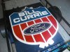
25 logos wiht hidden messages
I like this one. their signs rock too! it's cut out at the top around the "building".- signgal
- Post #5
- Forum: Logo Design
-

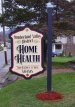
property rental company logo
YES!!! Use the arrow in the official icon/logo, not in the lettering. Less forced. You people are freakin' brilliant! Btw I like Marco's color combo... it's now! :) And I think Heath's Logo is an awesome example of symbols in a logo. BTW I've searched and searched and can't find the thread...- signgal
- Post #49
- Forum: Logo Design
-
-
26 ways to tell you're GROWN UP!!!
ok, so only 15 out of the 20, says I'm youthful, right? *looks at dried up house plant on the sill*- signgal
- Post #3
- Forum: General Chit-Chat
-

-
Fluorescent Green Banner Blanks
+1 just bought one for a construction company last week- signgal
- Post #8
- Forum: General Signmaking Topics
-
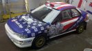
1st Wrap Design...Print...& Install
Now, see... I'm all impressed now LOL I give you a lot of credit and know you will take the criticism and become a wrap force to be reckoned with!- signgal
- Post #13
- Forum: Vehicle Graphics
-
1st Wrap Design...Print...& Install
Does that include design?! I think you got the American point across well and I think it was a very respectable first attempt. The back half of the care looks great really. Like the guys, I would have liked to see you company represented better but you have the right attitude. A great learning...- signgal
- Post #11
- Forum: Vehicle Graphics
-
-

Before & After
Glad you think so :) I was also thinking some dimension letters hanging here and there on those skinny divider walls might be nice. Customers are so tactile and would grab 'em to play with. You probably don't route so that might not be advisable but Gemini sends out samples pretty freely.- signgal
- Post #13
- Forum: General Signmaking Topics
-
Before & After
Awesome job! What a difference, huh?! Great start. The paint job will make an even bigger difference. Maybe on the posters from your old shop (I like them -professional) you could set up a hinge of some sort (you seem handy) so they could lay flat until you need to illustrate something to the...- signgal
- Post #10
- Forum: General Signmaking Topics