-
I want to thank all the members that have upgraded your accounts. I truly appreciate your support of the site monetarily. Supporting the site keeps this site up and running as a lot of work daily goes on behind the scenes. Click to Support Signs101 ...
You are using an out of date browser. It may not display this or other websites correctly.
You should upgrade or use an alternative browser.
You should upgrade or use an alternative browser.
A chance to make a banner! Need a favor
- Thread starter hightop
- Start date

AUTO-FX
New Member
AUTO FX,
The font is "Caligrapic".... needs to be kerned. The font wasn't the point though. The point was to get the message out as efficiently as possible. People driving by don't have a lot of time to read a banner so keep it short and sweet. IMHO anyway...
Just bustin' yer chops, no malice intended!
signmeup
New Member
Don't make me come over there....Just bustin' yer chops, no malice intended!
:Big Laugh
AUTO-FX
New Member
Don't make me come over there....
:Big Laugh
LOL ! I can see the headlines now -
"Pennsylvania man flattened by Canadian pancake trained in the Martial Arts"
JimmyG
New Member
Just some FYI for those that didn't bother to look it up....
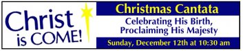
Christ IS COME
Celebrating His Birth, Proclaiming His Majesty
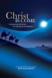
(exactly how it should be typed to reflect the published art on the cover of the sheet music...)
It is a short, 23 minute, choral worship musical for smaller choirs and choirs with limited time that was created by Deborah Craig-Claar and arranged and orchestrated by Dave Williamson...
btw Gino..."the check is in the mail"....:ROFLMAO:
Christ IS COME
Celebrating His Birth, Proclaiming His Majesty
(exactly how it should be typed to reflect the published art on the cover of the sheet music...)
It is a short, 23 minute, choral worship musical for smaller choirs and choirs with limited time that was created by Deborah Craig-Claar and arranged and orchestrated by Dave Williamson...
btw Gino..."the check is in the mail"....:ROFLMAO:
Attachments
hightop
New Member
JimmyG - Yep! That is the cover of the song book. I should have been looking at it more closely. Then "His" would have been capitalized and there wouldn't be threats of beatings from the nuns! (We aren't Catholic, but my nuckles stung for a moment, anyway!):scream:
Auto-FX and Signmeup - Grandma said if you can't play together nice, you can't play together at all!! :ROFLMAO:
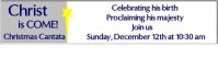
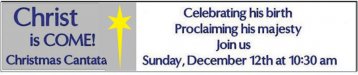
OK - On many suggestions, I made the gray area a little larger and put a white background behind the yellow star. I understand the Kerning comment, however...I confess I don't know how to fix it. Part of the learning curve.
New version is attached.
Auto-FX and Signmeup - Grandma said if you can't play together nice, you can't play together at all!! :ROFLMAO:
OK - On many suggestions, I made the gray area a little larger and put a white background behind the yellow star. I understand the Kerning comment, however...I confess I don't know how to fix it. Part of the learning curve.
New version is attached.
Attachments
Last edited:
signmeup
New Member
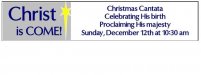
I still think you should make Cantata bigger but hey if you're happy....
I'm not familiar with your software for the kerning. Best I can do is suggest you click the help button.
Auto and I are going out behind the wood shed to settle our differences....... Hey... Auto!! Go cut me a switch!
One last suggestion:
I'm not familiar with your software for the kerning. Best I can do is suggest you click the help button.
Auto and I are going out behind the wood shed to settle our differences....... Hey... Auto!! Go cut me a switch!
One last suggestion:
Attachments
")
Gino
Premium Subscriber
I wondered if you had posted the wrong file..... carry on.
I thought the same thing. Many of the corrections she acknowledged have been ignored in the latest post.