-
I want to thank all the members that have upgraded your accounts. I truly appreciate your support of the site monetarily. Supporting the site keeps this site up and running as a lot of work daily goes on behind the scenes. Click to Support Signs101 ...
Search results
-
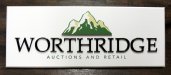
Very simple logo done dimensional
Sign is only 16" x 42" and is being shipped out of state, so these are the only pics I could get before it leaves and is installed on site. Maybe they will send me a photo of it on the wall. All PVC by the way. Matthews paints for the finish.- SignManiac
- Thread
- Replies: 14
- Forum: Dimensional Signs
-
-
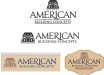
American Building Concepts Revised Logo
I'm finding the R swoosh visually distracting and not necessary. The font for AMERICAN on it's own is strong enough. Also not too hot on the coral pink background. I think with the red and blue you already have in it, white would be the other natural choice with a name like American.- SignManiac
- Post #6
- Forum: Logo Design
-

Trump + Sign = TASTELESS
If I spent that much money putting up a building, you can be sure my brand was on it... And I didn't think it looked out of place at all. Trump can be an egotistical azz, but he has a knack for making money!- SignManiac
- Post #14
- Forum: General Signmaking Topics
-
Adding a gradient fill to an odd shape...In Corel
Yeah the mesh tool can achieve some amazing effects...- SignManiac
- Post #8
- Forum: Corel
-
Sign Painter the Movie, panel discussion
There are just as many people in the business today that are young who do drugs and and also drink. I bet you would be surprised if we knew the actual numbers. It seems to be a common character trait with many creative people. Probably why so many are good at what they do. If it's the truth then...- SignManiac
- Post #9
- Forum: General Signmaking Topics
-
Facebook Shill
Now I'm curious to see if this makes any difference. But I refuse to tweet! https://www.facebook.com/pages/Skywatch-Signs/122146947802588?ref=hl&ref_type=bookmark- SignManiac
- Post #28
- Forum: General Chit-Chat
-

Shortcut to creating carbon fiber look? Pic inside
You could download a vector carbon file, use a color filter and then powerclip inside your text. Fred has some nice carbon fiber files on his clipart site as so does vectorstock. Edit, Freds site is express clipart. http://www.expressclipart.com/store/product_info.php?products_id=13658&cPath=&- SignManiac
- Post #3
- Forum: Corel
-
Can Hatco sandblast stencil be cut with a laser?
Nothing on their website and no answers on the google thing?- SignManiac
- Thread
- Replies: 3
- Forum: Miscellaneous Print & Cut Systems
-
is there a decent gold leaf paint available????
Matthews Brilliant Gold metallic. Forgot to mention, it needs to be clear coated with their UV satin or gloss.- SignManiac
- Post #9
- Forum: Hand Made Signs
-

-
More recent stuff
Really like the way you handled that. Looks great!- SignManiac
- Post #3
- Forum: Portfolio Board
-
A friend's/customer's experience with buying a sign franchise.
Anyone with brains should first have an attorney read through the FDD (Franchise Disclosure Document). Everything that the Franchisor requires from the Franchisee has to be disclosed by law and the Franchisor must give them two weeks so they have plenty of time to make a sound decision before...- SignManiac
- Post #7
- Forum: General Chit-Chat
-
WOW, I was not expecting this!!!!
Free press is the best press.:thumb:- SignManiac
- Post #2
- Forum: General Chit-Chat
-

Two signs for this week
Hoppen Home Systems is for inside office reception wall. Mermaids Lair was designed for the front of a new beach house. Customer provided the carved mermaid. Both are made from PVC and Matthews paint.- SignManiac
- Thread
- Replies: 1
- Forum: Dimensional Signs
-

Need Suggestions on a Logo
I like the direction of your top choice but feel the name is too small and week. Here's another take on it with a stronger emphasis on the name. Using green for the oval part of the logo and brown for the trees would help break the logo portion into something easier on the eyes.- SignManiac
- Post #3
- Forum: Logo Design
-

this is how we sell signs
No doubt presentation is 90% of the sale. I hit them on two fronts. The showroom is the the first hook and then I follow with scale color rendering like yours. You can't miss when the client has a clear vision of there project before it's even done!- SignManiac
- Post #9
- Forum: Sales, Marketing, Pricing Etc.
-
Alien Skin Eye Candy in Corel
My original version no longer works with Corel Photopaint since upgrading to a 64bit OS...- SignManiac
- Post #9
- Forum: Corel
-

-
What do you guys think??
I give you an A+ for using special effects! What do you have against working in black and white? I would recommend the Aurora CD collection. You would find it very useful.- SignManiac
- Post #25
- Forum: Logo Design
-
Need help with deciding on a logo
I would blend the two together for an outstanding design.- SignManiac
- Post #9
- Forum: Logo Design